I wrote this post for karapasleydesigns a few months ago….Awesome blog, please check her out.
Not only does it highlight the shelves in our rarely-viewed living room…it’s chock full of great inspiration that we wanted to share with y’all.
Greetings and Salutations….
I’m James from The Cavender Diary.

Kara asked me to stop by and share a few of the styling tips that my partner Jamie and I use at our own house.
A few weeks ago, we picked up 3 of these chrome and glass shelving units for our living room. That meant that with the shelves almost filled with books, we would have the entire top to display art and a few tchotchkes. When you have as much “acquired stuff” to display as we do, it can become a little overwhelming. Fortunately, after 20 years of display for retail stores, I’ve picked up a few styling tricks to keep all our inexpensive treasures looking like treasures, and not……well…… just plain clutter.

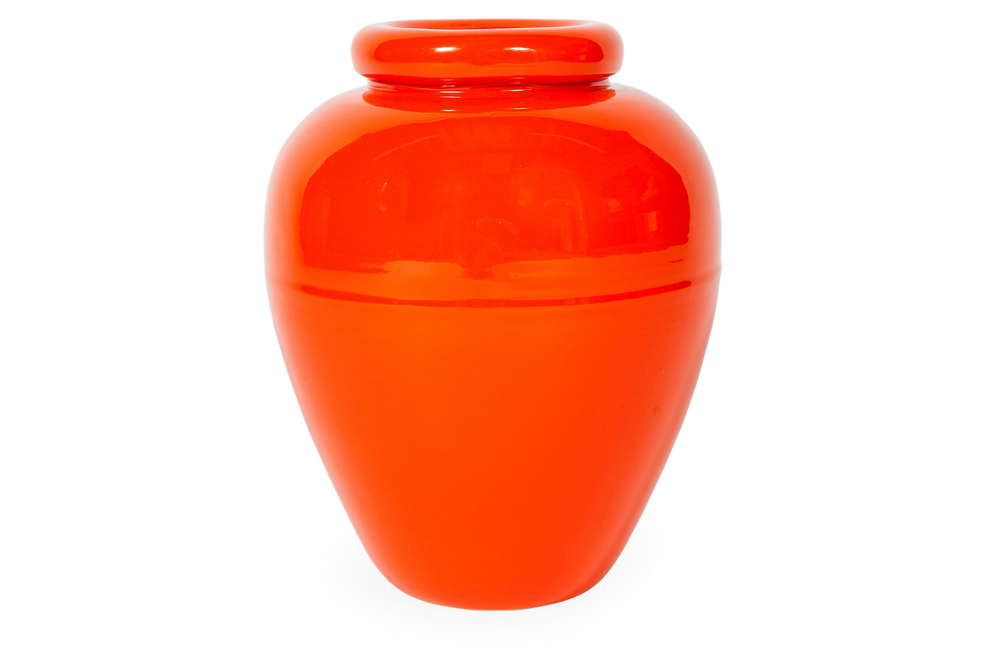
Want to know the secret to arranging your possessions so that everything looks balanced? It’s a pyramid. Seriously, group taller items in the middle, and shorter ones on both sides. Try to avoid everything being the same height ( except for a collection of the same thing….like the jars ). The color story is pretty much just black, white and natural, but there are also small amounts of red and yellow interspersed for just a little energy. The wall mounted hurricanes act as “book-ends” for the whole she-bang.

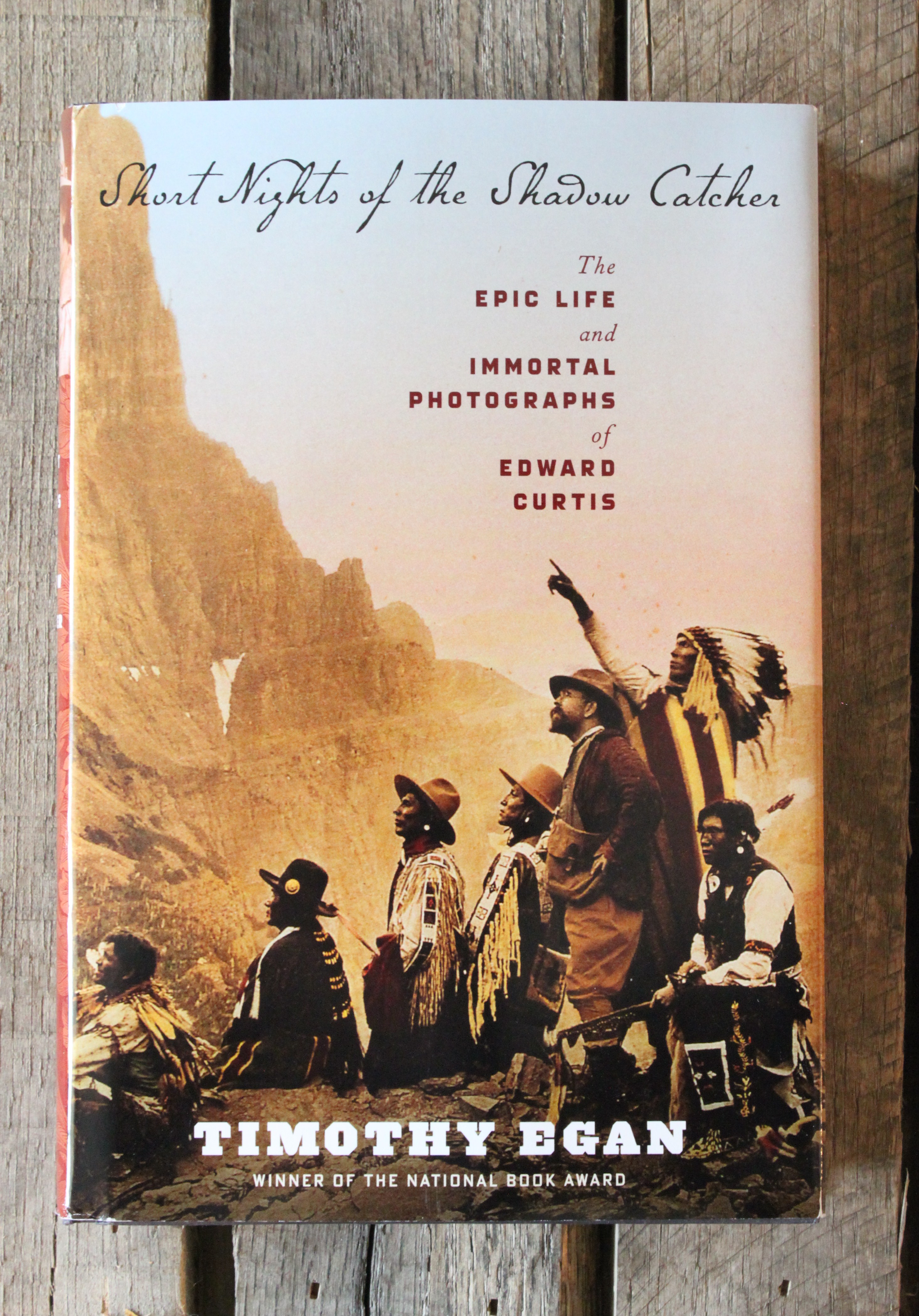
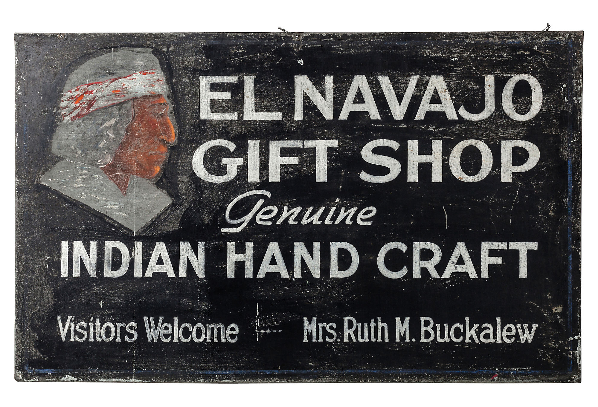
Art doesn’t have to cost a fortune or even have matching frames to look cohesive. An African mudcloth with an IKEA picture light, mingles with an Edward Curtis Indian portrait, a color copied vintage map and a Pop-Art alphabet piece. They have very little in common….except for similar clean-lined frames and crisp white mats. Your pictures don’t need to be professionally framed to look expensive. Any framer will cut a white mat, perfect for a frame you may already have, for about 20$. White mats = instant art pedigree.

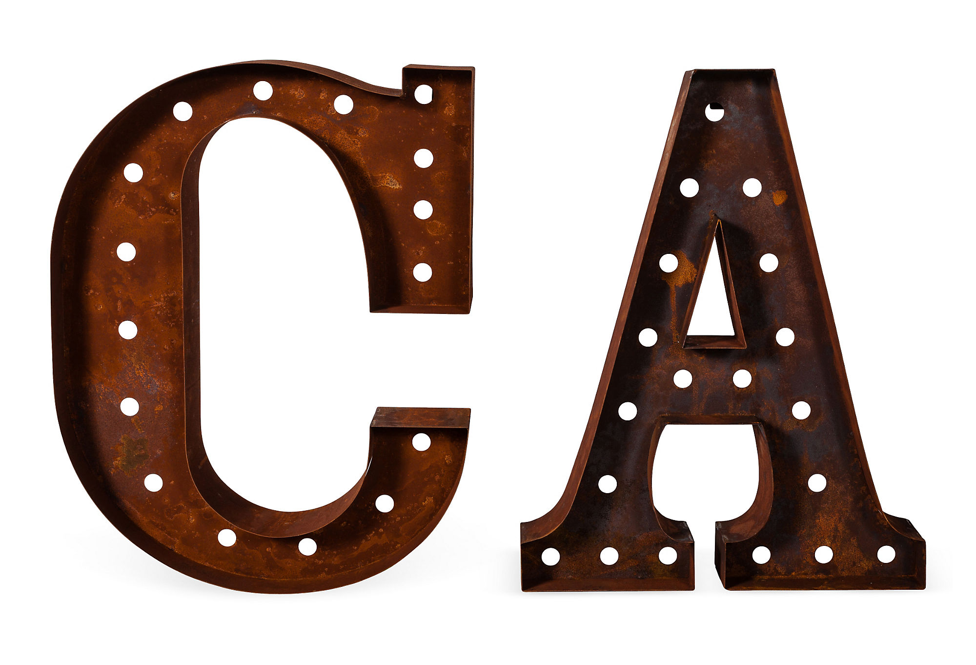
Not every picture has to hang on the wall. Because we move our ever-changing art collection almost monthly, I usually just lean them in groups. This keeps our sight line low and tight and makes the ceiling appear to be higher. Too make the alphabet print the highest point I set it on a piece of scrap wood. There is even a smaller pyramid configuration in this grouping too.

Don’t overlook a purchase just because it’s a little damaged. The chalkware Jesus was a junk shop find that looks like a cherished family heirloom with his chipped patina. The Indian portrait came out of a $4 Amazon book that was missing most of its binding. I just taped it into a simple Ikea frame that already had a white mat. We used a plate stand as an easel.

We always add small details that evoke memories. Jamie and I both travel for work, so we constantly pick up vintage postcards, old black & white photos, and Letterman’s patches on our travels and then tuck them into the corners of frames all over our house. I’m all for souvenirs that only cost a buck or two. Even a set of “Silver Screen Cowboys” stamps become a part of the mix. This is a perfect thing to do with family photos, ticket stubs and fortune cookie fortunes.

Plants don’t have to be contained in flower pots. I love orchids, but sometimes they are just a little too “precious” for me; so I repotted this one in a tomato can. The colors couldn’t be more perfect together. I’ll pretty much use anything I have available to pot a plant in….. a silver trophy, an ice bucket, a wooden box. I’ve even used old paint cans with dried paint dripped down the sides. Think outside the box, or pot.

Anything in a frame will instantly look like art. I’ve never found an object that I wouldn’t hot glue into a shadow box. These celluloid indians look like a one of a kind piece and they were just a couple of bucks each on eBay. We have also framed Pezz dispensers, baseball mitts, belt buckles and even paperback Western novels. Trust me, this is a fool-proof stunner every time. I use hot glue, but velcro or bank pins will make things easier to change out later.

Contain your collections. These jars are just kitchen canisters from a department store. 3 of the largest size looks way more graphic than one of each size. We used paint stripper to remove the way too bright enamel color from the lids and reveal the “much cooler” galvanized metal underneath. The croquet balls were just gathering dust in the garage, now they add a visual “punch”. Ok, so we didn’t drink all that wine alone, we had a little help……. the Champaign corks have the dates that we opened them ( Birthdays, New Years, Anniversaries…etc ) written on each one. Any collection, like baseballs, dominoes, or sea shells, will look less “junky” in a canister.

Once we place a big piece of furniture, it stays put. All the accessories, on the other hand, rotate constantly. And rotate constantly is what they do.
So there y’all have it. Just a few pointers on how we accessorize our home without letting all the “stuff” we’ve collected take over.


