THE CAVENDER DIARY

2 GROWN MEN vs a 40 YEAR OLD HOUSE

  • Home
  • Who Are We?
  • House Tour
  • To Do List
  • Projects
  • Recipes
  • Did Ya Know?
  • Books
  • Our Press

You Don’t Have to Put on the Red (Barn) Light

Posted by James on June 24, 2020
Posted in: New Home. Tagged: 16 Inch Barnlight, Farmhouse Lighting, Gardena Gooseneck Barnlight, Gooseneck Barnlight, Red Barn Light, Steel Lighting Company. 24 Comments

I’ve been in covid-related limbo the last couple of months.

Jamie’s job hasn’t really been affected.

While I’m not in demand so much anymore.

Not a big deal because with all my new-found free time I have been catching up on the myriad of house projects that have slipped through the cracks over the past decade.

It’s good for me to keep busy.

Idle hands and all,

One of those overlooked projects is replacing the light over our garage.

Neither of us remembers what was on the back of the house originally, and we can’t really tell from this tiny, tiny little picture that I saved from the Trulia listing. (Notice the stylish pea-soup green garage)

Cavender House Backyard from Listing

I assume it’s one of those double-headed outdoor floodlight fixtures, probably with a motion detector, and 2 exposed lightbulbs.

Not very sexy, I know. But these were the “standard” on every single basic American house built from about 1945 until…… actually, I don’t think they’ve ever stopped being the “standard”.

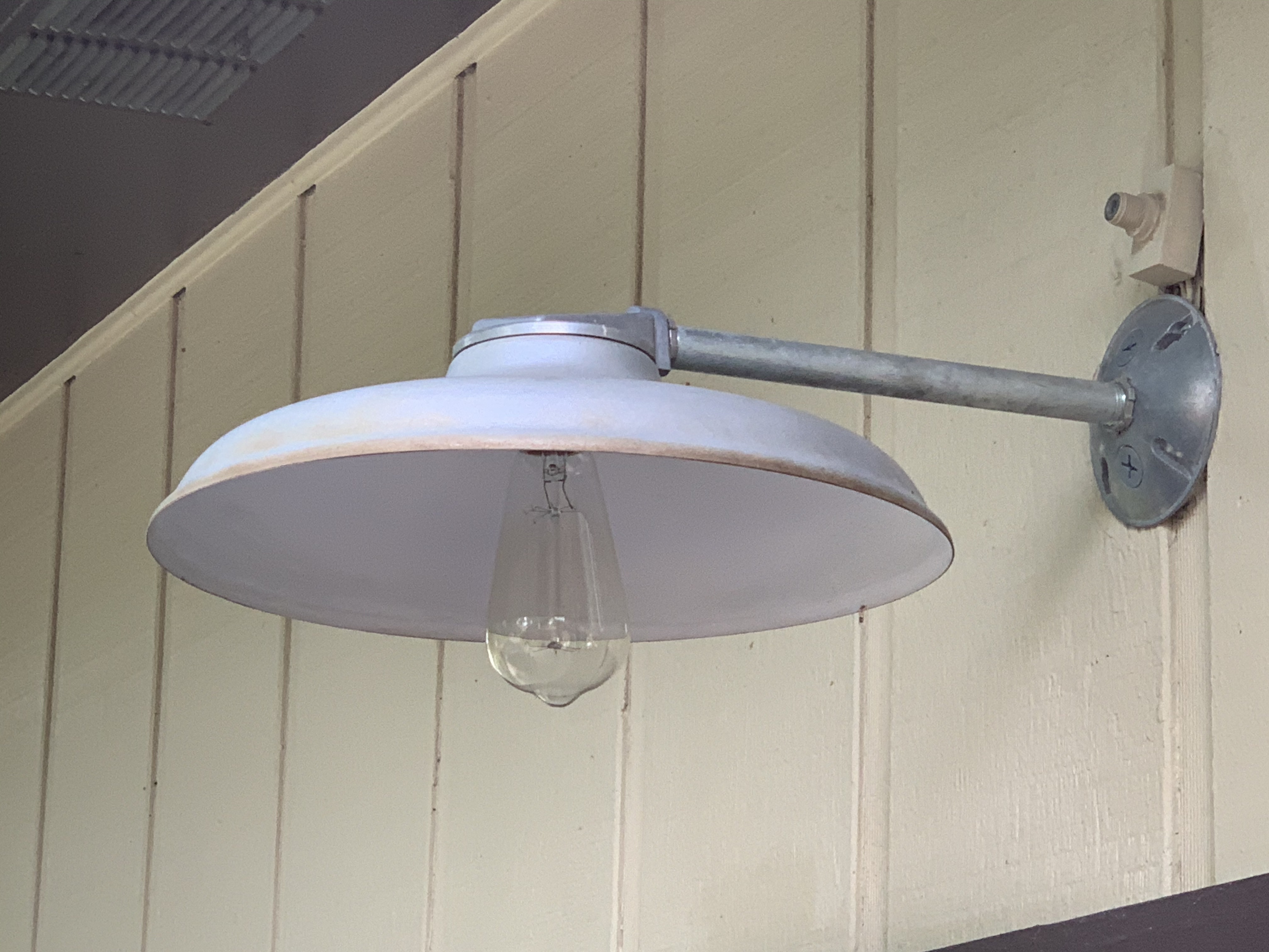
I found this ever so affordable (somewhere in the $30 range) silver barn light on Amazon sometime after we moved in.

Old Silver Barn Light Over the Garage Door

It’s small,

It’s sans the standard barn light gooseneck,

It’s oddly shallow,

It’s been… fine.

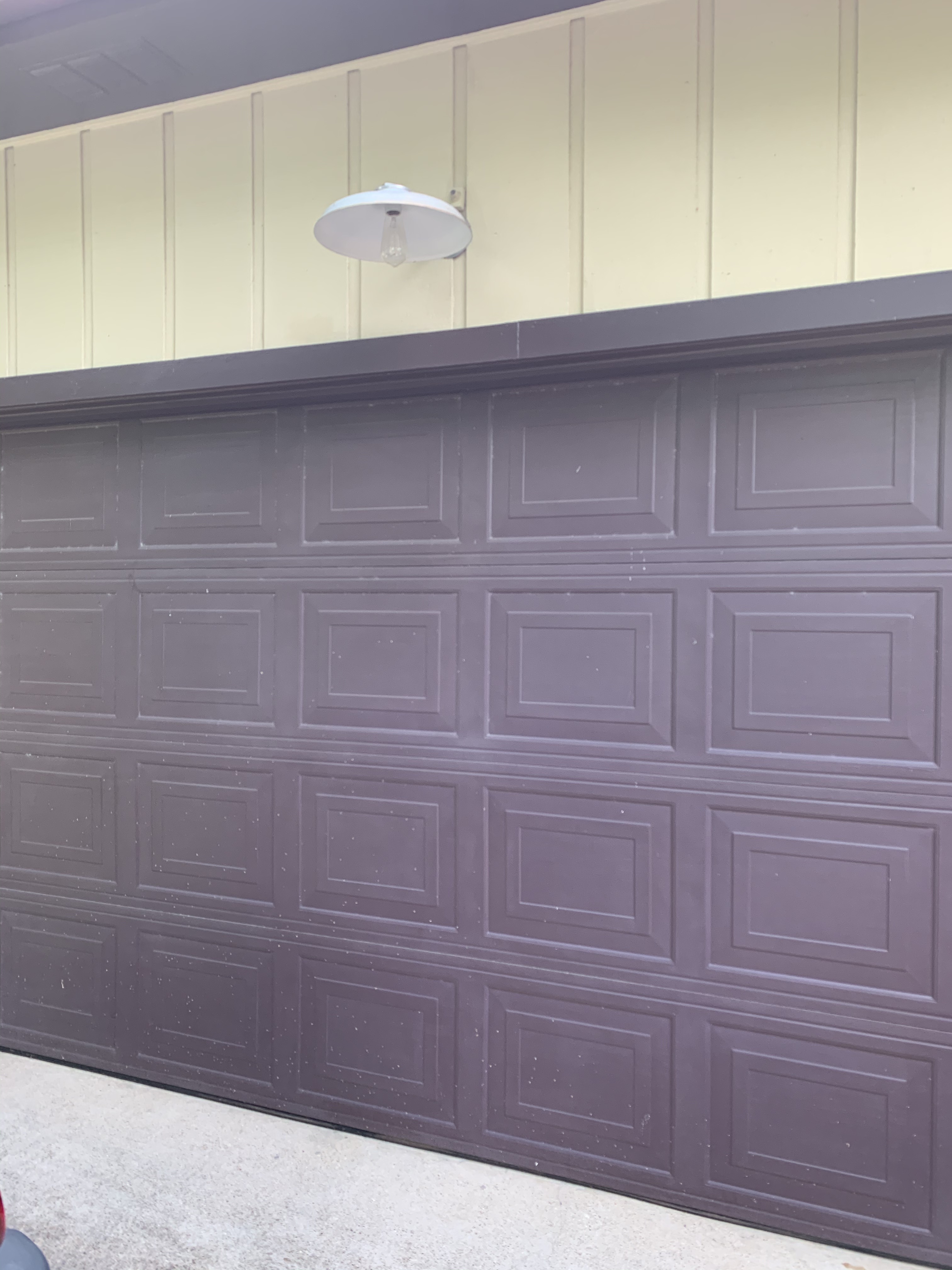
Garage Door with Former Small Silver Barn Light

Utterly forgettable, … but fine.

With the addition of the sunset sensor, that little box over the top of it, it has served its purpose for just over 10 years. Until sometime in January when the sensor just stopped working.

I thought about painting it glossy orange, but why bother if I have to keep flipping a switch like a neanderthal every time I want to see what’s happening in the driveway at night?

I’m kinda ready for something new anyway.

I started the hunt on Amazon for a replacement (preferably one with a built-in sunset sensor – which is a surprisingly rare feature in a barn light.)

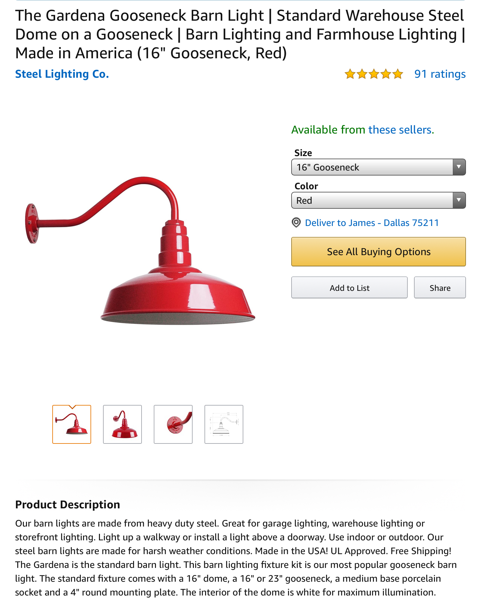
There were a lot of beauties to choose from, but I settled on this goosenecked girl right here.

IMG_2163

In bright red.

THE COLOR OF A FIRE ENGINE!

16 inches is plenty big, and just happens to match the size of the black factory pendants already hanging inside the garage.

Pricey though. Costs as much as 9 of those black factory pendants.

But here’s the clincher. I had American Express rewards points transferred to an Amazon gift card and my final cost was only $7.24.

Seriously.

(Plus another 10 bucks for the sundown sensor – sold seperately)

It’s even more beautiful in person, heavy and well constructed, with a glossy powder-coated enamel finish. American-made even. Huge improvement over that last 2 light fixtures that hung in that space.

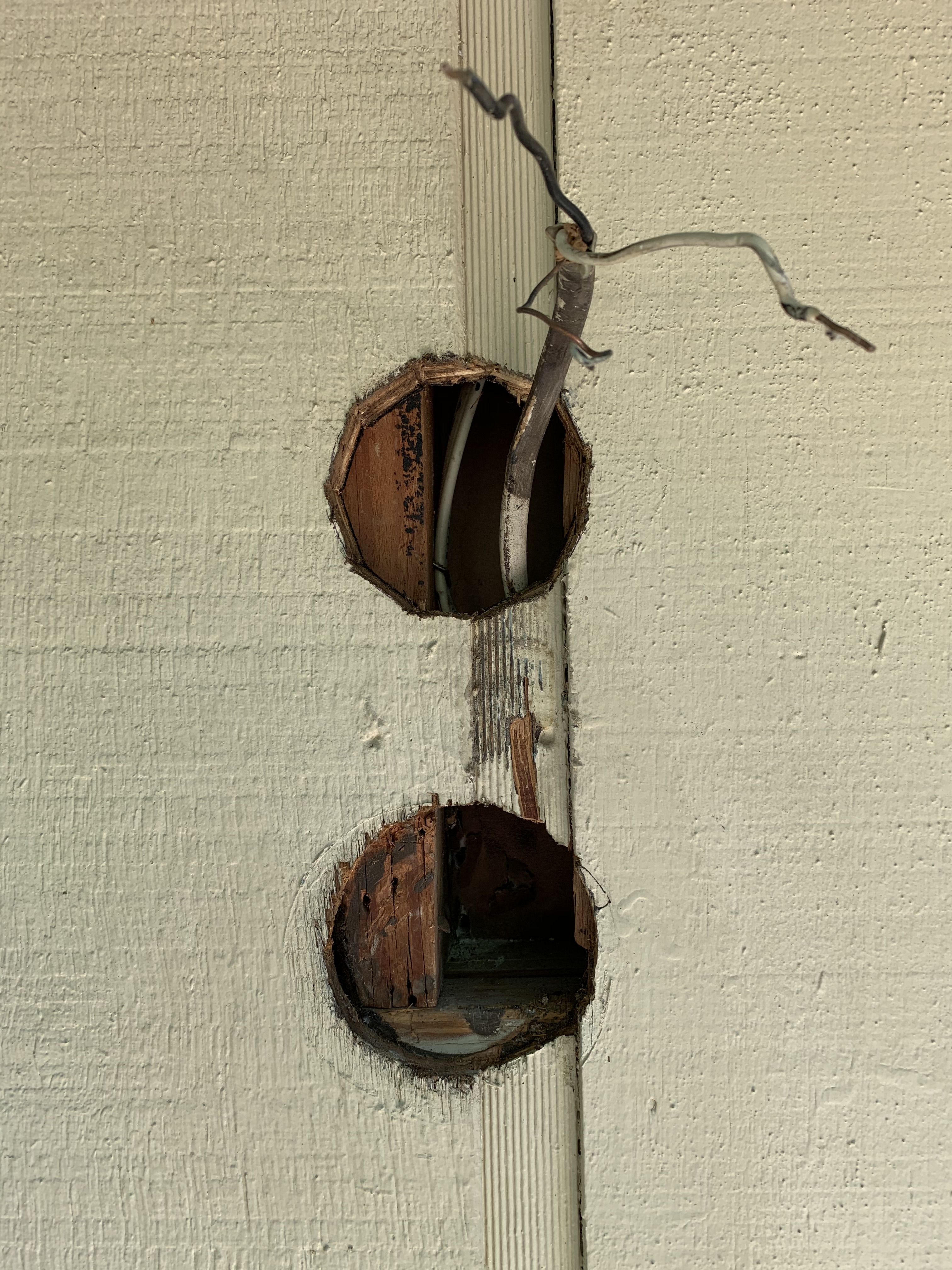
Since nothing is ever easy, I had to move the light mount up 5 inches on the wall above the garage door so it would be centered on the little wall section appropriately.

Two Holes are Not Better Than One

Tedious work, I know.

But it absolutely needed to be 5 inches higher.

I used a Dremel to cut a new round hole in the exterior and simply transferred the round mounting box to the new hole and the cut-out wood circle to the previous hole…

…and filled in with a little putty.

New Electrical Box Over Old One

Since I’m already painting the wall I might as well paint the sundown sensor to match.

Another tedious detail.

That odd little black box…

  • Why is it black?
  • Who has a black house?
  • Why would anyone ever need to see it?

…will definitely distract from the beauty of my new glossy-red lamp.

I taped around my newly-installed red lamp, and placed a little circle of blue painter’s tape over the sundown sensor eye. Then I coated everything that wasn’t a red barn light with paint to match the color of the house.

“Vanilla Cream” is what we call it because we honestly don’t know what it’s real name is, the house just came this color.

(Well, that garage didn’t come this color, the rest of the house did, but now it all matches)

Painters Tape Around BAse

Now, here’s the one detail about this kinda pricy barn light that just doesn’t make sense to me…

THE MOUNTING SCREWS ARE SILVER….?

Why are the Screws Silver

Seriously?

Who produces a product like that?

Jamie had to remind me that not all of the world is designed by art directors and “regular folks” don’t care about details like this.

I’m sure silver screws on red laquer are just fine and dandy for “regular folks”… but there are anal-retentive detail-oriented people living in this house.

And we just can’t have that.

Remember that glossy enamel paint we used to use on model airplanes as kids?

They still make it.

(My dear friend George will remember road-trippin’ us to a hobby shop in Grapevine, Tx to buy it when we were kids because we were too young to buy it in our hometown.)

Testors Red

So I took another road-trip, this time to Michael’s in Cedar Hill, and returned with four little jars with four different shades of red to choose from.

In case you’re wondering…

“RED” matched the best.

IMG_6775

Go figure.

Pretty, ain’t she?

New Red Barn Light Over Garage

Notice how the patched hole, silver mounting screws and black sundown sensor all fail to distract for her beauty……

You’re welcome.

“Detail Oriented”, he whispers to himself.

Here’s our driveway right after I installed the little silver light about 9 years ago…

Back Driveway & Grass

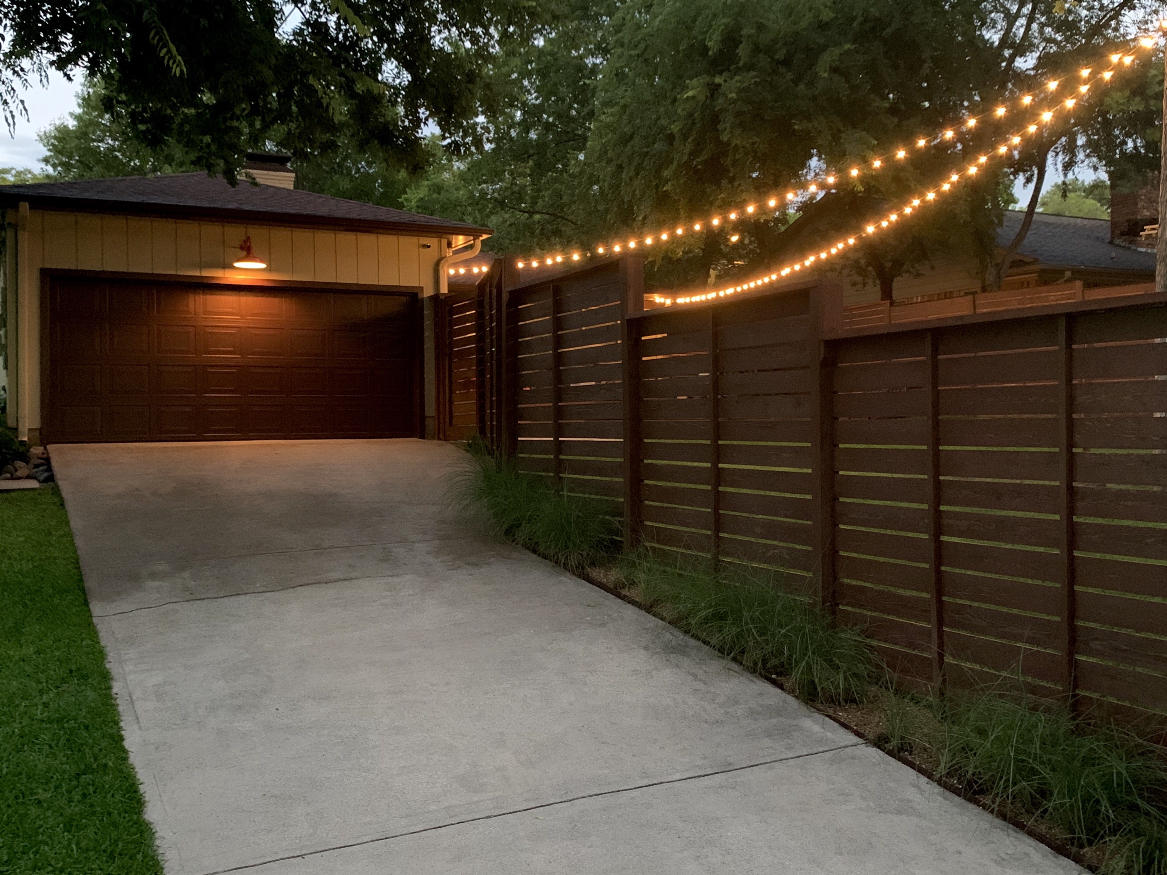
And here’s that same view today, with our new red barn light in all her glory.

Driveway June of 2020

Way, More, Much better.

Am I  right?

Looks even better at night….

Driveway with New Red BArn Light at Night

OH, and as if moving the wall mount up 5 inches and painting the screw heads red wasn’t detail oriented enough….

Over the past 2 weeks I repainted the garage door – you can see how battered it looks in the top-most picture, power-washed the driveway, replaced the river rock border with pea gravel, added a few more razor grasses, replaced all the cap boards on the fence… and, why not, restained the entire fence.

Just to take a picture….

No worries,

I had the time.

32.745054 -96.864574

Share this:

  • Facebook
  • LinkedIn
  • Twitter
  • Pinterest

Like this:

Like Loading...

The Art of the Conversational

Posted by James on June 4, 2020
Posted in: New Home. Tagged: Conversational Tie, Equestrian Tie, Fishing Tie, Polo Ralph Lauren, Polo Ties, Ralph Lauren Ties. 14 Comments

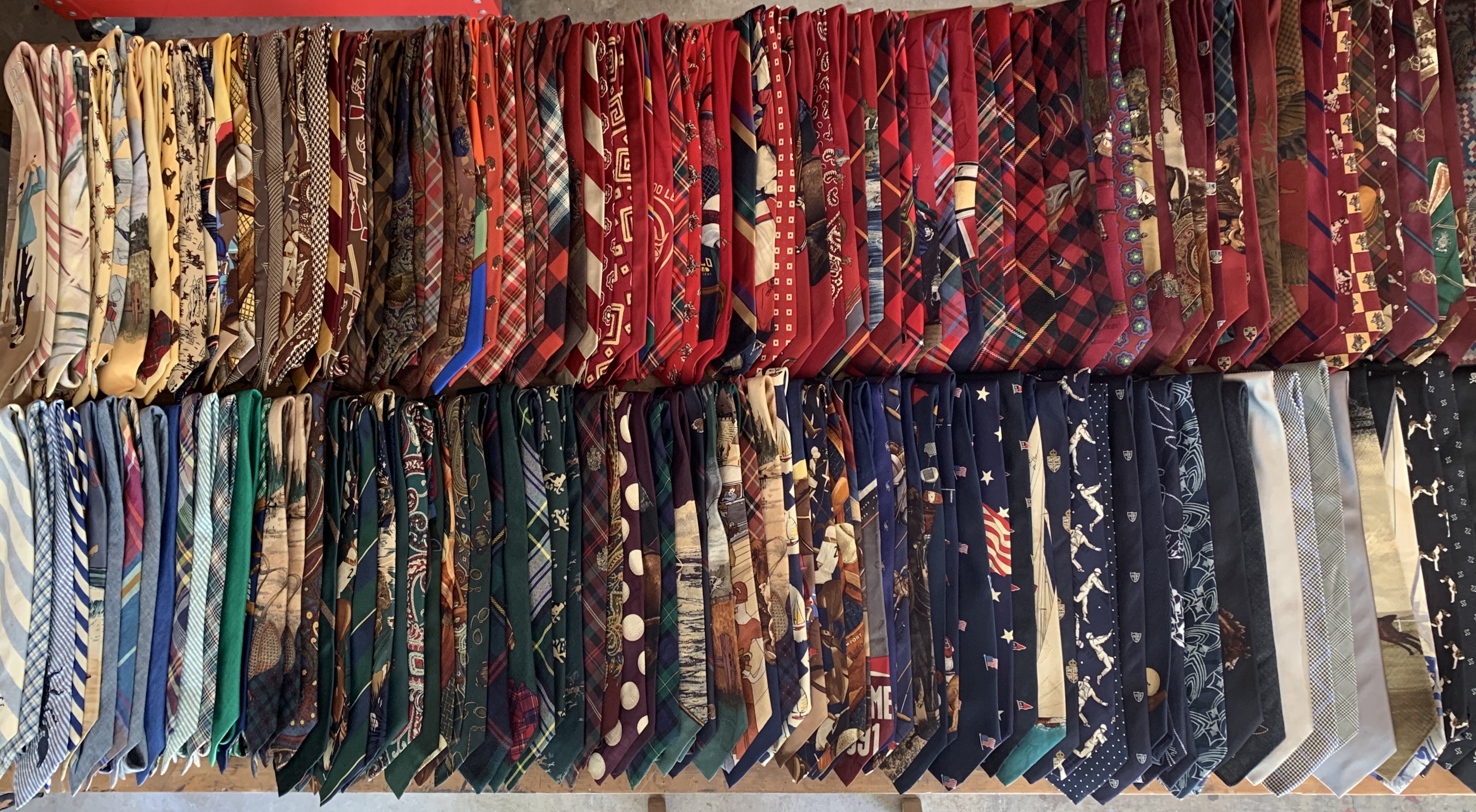
There’s been a lot of cleaning and reorganizing around the Cavender house the past couple of weeks, and I thought it was a pretty good time to color-order and photograph my ties.

I photograph to prevent me from buying repeats.

Yeah, I have that many.

Assortment of Old Polo Ralph Lauren Ties

But in my defense, I went to college at a time when a man was judged solely on the number Polo ties that he owned.

When I was laying them out to photograph, Jamie asked me if this was for a blog post.

No, of course not. 

But as I was shuffling through the basic rep stripes, tartan plaids, and foulards there were just so many beautiful printed ones. I rarely wear ties anymore and it’s such a shame to just tuck them back into a dark closet. (Except for the cashmere and wool; they live in the garage freezer.)

I thought why not share a few of my favorite conversationals?

“What the hell is a conversational tie?” you may ask.

Exactly what it sounds like; a tie print loaded with so much personality that it sparks a conversation.

It’s certainly no secret who my favorite fashion designer is.

Ralph Lauren started with ties. He did, in 1967. In the mid 1960s men’s ties were black, grey or navy. Two inches wide. End of search. But Mr. Lauren knew that fashionable men like himself were looking something different. With a small investment from Ned Brower, and working out of a single drawer in the Empire State Building, he repped sample ties made from upholstery fabrics; velvets, brocades and damasks. Not only were the fabrics unusual – some so thick they had to be finished by hand – his ties were also wide. Very wide, almost four inches.

Bloomingdales was a huge account, and one that would give the young designer a presence on 5th Avenue. But when the big retailer requested that he narrow them, AND forgo his POLO label – Bloomingdale’s would stitch in their own tags – Mr. Lauren refused.

His vision just wouldn’t be compromised.

Bloomingdale’s reluctantly backed down and bought a handful just in time for Father’s Day shopping. Mr. Lauren gave each salesman in the Bloomingdale’s men’s department a tie, showed them the proper way to tie it (with little dimple centered just below the knot) and even polished the store’s brass display case himself.

His wider, more luxurious ties were an immediate hit….. and y’all know the rest; it wasn’t long before there were Polo brand shirts and suits to wear them with.

I’ve been collecting Ralph Lauren ties for about 35 years now. When I was working in retail sales, I coveted ties like these but they were much too expensive for me to buy without an employee discount. Now I mostly find them on eBay and at consignment and thrift stores – usually in the ten dollar range.

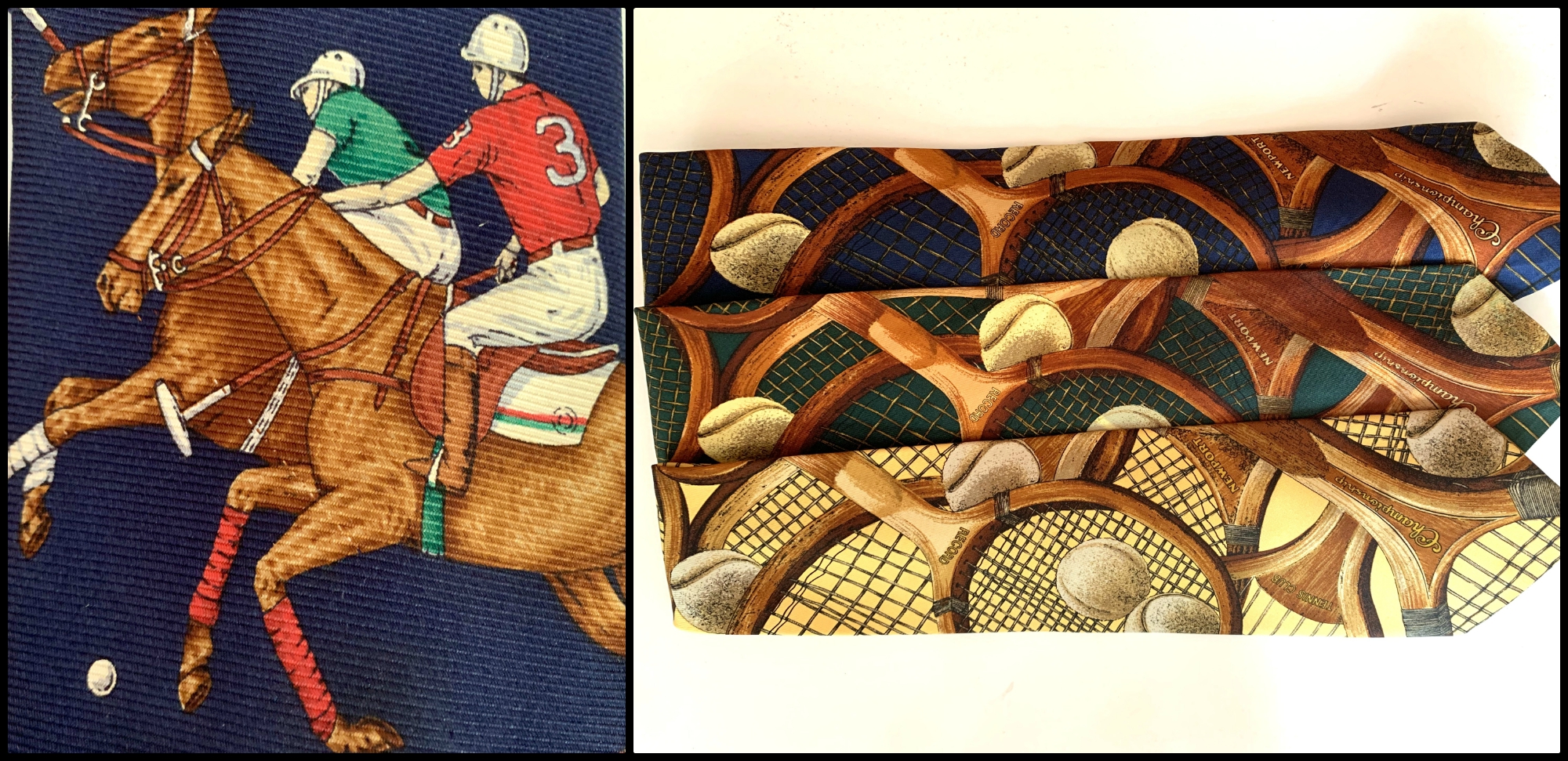
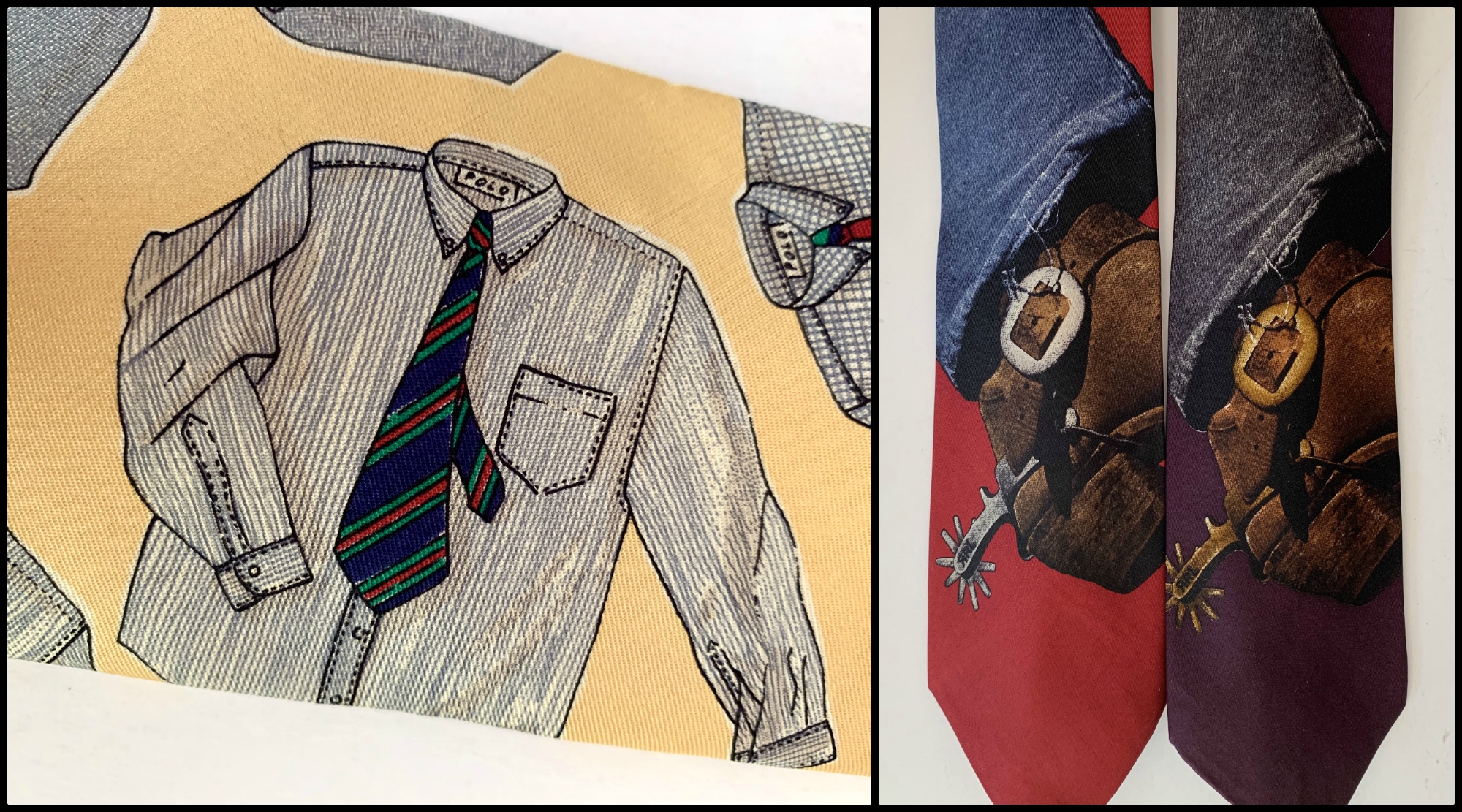
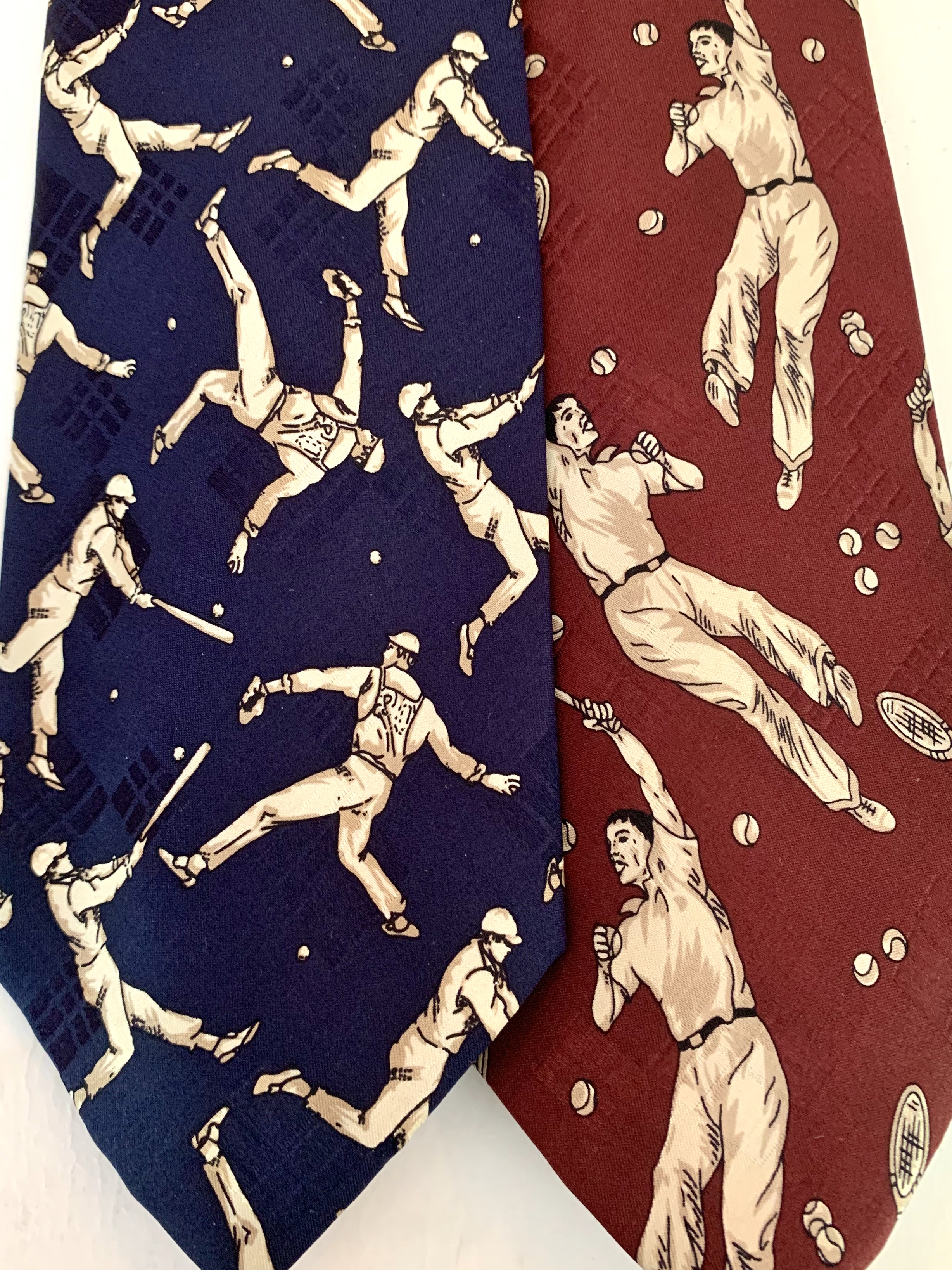
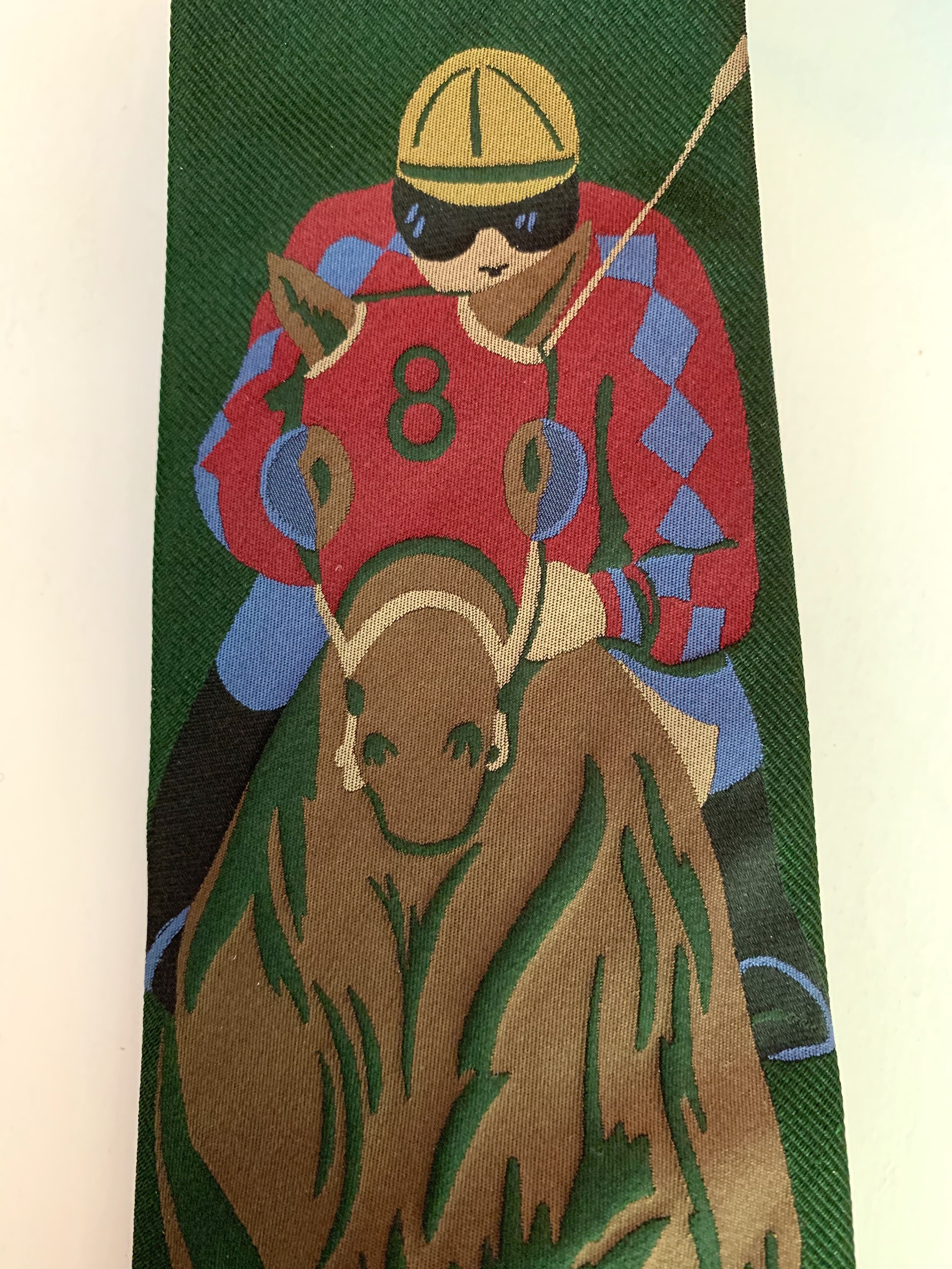
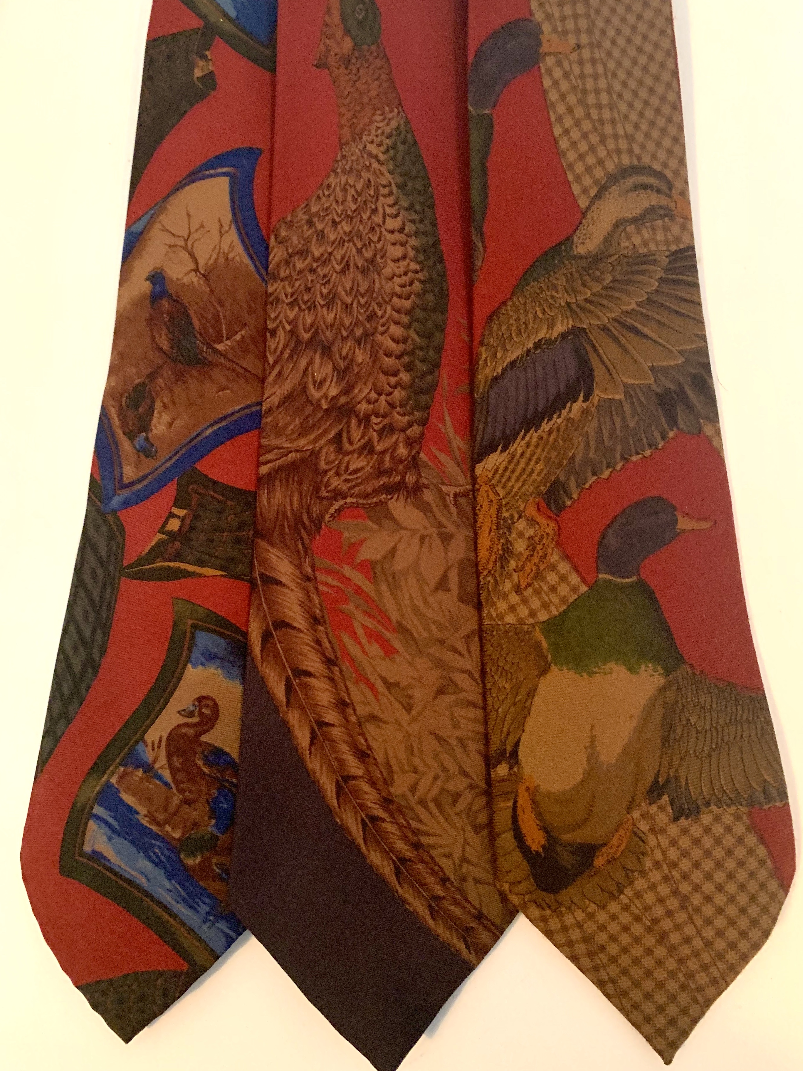
I thought I’d take y’all on a tour of a few of my favorite conversationals.

Vintage Fish on Buffalo Check on Vintage Polo Tie

Conversational Tie Collage 1

Field and Stream Magazine Cover on Vintage Polo Tie

Nautical Ralph Lauren Conversational Ties

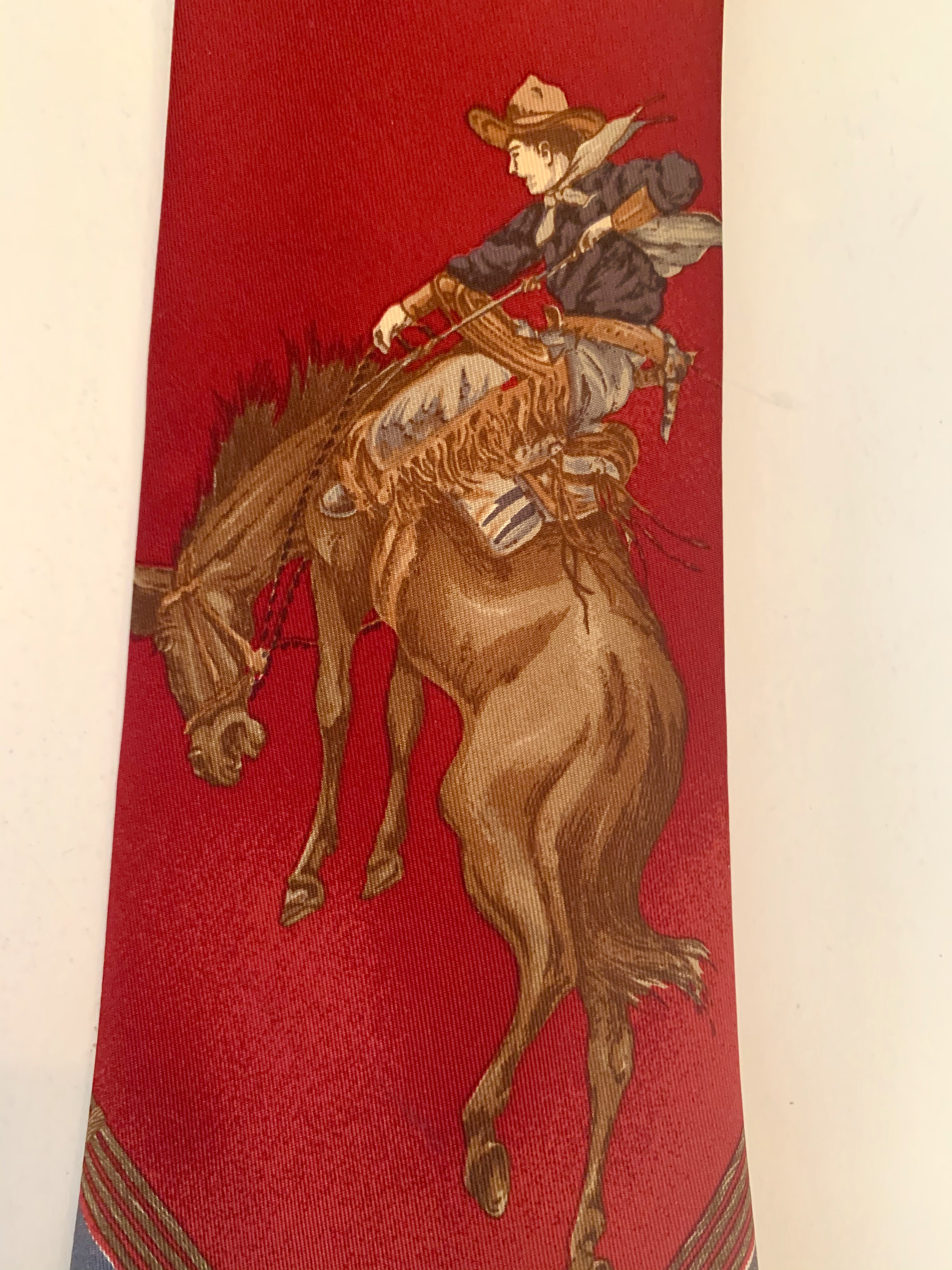
Bronc Buster on Vintage Ralph Lauren Tie

American Flag on Vintage Polo Tie.

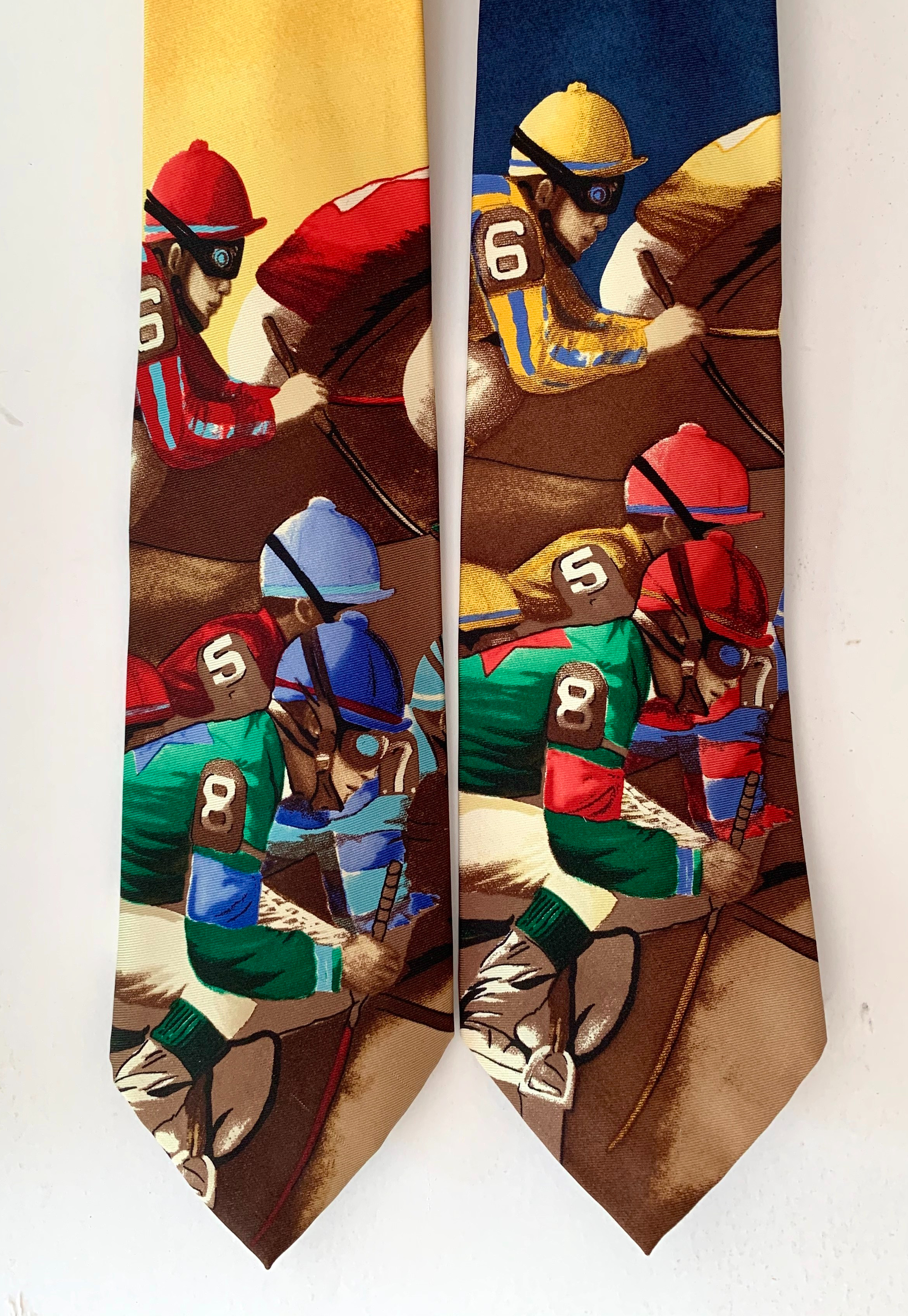
Jockeys Racing Across Old Polo Tie

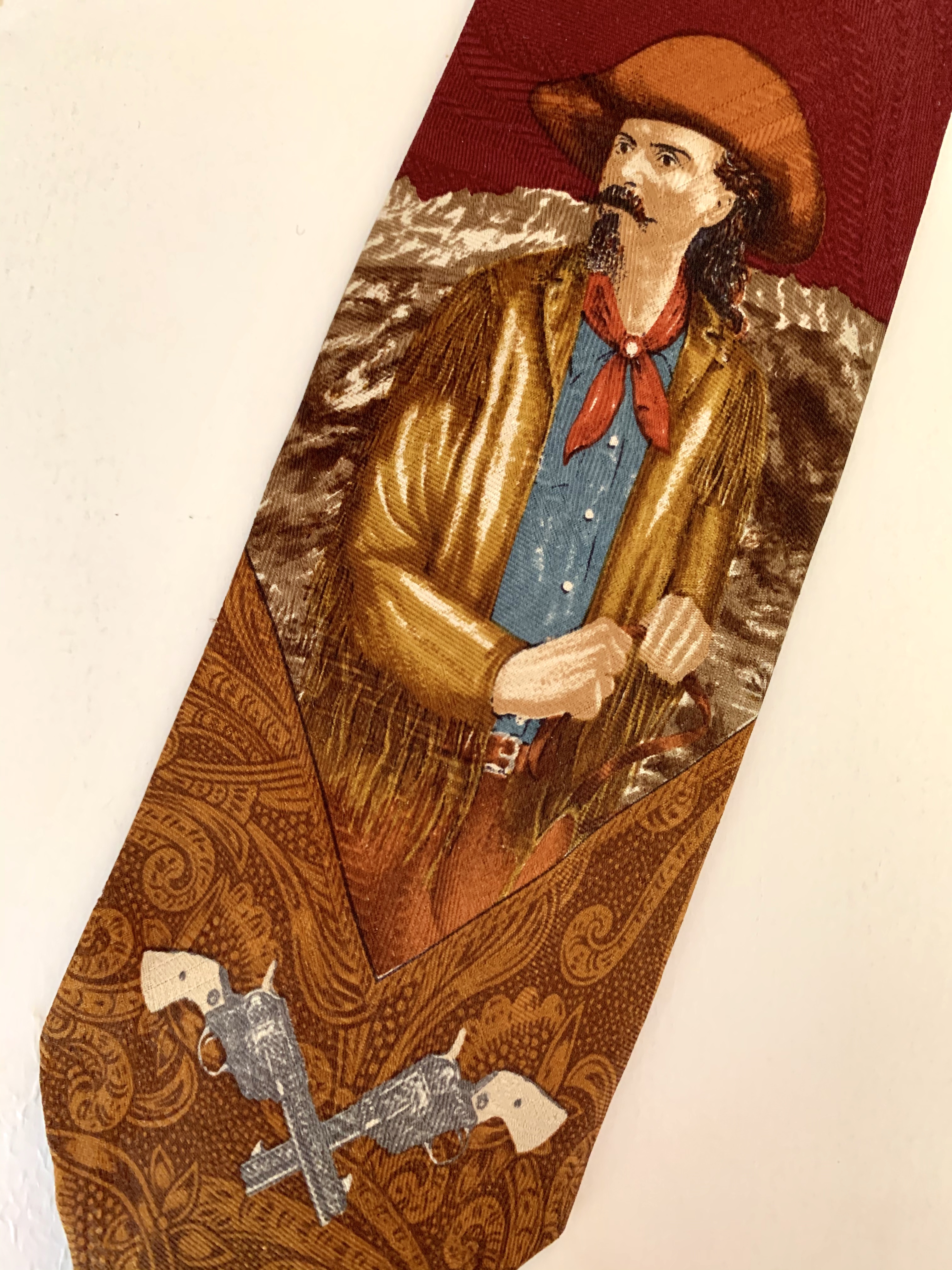
Buffalo Bill on Vintage Polo Tie

Conversational Tie Collage 2

Bear on Vintage Polo Tie

Bucking Broncos on Vintage Polo Tie

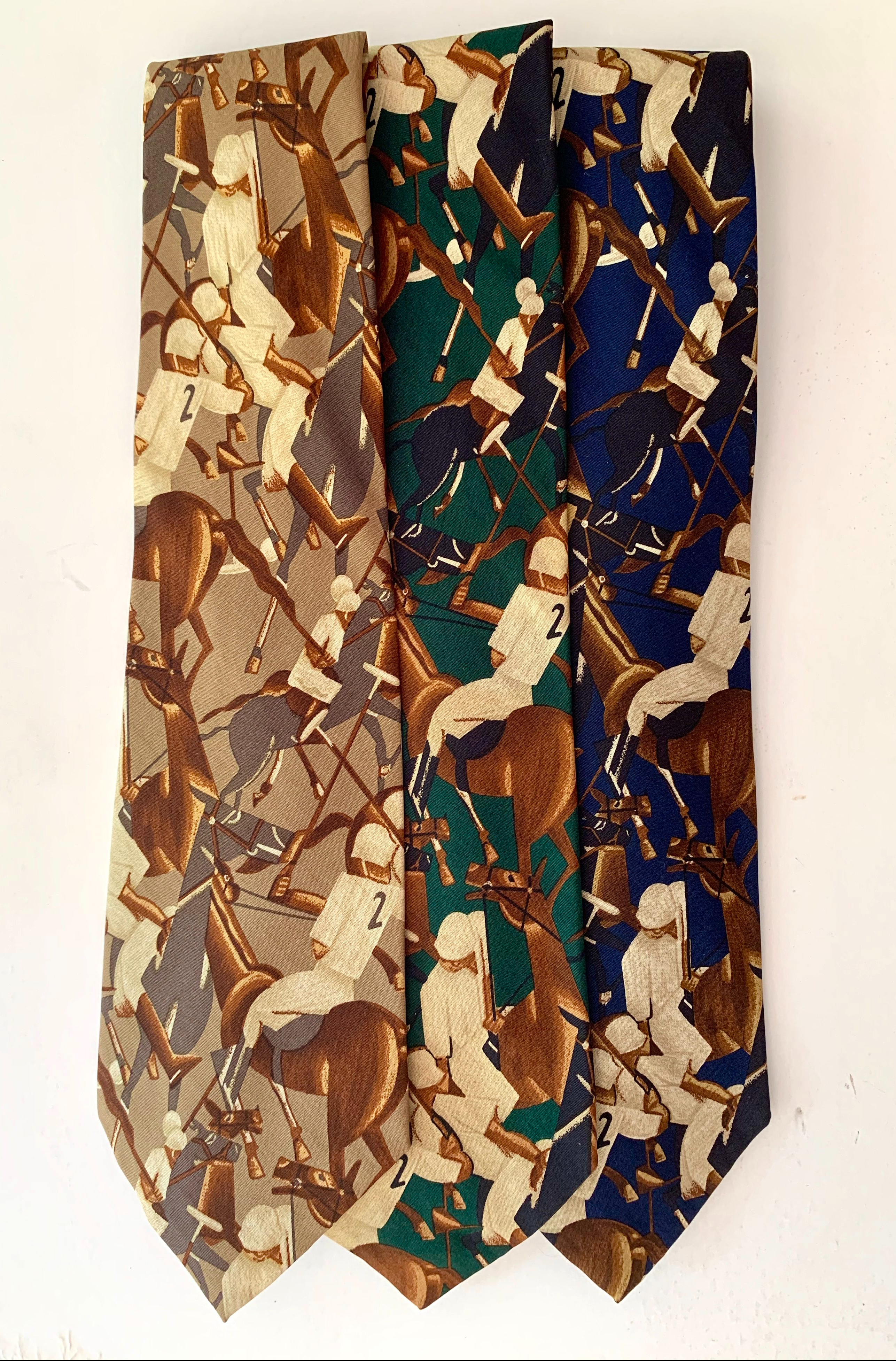
Vintage Deco Polo Player Print on Vintage Polo Tie

Conversational Tie Collage 3

Vintage Travel Poster on Vintage Polo Tie

Vintage Sports Players on Vintage Polo Tie

Embroidered Jockey on Vintage Polo Tie

Equestrian Print on Vintage Polo Tie

IMG_6474

Assortment of Bird Themed Vintage RL Ties

Conversational Tie Collage 4

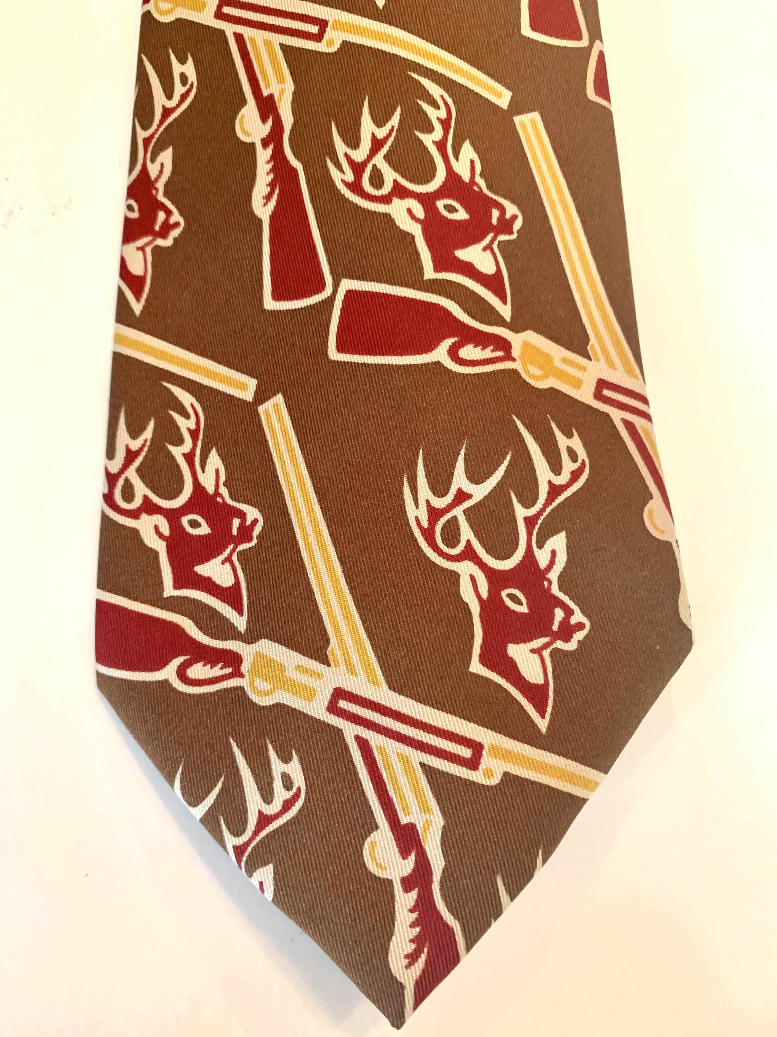
Guns and Bucks on a Vintage Ralph Lauren Converstional Tie

The 90s saw a huge upsurge for the conversational tie. Nicole Miller, Tabasco Sauce and even Jerry Garcia got in on the action. There’s a very fine line between cool and tacky, and it was Mr. Lauren, of course, who lead the pack with his cool conversational ties. He pulled inspiration from vintage Field and Stream magazine covers, Hermes scarves and deco travel posters. Flamingos, yachts, roulette, cricket, hula girls, rifles – whatever your interest, he made a tie for it.

I think they are like little works of art.

It was about the time that Regis Philbin appeared in monochromatic shirt/tie combos on Who Wants to Be a Millionaire…… that it all went to hell. Men’s fashion tastes shifted towards sleek and modern,

and conversational ties became a joke.

I realize that ties in general are almost completely passé – men don’t really wears them anymore; even to job interviews. (rolls eyes)

The generation under me views them as a corporate noose.

They prefer ties to be black, grey, or navy. Two inches wide.

Not this guy.

Give me a dog,

or a cowboy,

or a fish.

Share this:

  • Facebook
  • LinkedIn
  • Twitter
  • Pinterest

Like this:

Like Loading...

Is It Still Wallpaper if it’s on the Ceiling?

Posted by James on May 23, 2020
Posted in: New Home, Projects. 33 Comments

“As God is my witness, as God is my witness it’s not going to lick me. If I have to lie, steal, cheat or kill. I’m going to live through this and when it’s all over, as God is my witness, I’ll never hang wallpaper on a ceiling again.”

Have any of y’all ever been neck-deep into a project and realized that maybe you’ve finally fucked up and bit off more than you could chew?

Because I haven’t.

I’m the most talented person I know, and I can do anything.

Or so I thought.

Let’s start at the beginning. Do y’all watch Grace Mitchell On HGTV’s One of a Kind? Amongst a flood of shows about twins and shiplap this chick is a breath of fresh air. She designs interiors around her client’s personal experiences. Grace never misses an opportunity to wallpapers a ceiling – sometimes TWO – and they are ALWAYS stunning. Before her, I’d always thought wallpapered ceilings made a room look…. well, short.

Back in March, with Grace’s inspiration bouncing around my head, I ordered a few rolls of this constellation wallpaper; Ralph Lauren Northern Hemisphere.
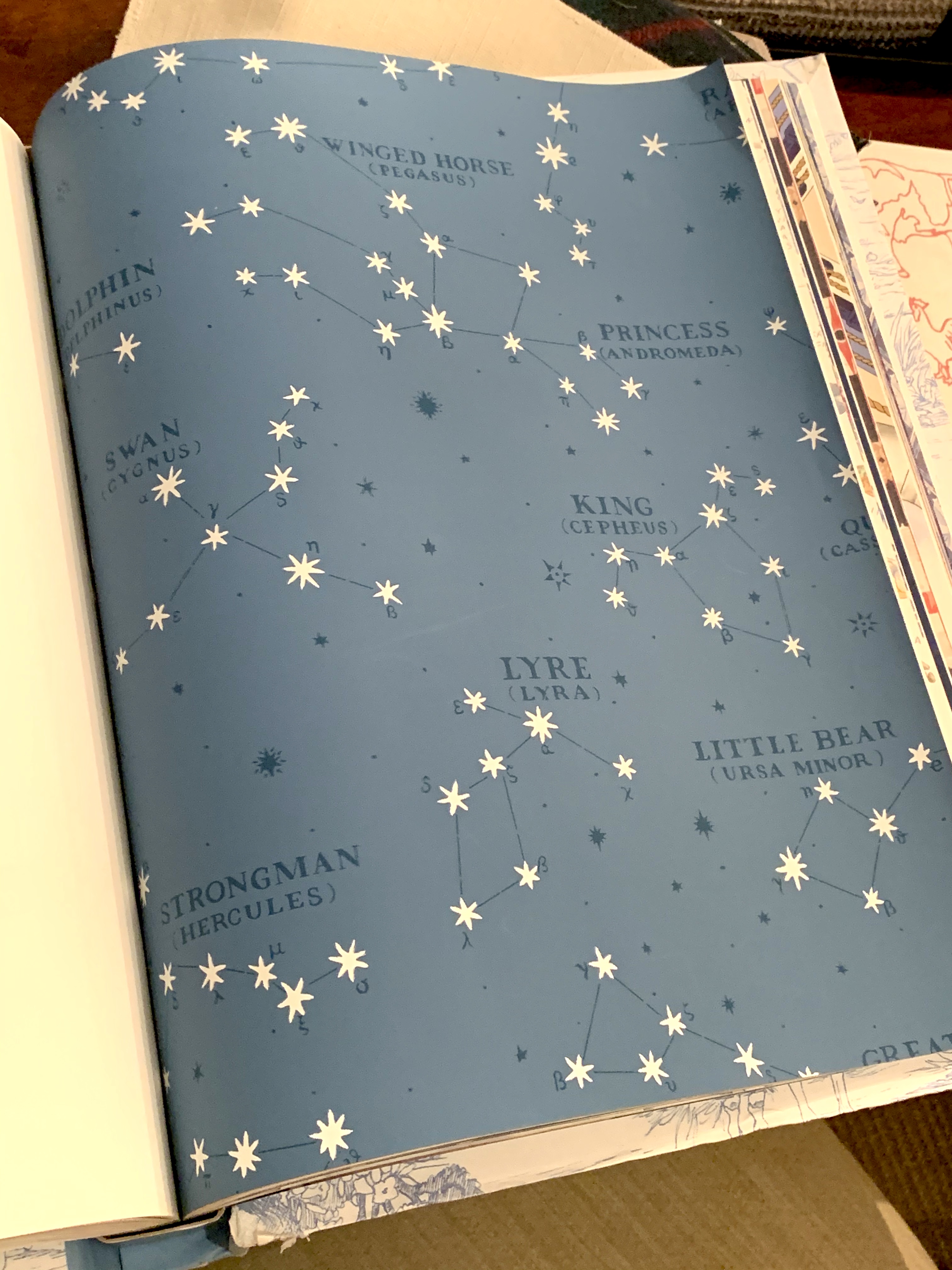
Northern Hemisphere Wallpaper in the Color I wanted

If I was going to be stuck at home for a few weeks I might as well make the most of it and paper the guest room ceiling. Right?

After about two months of tapping my foot…… I finally received THIS wallpaper.

Northern Hemisphere Wallpaper in Color I Didn't Want

Problem numero uno. Wrong paper.

It’s darker…. the difference between Aegean blue and navy….. and all the verbiage is gold.

GOLD

Honestly, it was my mistake. I was in a hurry and didn’t realize that my preferred color was unavailable. If wallpaper on the ceiling makes a room feel short, won’t a darker color make that even worse? So it sat in the garage for a week, while I decided either to return it….. or accept the dark blue and gold.

GOLD

I might as well get this over with.

Wallpaper isn’t completely new to me, I’ve hung it a few times. I’ve also paid close attention while my contractors hung it. It’s the installing it upside down part that has me a little apprehensive. So I refreshed my skills with a couple Youtube videos and read a few online tutorials – Brian Patrick Flynn has several step-by-steps on HGTV.com– and I was ready.

This should just take a few hours.

I emptied the guest room and assembled my wallpapering tools…
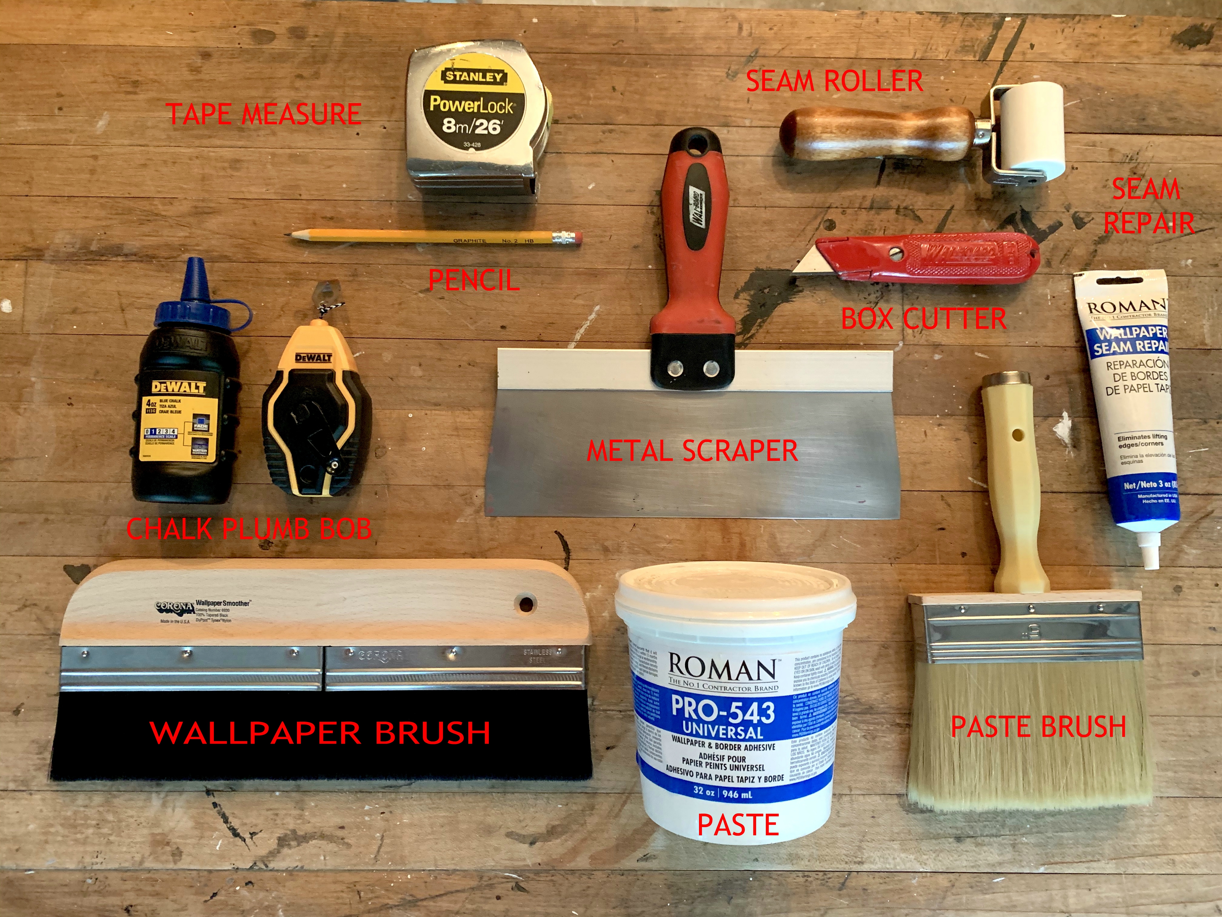
Tools for Wallpapering

…then tackled problem numero dos; the work surface.

At fist glance, our guest room ceiling looks fine.
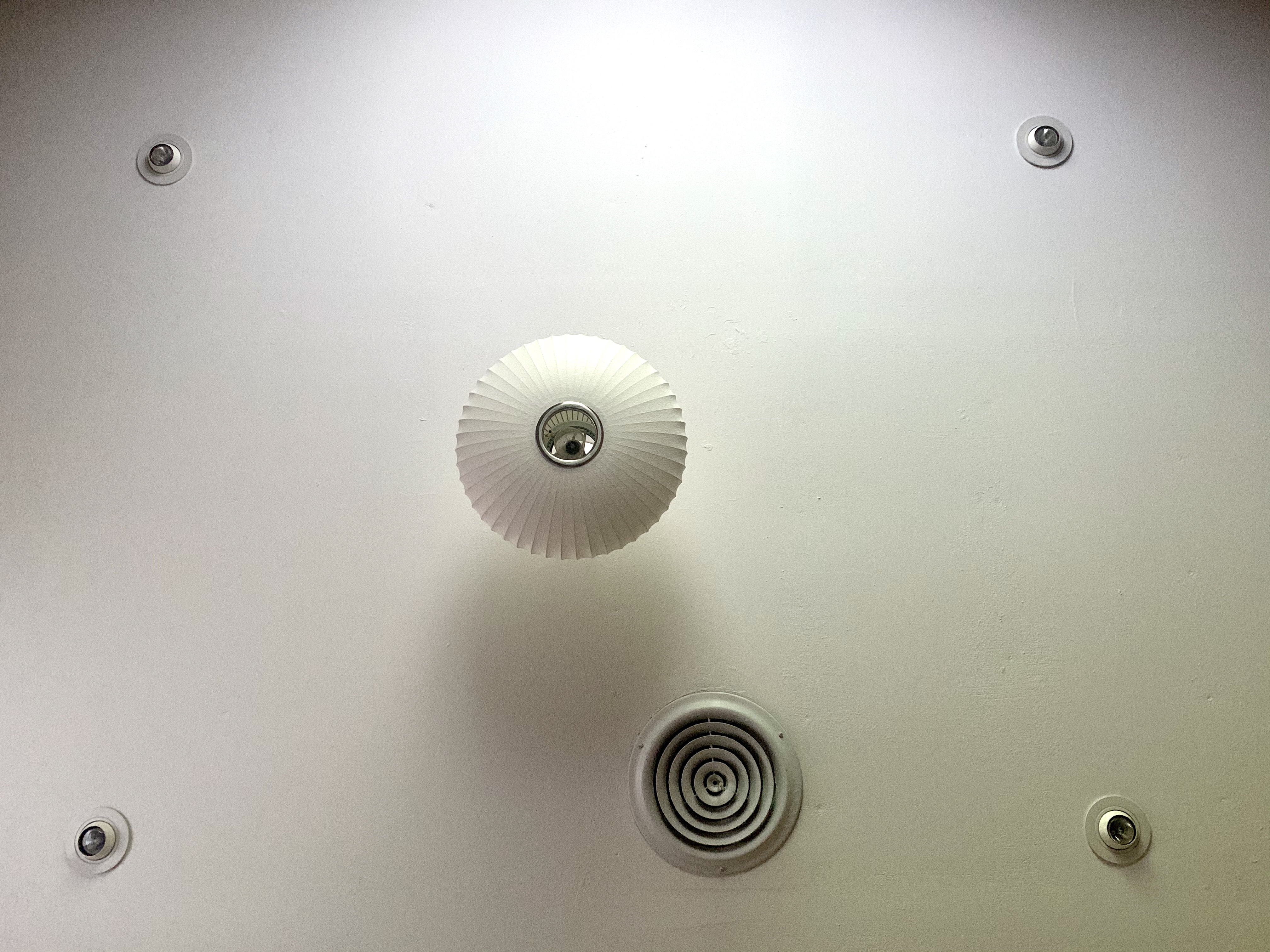
Ceiling in Guest Room

Zoom in a little closer and it looks more like the surface of moon.

Is that Aitken?
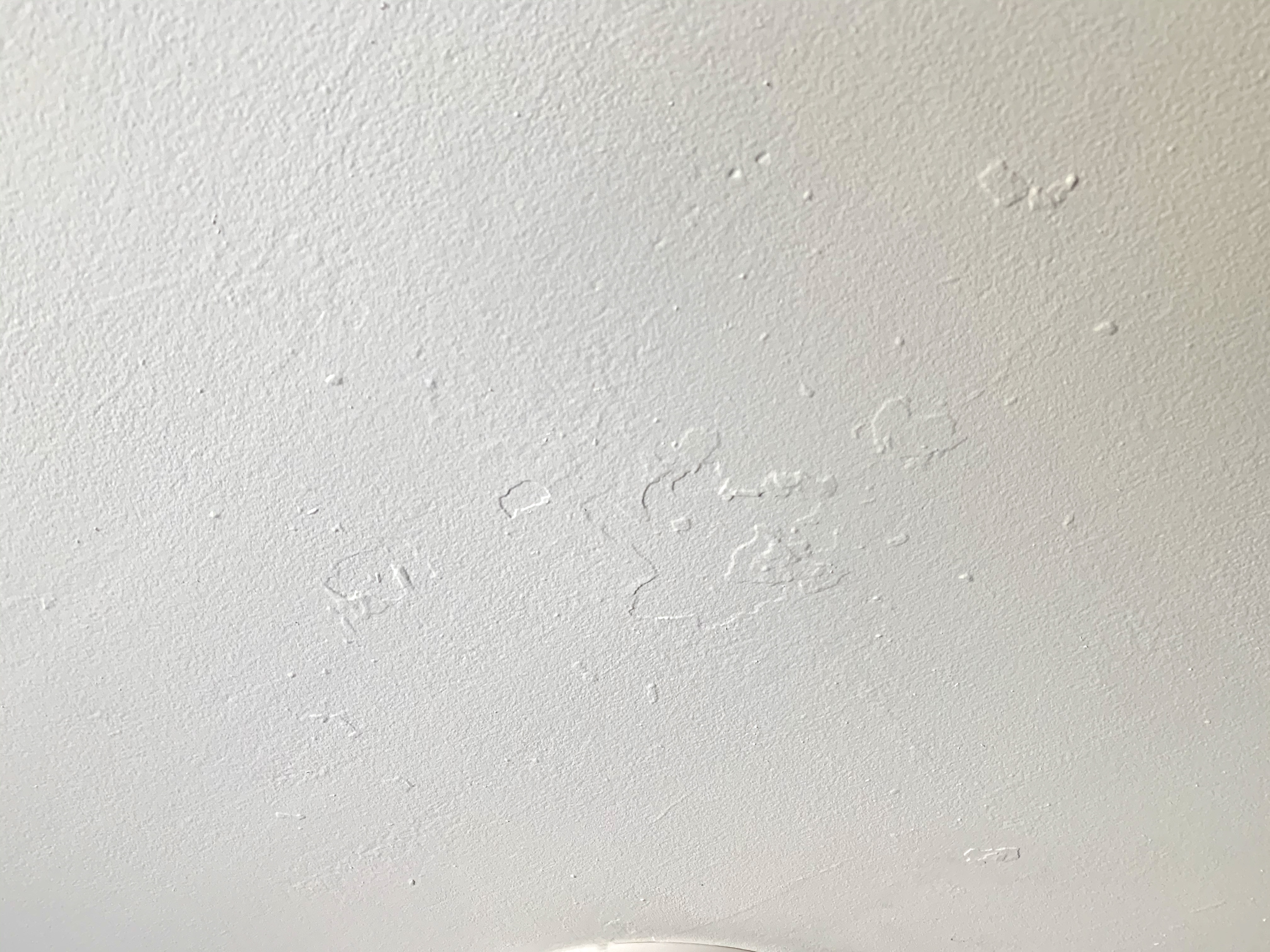
Surface of the Moon

It’s an old house, and we know she used to have popcorn ceilings.

I grabbed a metal scrapper and a razor blade and scraped off as much of the mountainous landscape as I could. I also filled in the “craters” with a light shmeer of drywall compound, followed by an even lighter sanding.
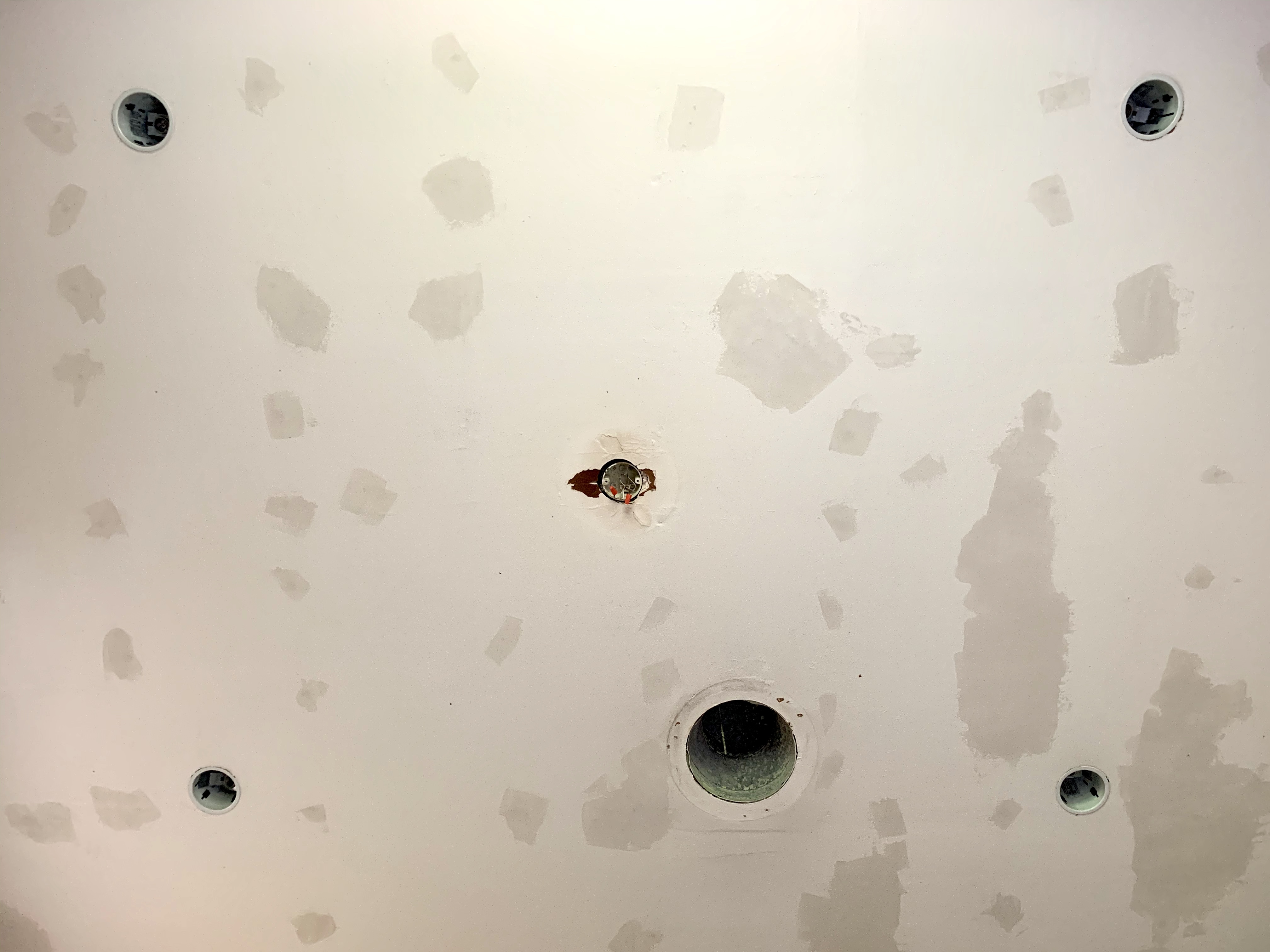
Patched and Scraped Ceiling

The next step in wallpaper surface prep is to apply a sealer/primer. Like PRO-999. Not only will the sealer/primer help the paper adhere to the ceiling better, it will also make it easier to remove if we ever changed our minds.

I think I would normally just skip this step, but I wanted to use my whole ass and not just half of it… and Lord knows, I’ve got plenty of free time to do things correctly.
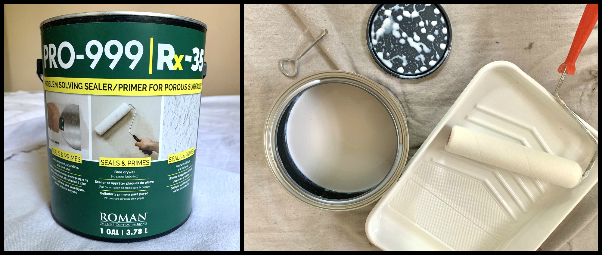
Wallpaper Primer Collage

I used a roller with 1/4 inch nap – save the 3/8 nap for paint.

3 – 12 hours of drying time means my fist day is finished.

Day #2

Because I know that my wallpaper is 27 inches wide, the next morning I used the plumb line to mark the ceiling at 27 inch intervals.
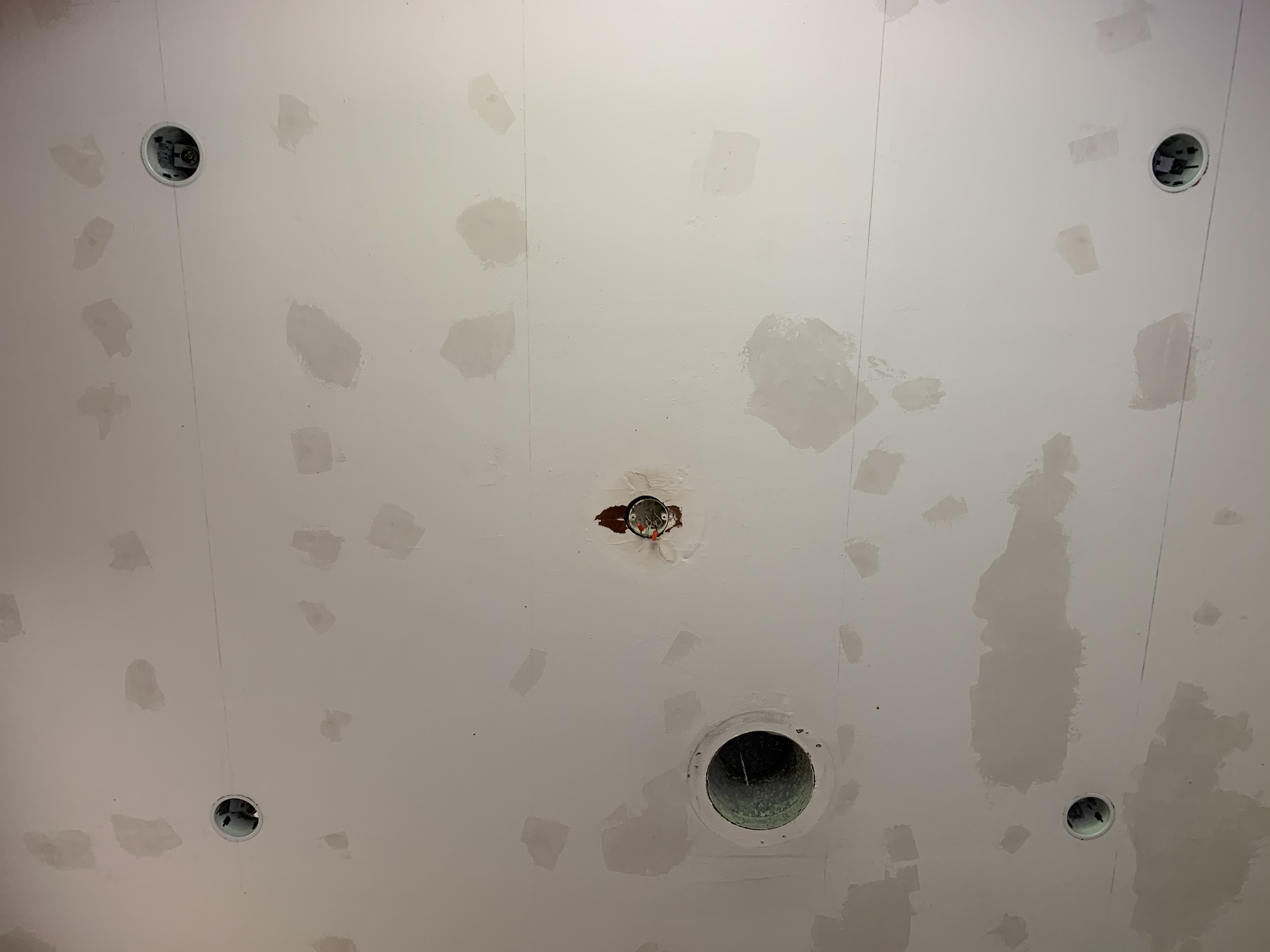
Wallpaper Primer Applied and Line for Stripes

Here’s where the wisdom of my vast experience comes in handy. I took my paper to the Home Depot and had the chick in the paint department color-match a quart of flat latex.
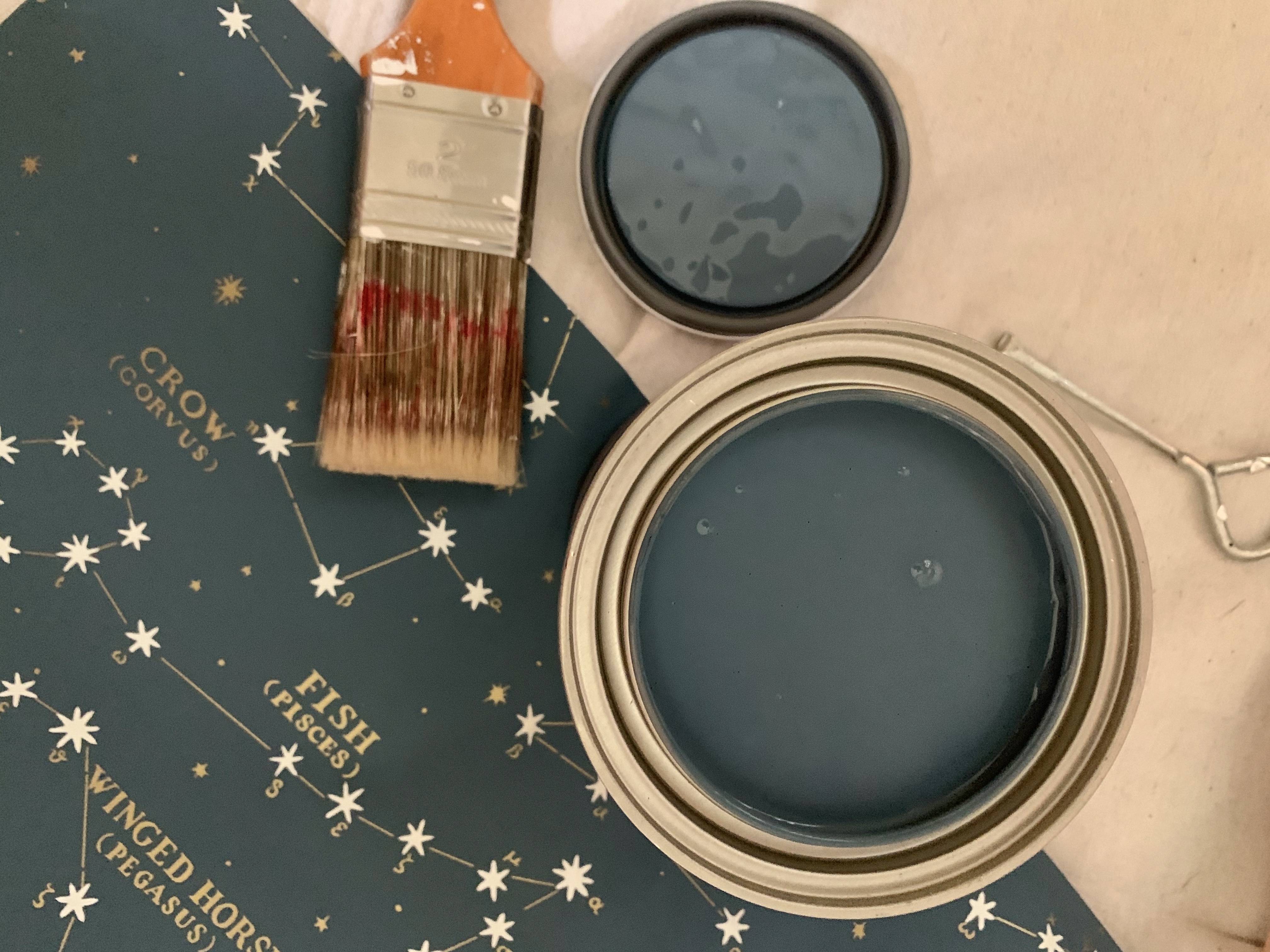
Blue Paint to Match Wallpaper

With a 4 inch sponge roller, I painted over my chalk lines…. like so.
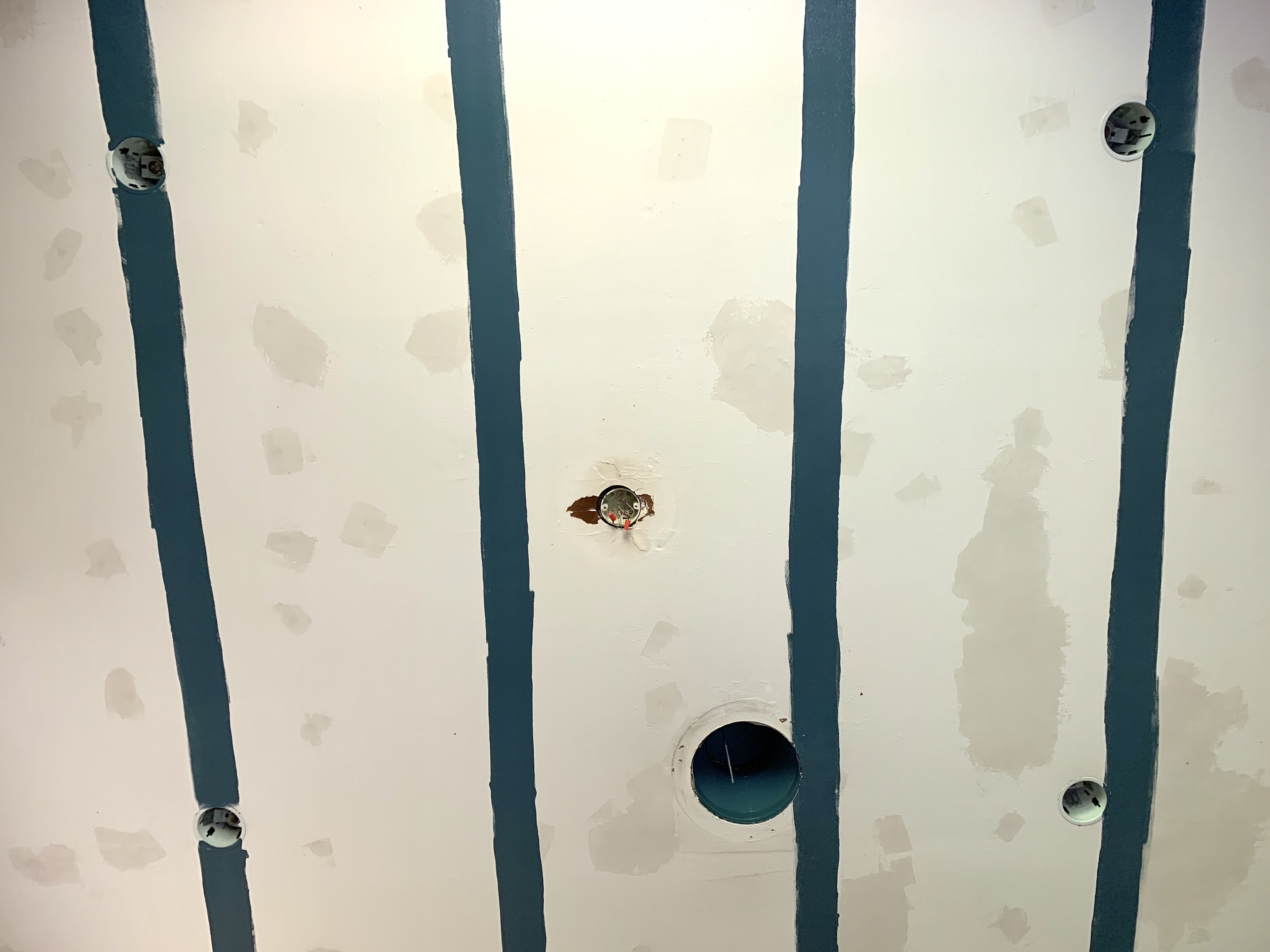
Blue Stripes on Ceiling

Now if there are any gaps between the paper the blue will show thru instead of glaring white ceiling.

Pretty clever, I know.

Except that I forgot that I just painted over my primer – the seams are where I want the paper to stick the absolute best.

So, one more coat of sealer/primer.

And another 3 – 12 hours of drying time.

Day #3

I made another blue chalk line thru the center of the first painted blue stripe so I would have a straight edge to line up with. Blue chalk line on blue paint. Who saw that one coming? Hmmm,

Everything I read/watched said to dry-fit a run of paper first, leaving several inches on each end to trim off later. Sounds easy enough.

Next spread paste on the backside, folding the wet sides together, and let the paste “cure” for 10 minutes. (There is no mention of “curing” in the directions on the paste can)

There’s no way this is a one man job, so after negotiating with Jamie (My attention to detail makes me an amazing art director, but unfortunately not so much fun to work with), he stood behind me holding the wet paper. We climbed onto the scaffolding and slowly lay the paper across the ceiling with the wallpaper brush. Everyone else, and I mean EVERYONE in EVERY video I watched, was able to slide the paper slightly to make adjustments.

Not me.

It stayed exactly where I put it the first time.
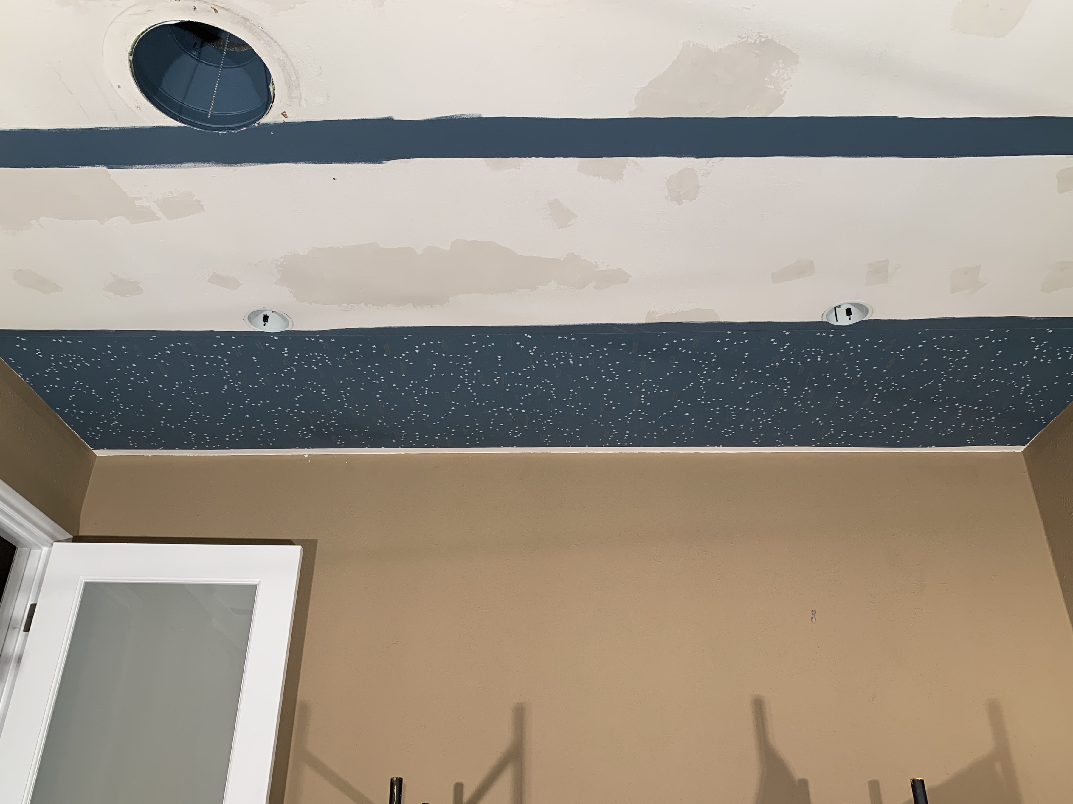
The First Strip of Ceilingpaper

Which, aside from a few minor wrinkles, and that it was sort of lined up with the blue line that I couldn’t see, looked ok.

The second piece is where shit got messy.

For this one we tried glue on paper – wait 5 minutes, and glue on ceiling.

Lining up the seams over our heads was much trickier than just matching a chalk line.  Although we were able to slide the paper in place a little easier, my initial run was less than straight, forcing this run to be even less than less than straight. 20 minutes later we at least had paper on the ceiling….. and wallpaper paste all over both of us, and the paper. (Luckily it wipes off with warm, slightly-soapy water) All that tension combined with the heat from the work lights might have caused some sharp words to be exchanged.

And even after I promised to play nice.
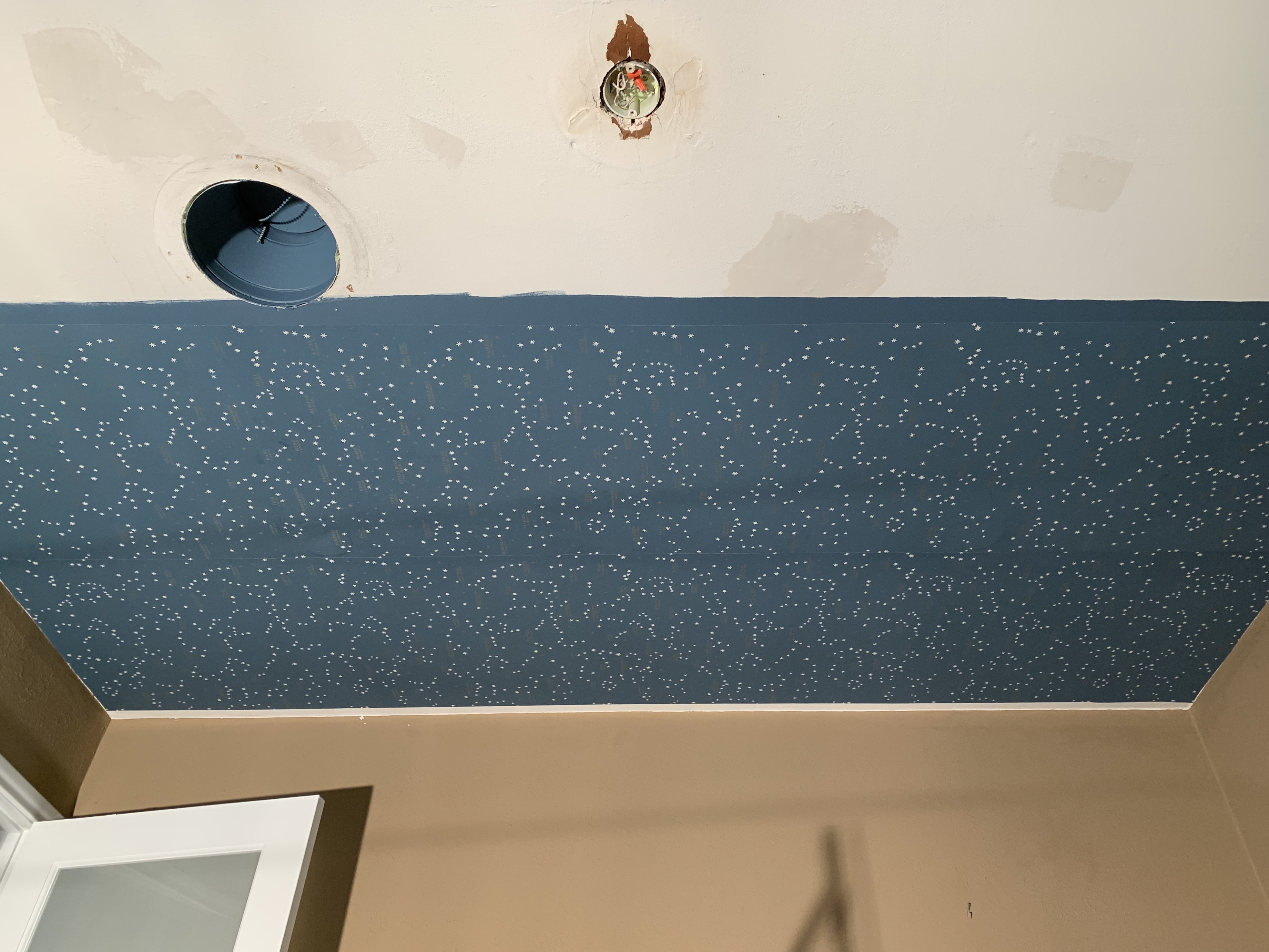
The Second Strip of Ceilingpaper

At least this piece also looked….. ok.

Thank the maker I had the foresight to paint blue stripes first.

I unrolled the remainder of the double roll to cut the third piece and….

Have I mentioned what a “repeat” is?

Pay attention, because I’m laying down some serious wallpaper installing wisdom right here. Every wallpaper has a repeat in the pattern so that pieces can be laid next to each other and the pattern continues seamlessly from one to the next. This paper has a repeat every 27 inches.

Over 2 FEET.

That means that I should have planned for at least 26 inches of wasted paper for every run.

I didn’t.

There’s a yardage calculator on the website where you plug-in your dimensions (12 feet X 10 feet) and it calculates how many rolls you’ll need (2 double rolls).

The fine print says to buy at least 10% extra to account for the repeat.

2 double rolls (33 feet on each) isn’t enough paper for 6 complete PATTERN-MATCHING runs.

The best I could get was 4…  and about 10 inches shy of a fifth.

CRAP!

I’m not going to sugar coat it…..

This was that moment of extreme panic.

There was much saltier language than before.

If I order another roll it could take another 2 months to receive. We can’t live with the room torn up for 2, or more, months. We don’t have time to hire a profesional installer either; like I should have in the first place. I didn’t want to work this hard and have to look at a

 big friggin’ patchwork-quilt mess,

GLUED TO OUR CEILING,

for the rest of our lives.

I closed the door and I made a stiff drink.

Day #4

After apologizing to Jamie and promising not to take any more of my frustrations out on him – seriously, there was no way I could finish this alone – just like Scarlett O’Harra, I put on my big-boy panties and made the best of the situation at hand..

I delivered Melanie’s baby without Dr. Meade.

We knew the formula to make the paste work and together we slowly put up two more runs. We knew that rest of the ceiling was gunna have to be whatever we had left over.

The last 10 inches of run number 5 is just a random piece that kinda matches up, and run number 6 is luckily only 4 inches wide. Three separate pieces, but still only 4 inches wide.

I spent the rest of the day trying to hide all my flaws:

  • Painted the exposed edges of the paper blue, it’s white
  • Glued down all those loose edges with Seam Repair
  • Cut out stars with cuticle scissors and glued them over every star that landed on a seam
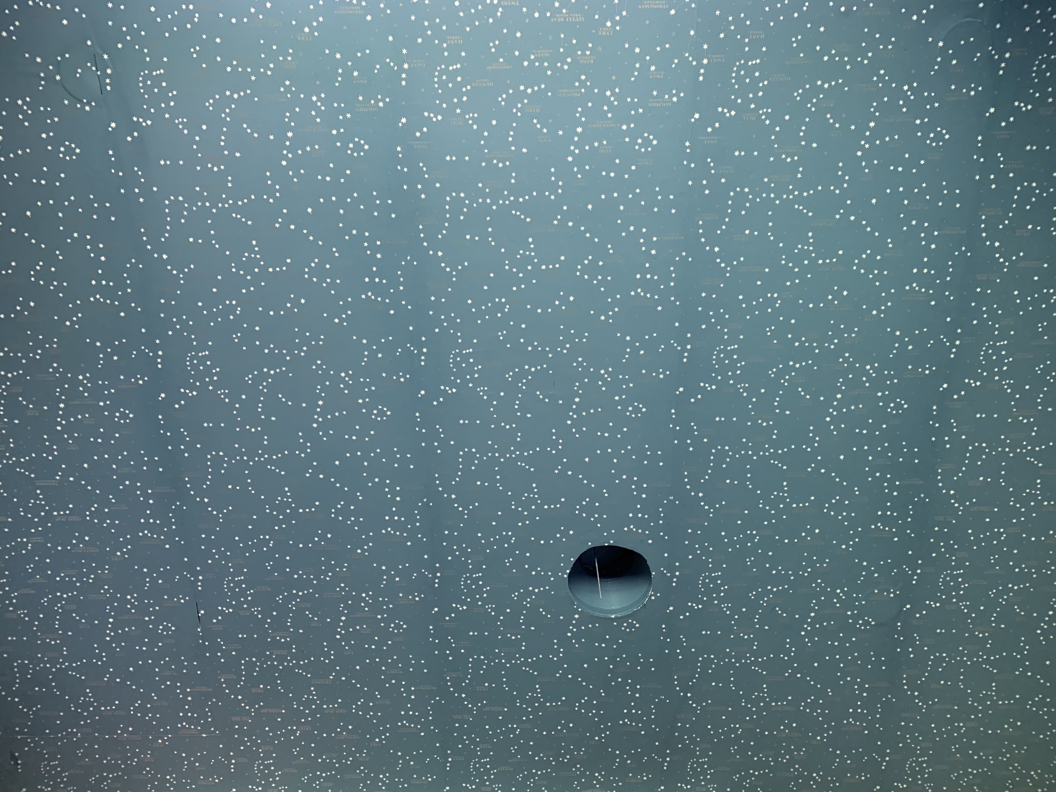
Finished Wallpaper on Ceiling

When I look at it now, after three days of cursing and pasting paper over my head, here’s what I realize.

  • It doesn’t make the room look short.
  • No one will ever notice the pieces I patched.
  • It’s far from perfect, and that’s ok.
  • The blue changes depending on the light
  • The gold disappears depending on the light.
  • The seams are what they are.

After even more internal debate, I decided to paint the light cans and vent cover to camouflage them against the blue paper. Y’all may have noticed earlier that I already painted blue up inside the air vent.
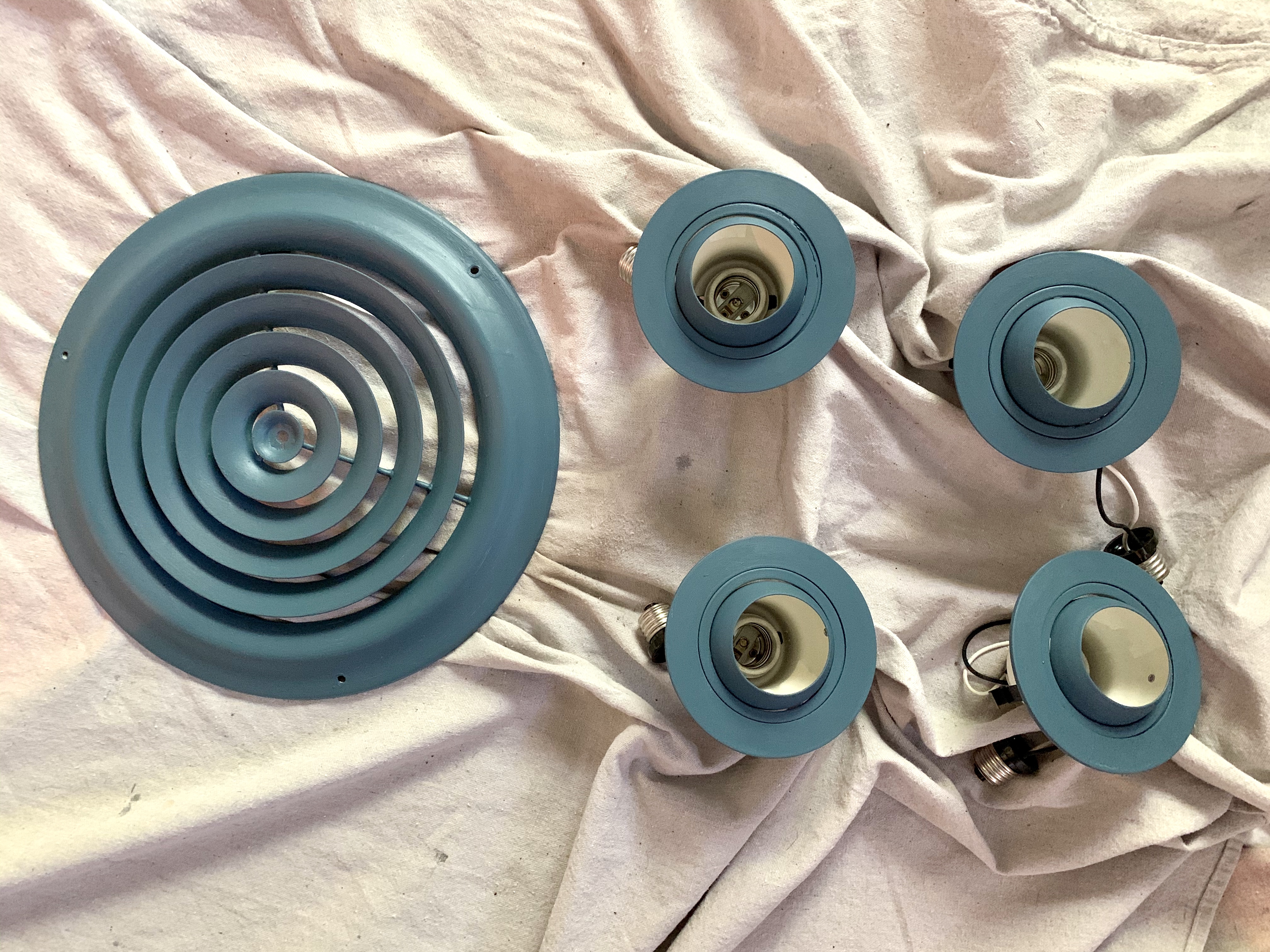
Blue Paint on Ceiling Pieces

Glad I did too.

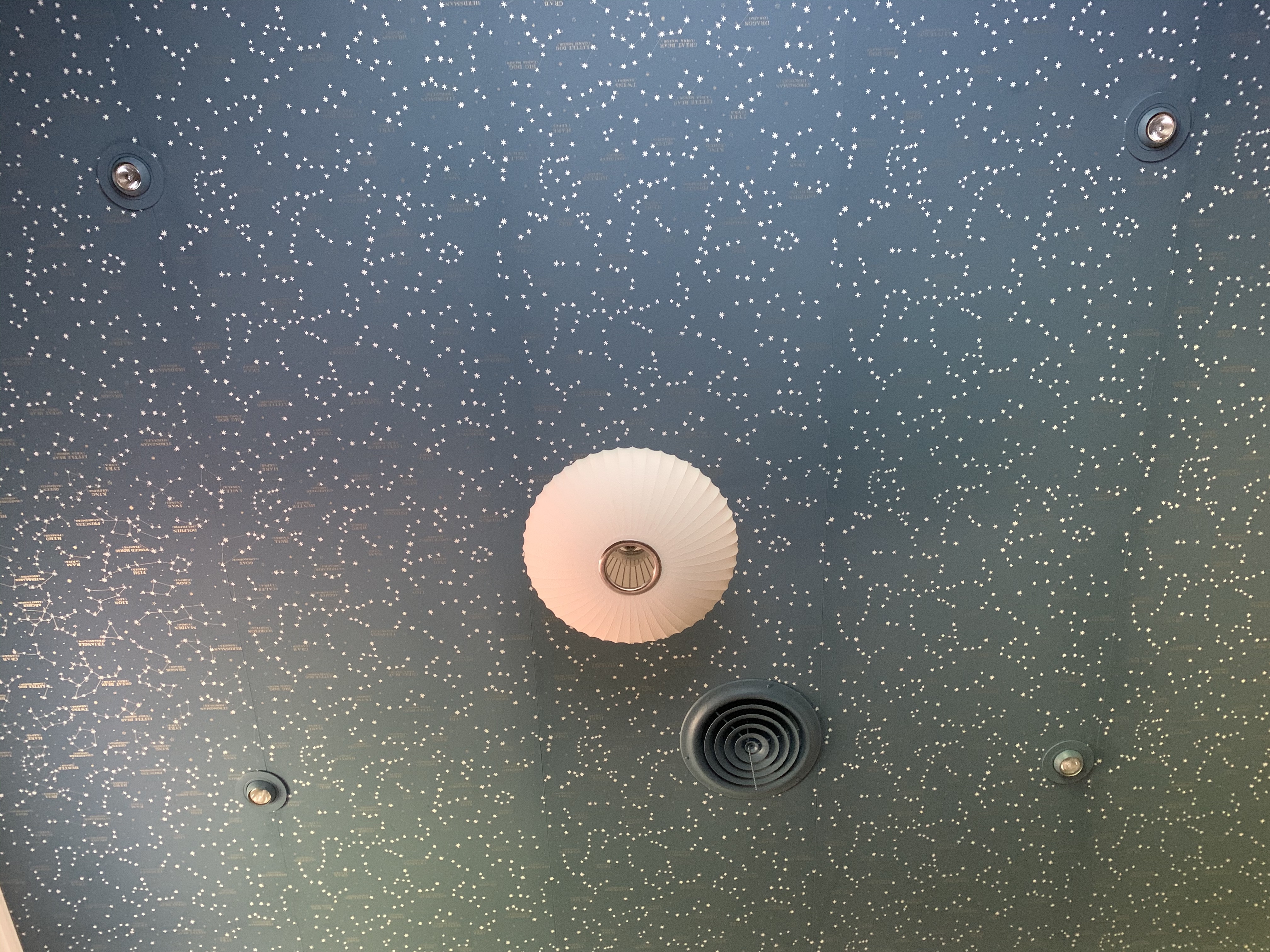
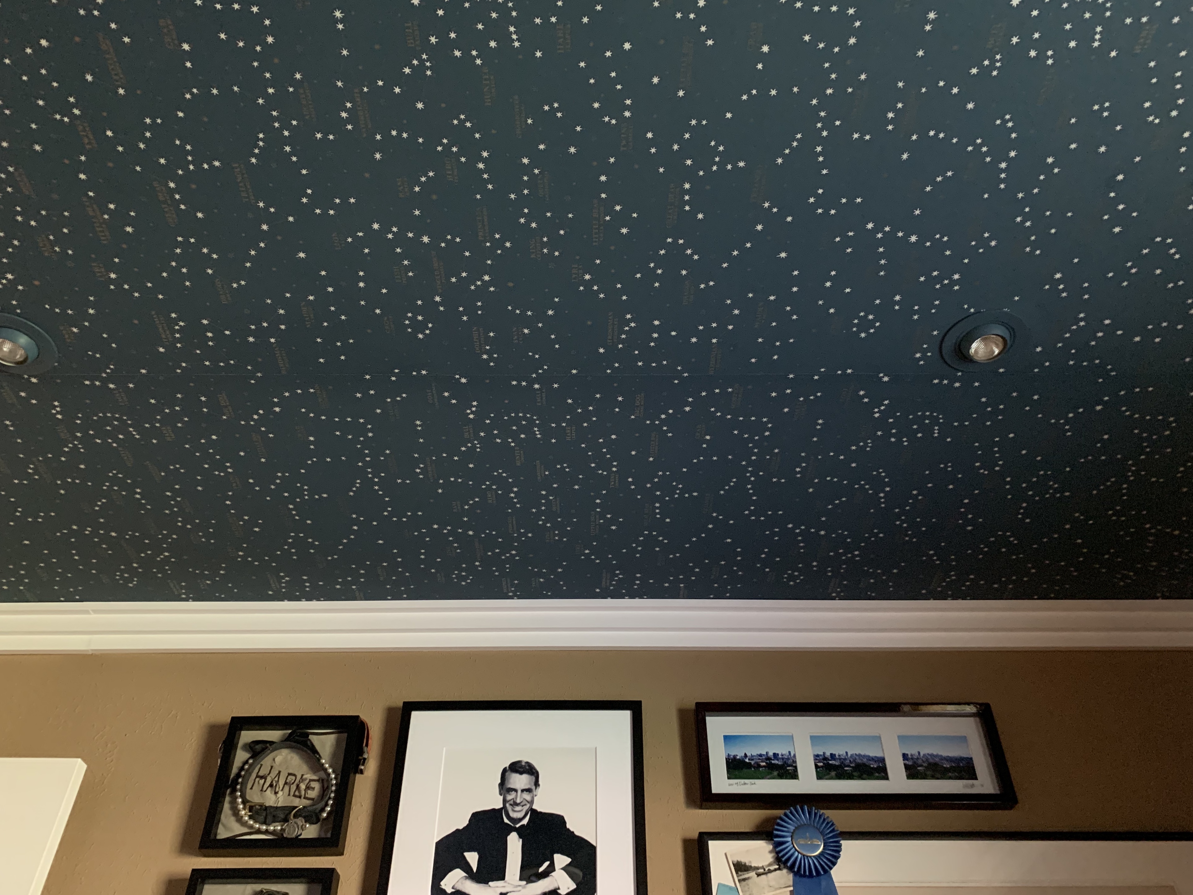
Finished Ceiling with Ralph Lauren Northern Hemisphere Wallpaper

Best decision I made yet.

Day #5

Unfortunately, all that wallpaper paste slinging around the room really gunked up the walls.

What’s one more day to repaint the whole room?
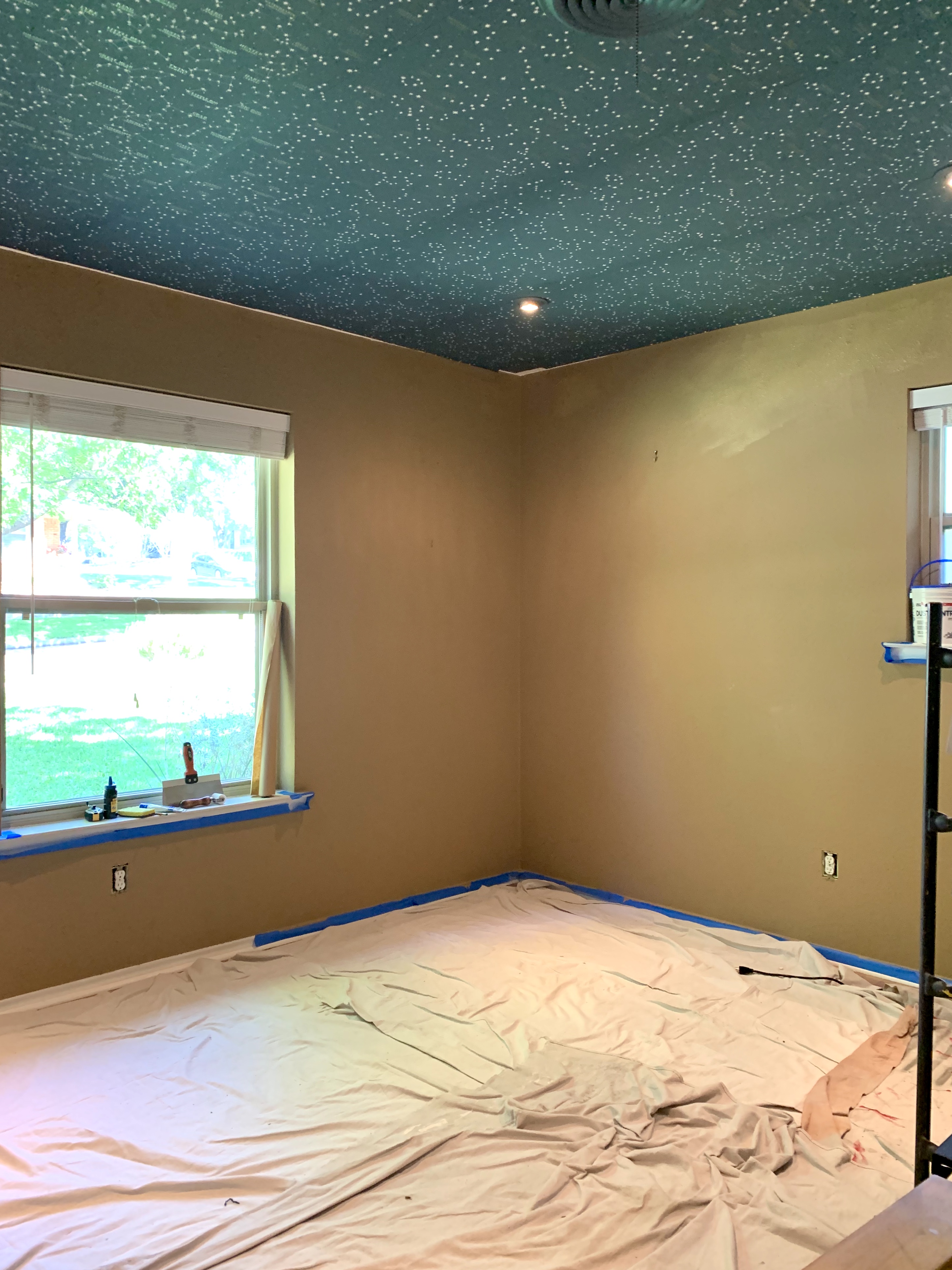
Guest Room Before Crown

Day #6

At this point, what’s even one more day to add crown molding too?
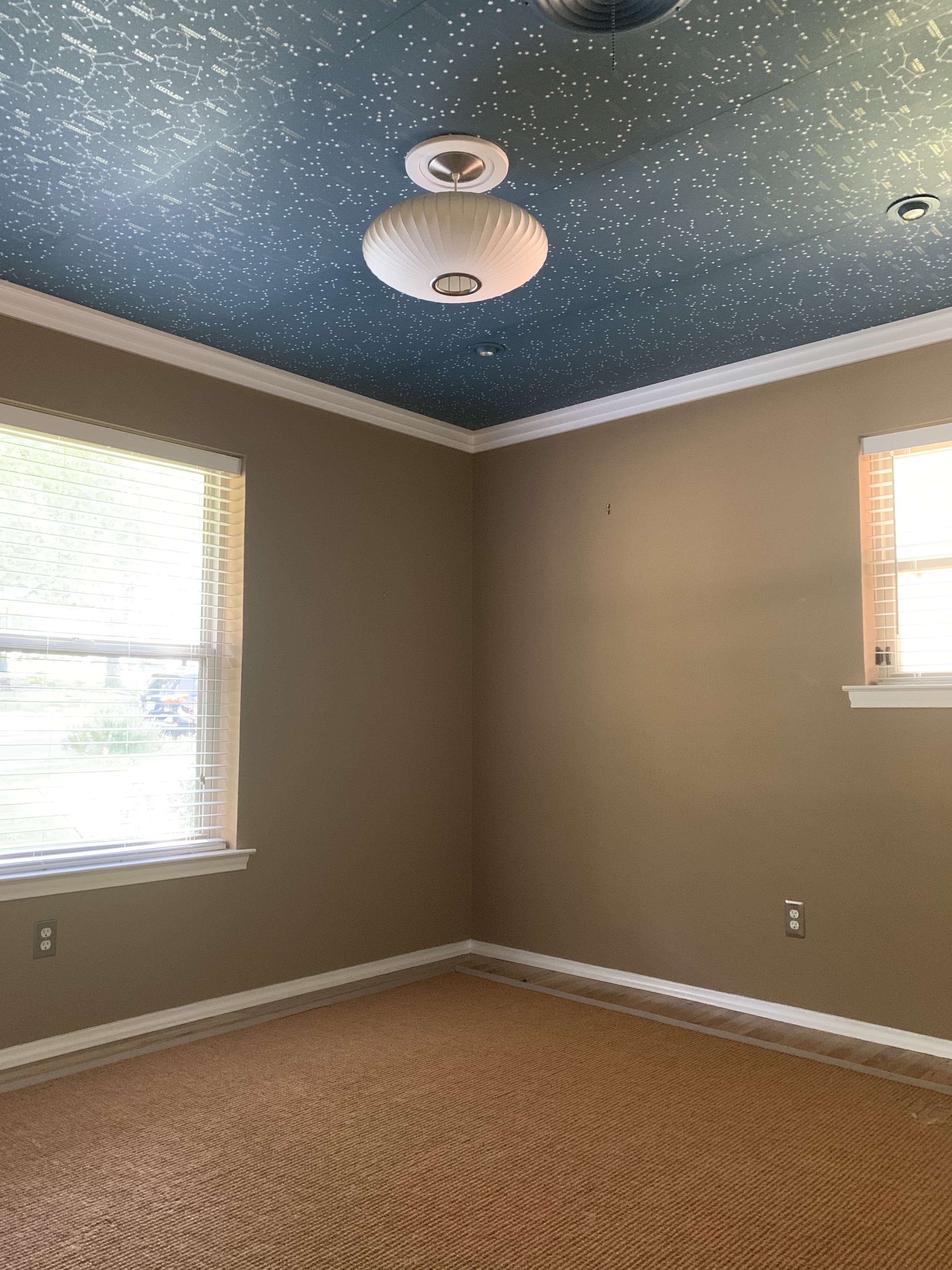
Guest Room After Crown

The crown seriously cleans up the edges.

My just-a-couple-hours project took a week.

Yes, this whole process was a tremendous pain in the ass,

(Exhale,)

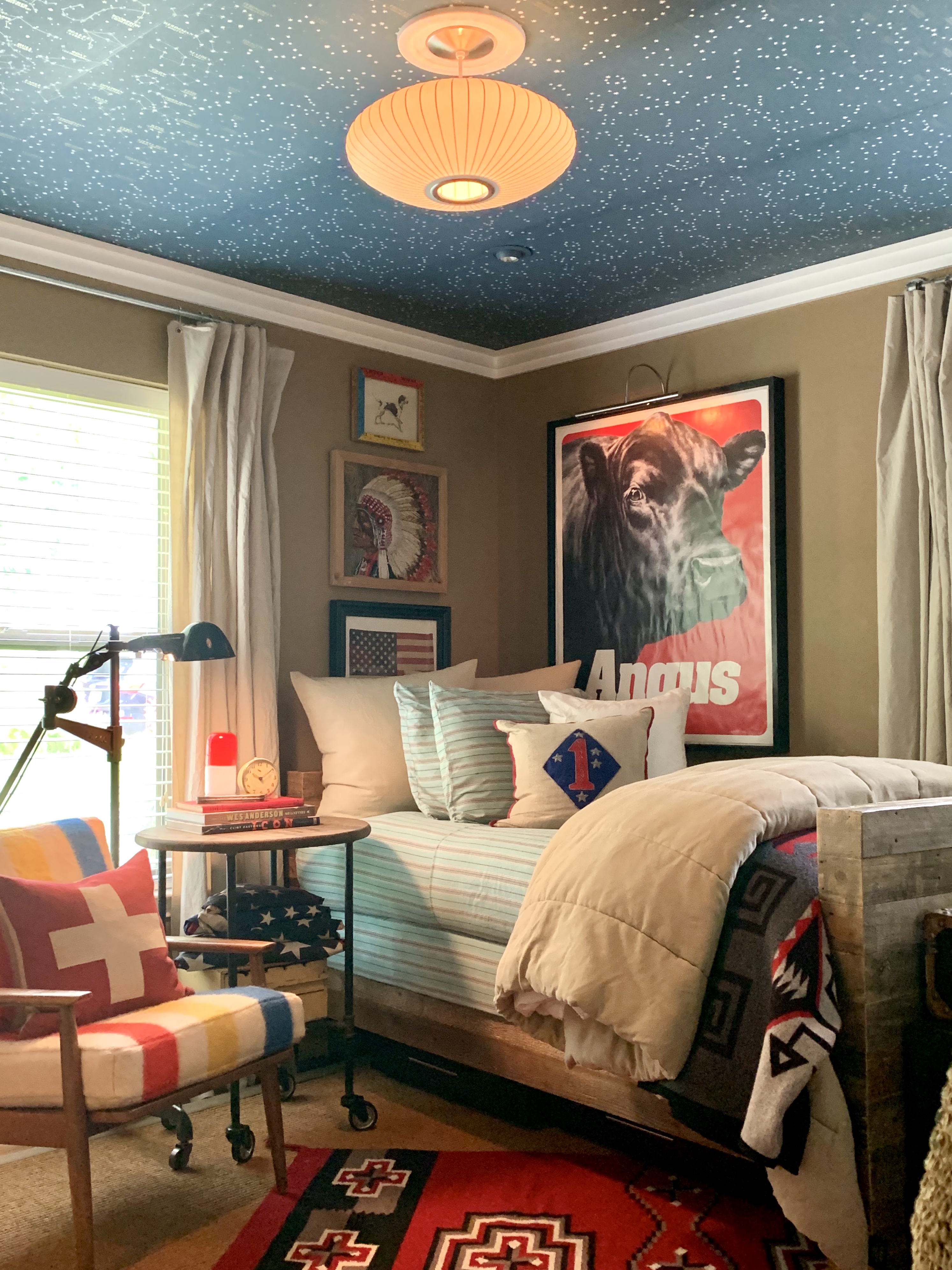
But I think the end results are pure magic.

It really transforms the whole space.
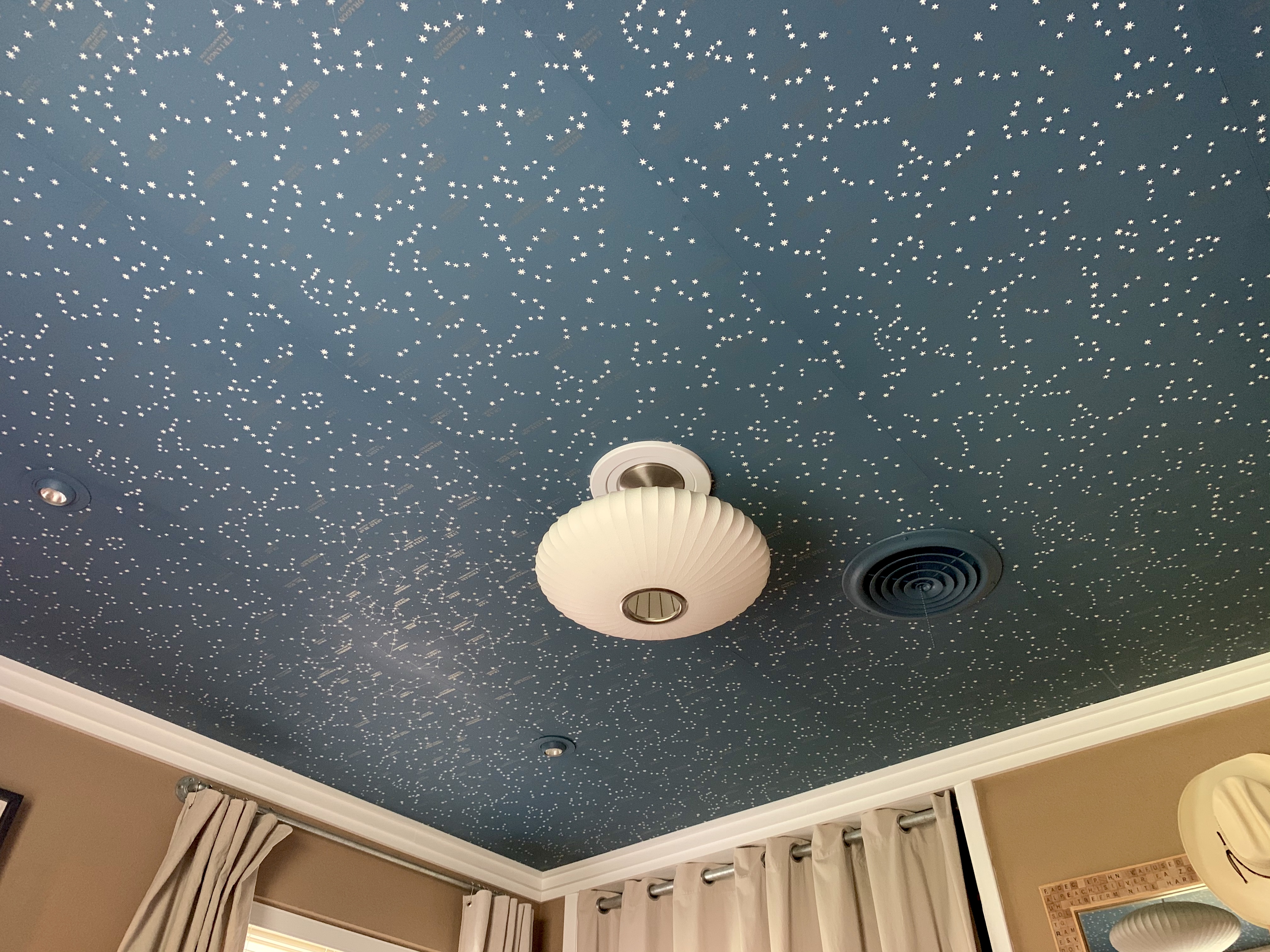
Corner Shot of Ralph Lauren Northern Hemisphere Wallpaper on the Ceiling

Ralph Lauren Northern Hemisphere Wallpaper in Guest Room Over Cary Grant

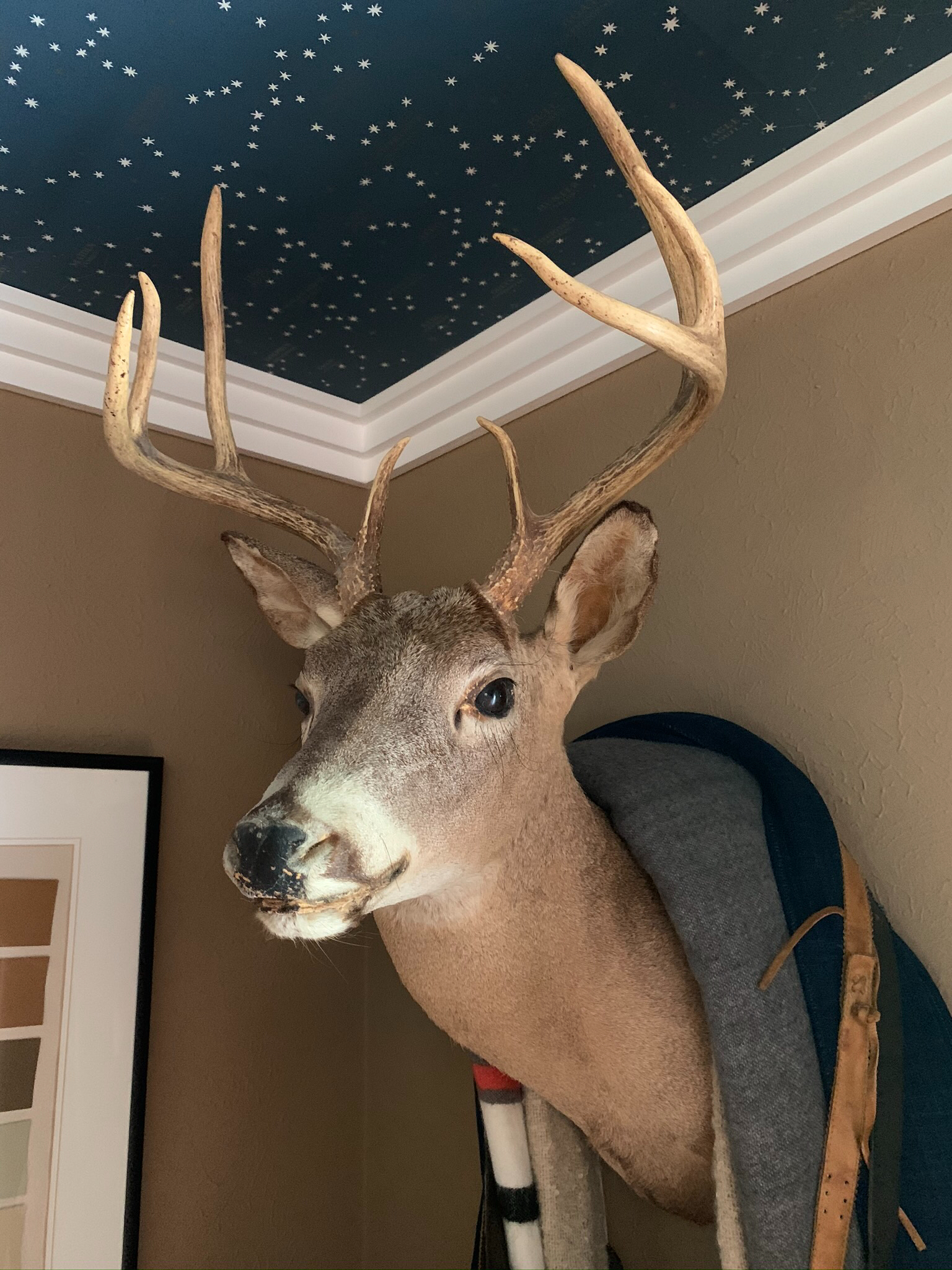
Whitetail deer Mount with Ralph Lauren Northern Hemisphere Wallpaper in Guest Room

Corner of Guest Room with Ralph Lauren Northern Hemisphere Wallpaper on Ceiling

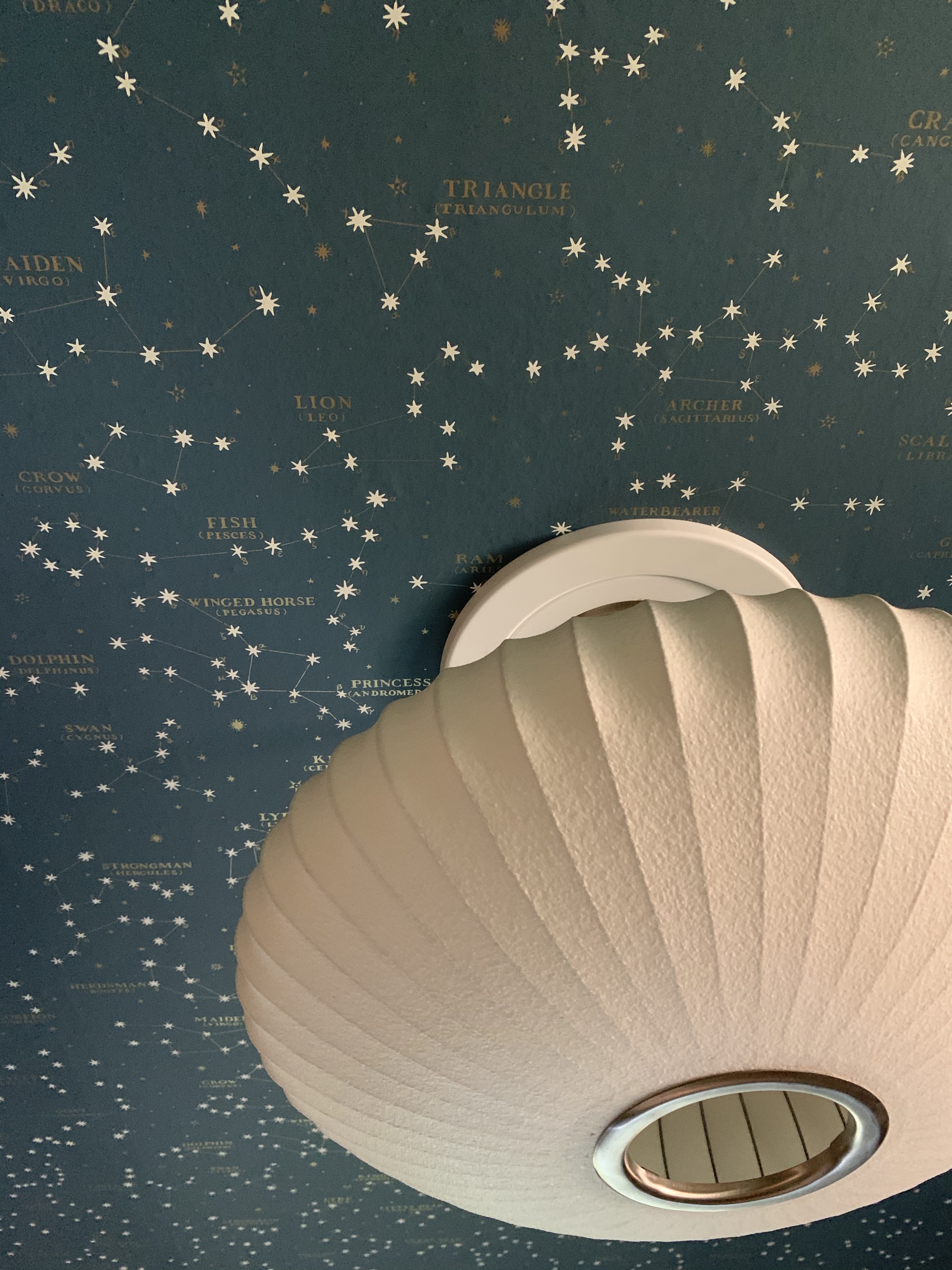
Nelson Saucer Lamp Against Ralph Lauren Northern Hemisphere Wallpaper

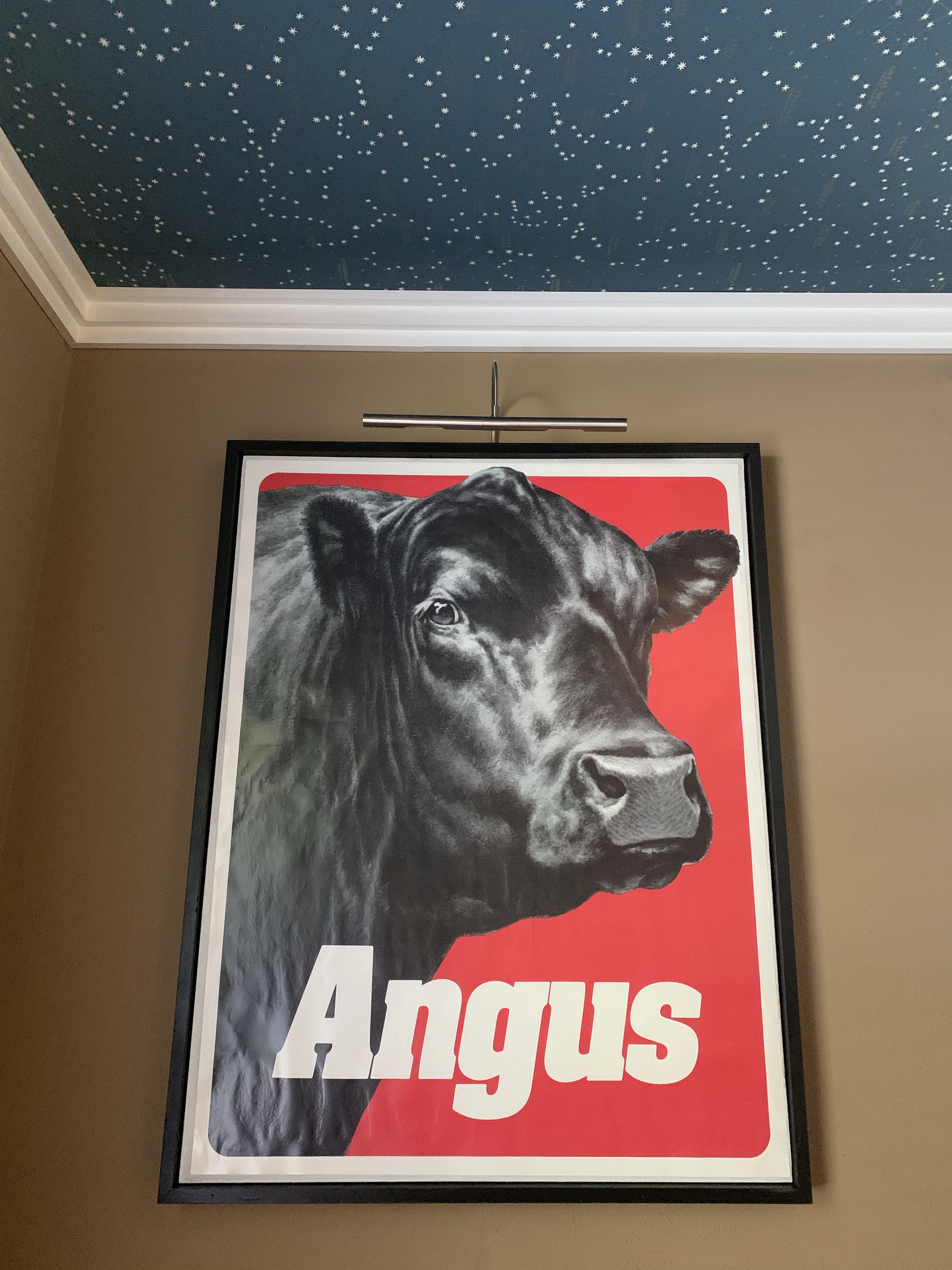
Angus Poster in Guestroom with Northern Hemisphere Wallpaper

As it stands today, thanks to Boys Life Magazine, I can always find the Big Dipper/Big Bear – Ursa Major. It contains the North Star, and also points towards the Little Dipper/Little Bear – Ursa Minor.

I can usually find the Scorpion, my birth sign. And, of course, Orion – the Hunter. 

I could find more when I was in grade school.

I would have lost it if this were my bedroom ceiling as a little boy…. falling asleep every night beneath Cassiopeia, and Andomeda, and Perseus just like our overnight guests someday will.

Did I mention that the stars glow in the dark?

Because they do.

Pure magic.

(Big pain in the ass that I’m never attempting again)

But pure magic.

Share this:

  • Facebook
  • LinkedIn
  • Twitter
  • Pinterest

Like this:

Like Loading...

Tile Be Around

Posted by James on May 10, 2020
Posted in: New Home. Tagged: Covid Art, Patio Furniture, Tile Table Top. 15 Comments

With so much time on my hands lately,

Honestly, SO…… MUCH…… TIME……

I’ve been tackling projects that have been in our queue for years.

This cocktail table on the deck used to be in our living room.

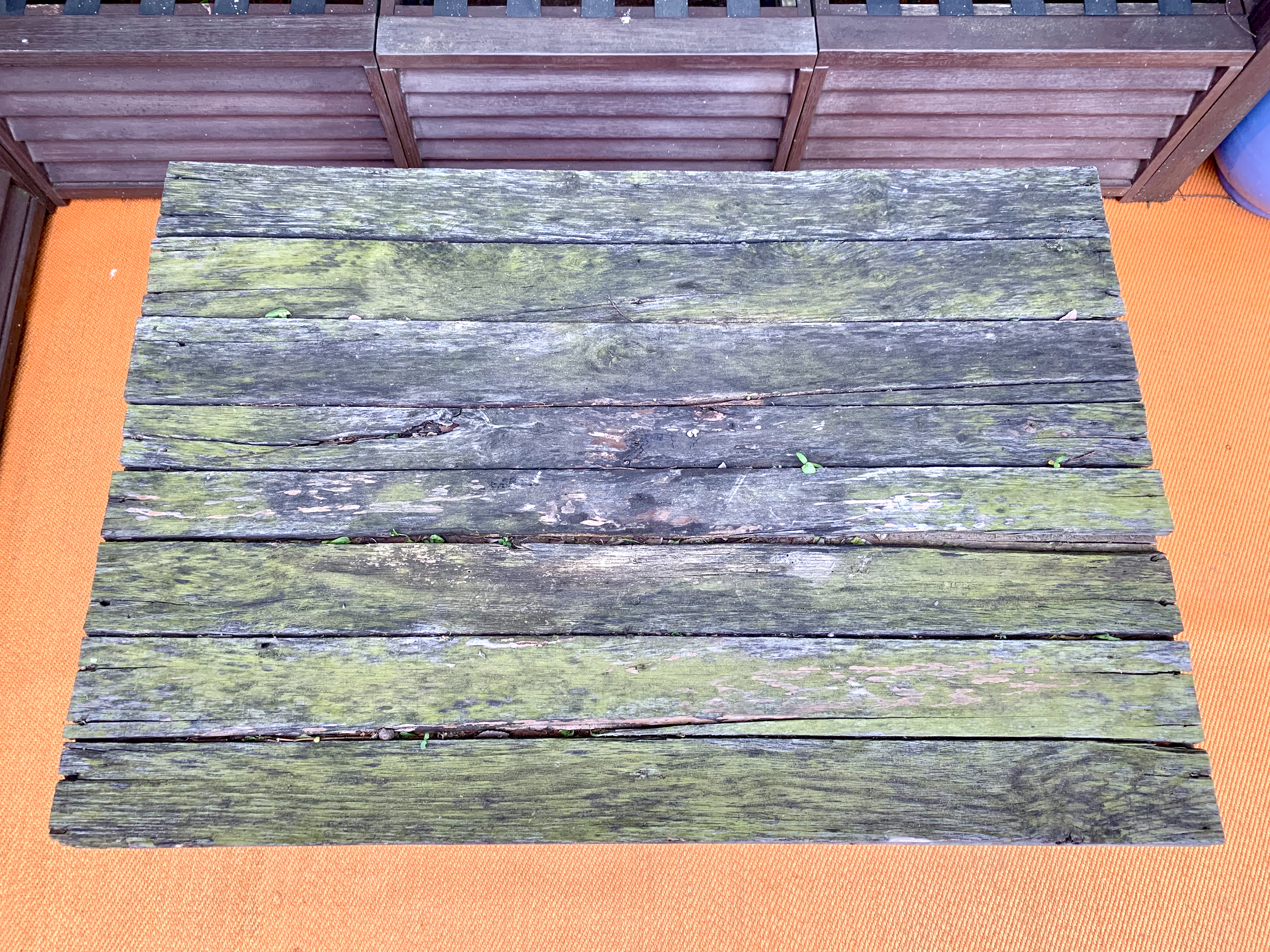
Pallet Wood Table

Hardcore Cavender Diary readers will remember when I covered it in pallet wood.

It was honestly a “blog thing” a few years back to cover shit in pallet wood.

Anyhoo, the Texas elements have not been good to her…

Yes, it’s green.

….and things are sprouting.

Sprouts in the Pallet Wood Table

Since we plan to one day use this to place food/drinks on,

I should probably do something.

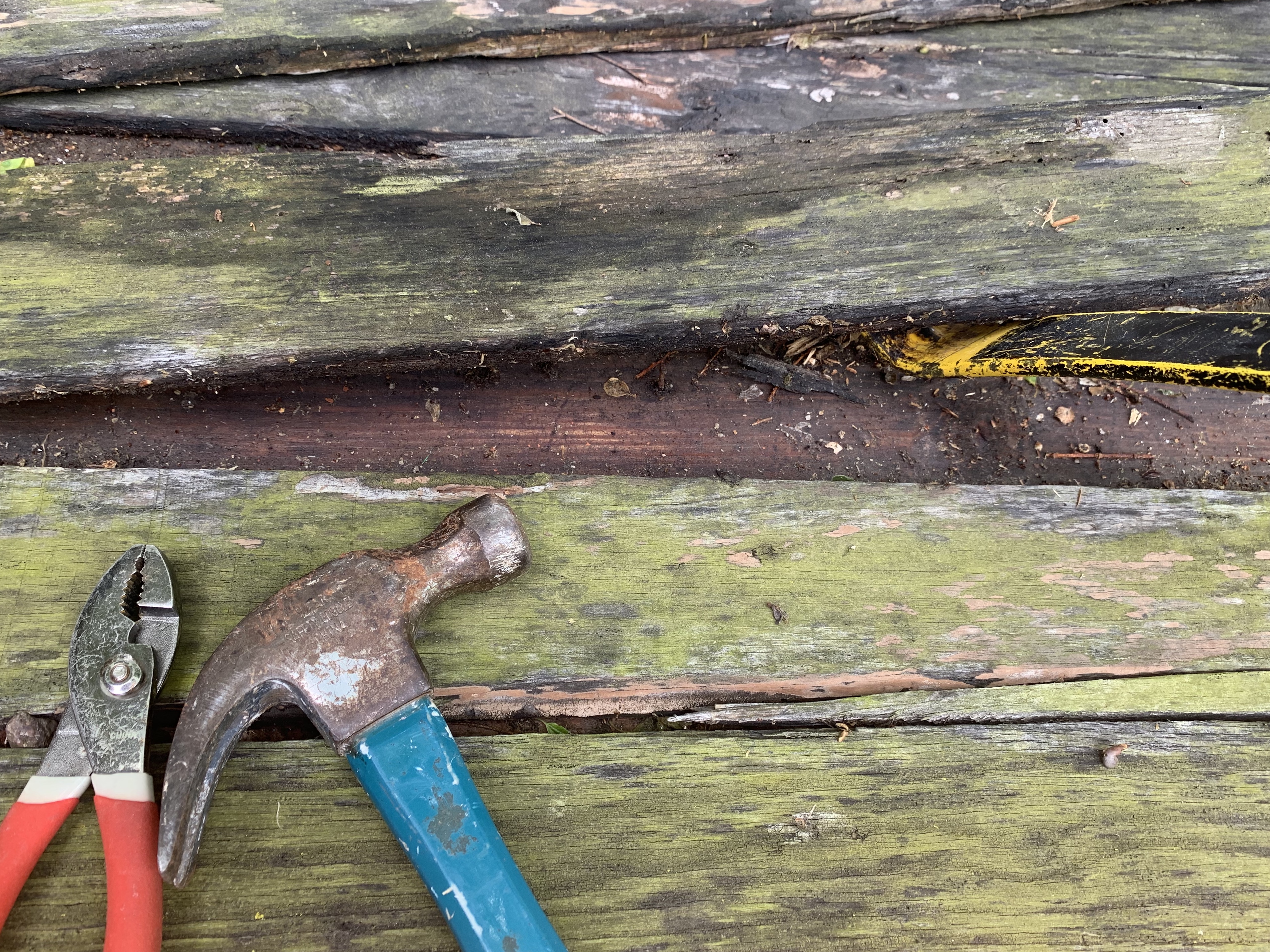
I grabbed a few tools to pry up the layer of rotted pallet wood…

Didn't Need Tools

… and didn’t need them at all.

Most of the wood just kinda fell off.

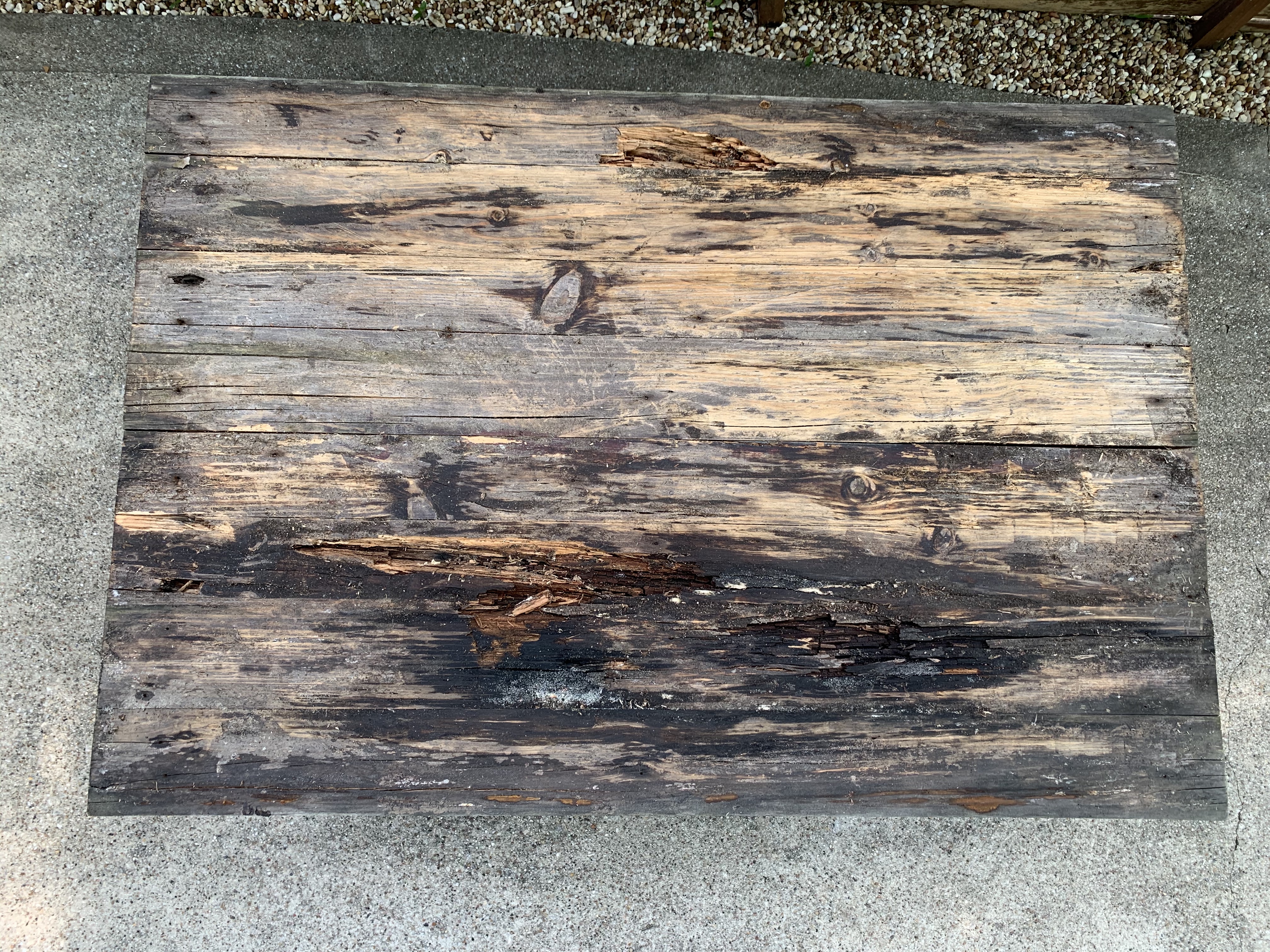
The original wood top underneath wasn’t much better…

Rotten Wood Under Pallet Wood

I had planned to tile over it…. but that was a No Go.

It was a little too …… mushy.

So I grabbed my mask, some gloves, and a 6-foot tape measure (ughhh) and headed to the Home Depot for a few pieces of pressure treated lumber.

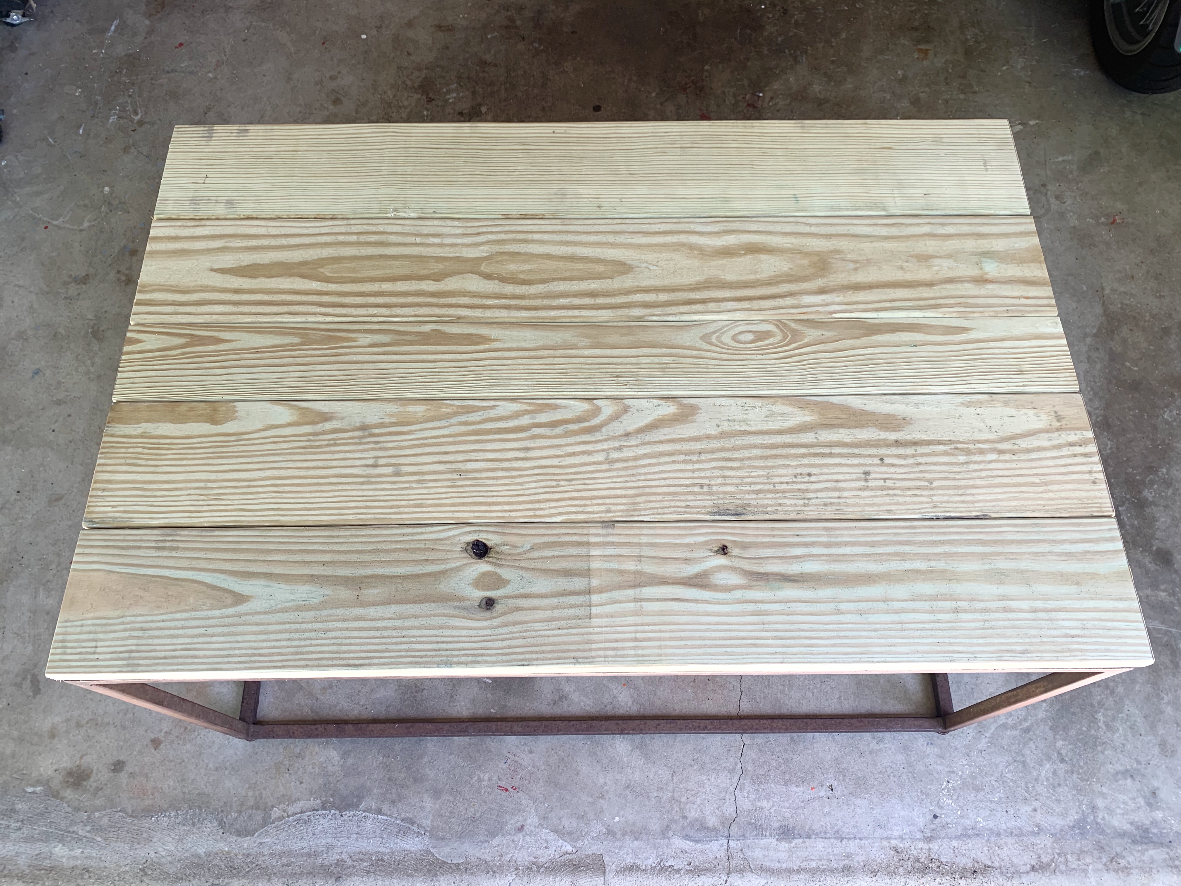
An hour+ later I had a whole new, much more weather-resistant, wood top.

New Pressure Treated Wood Top

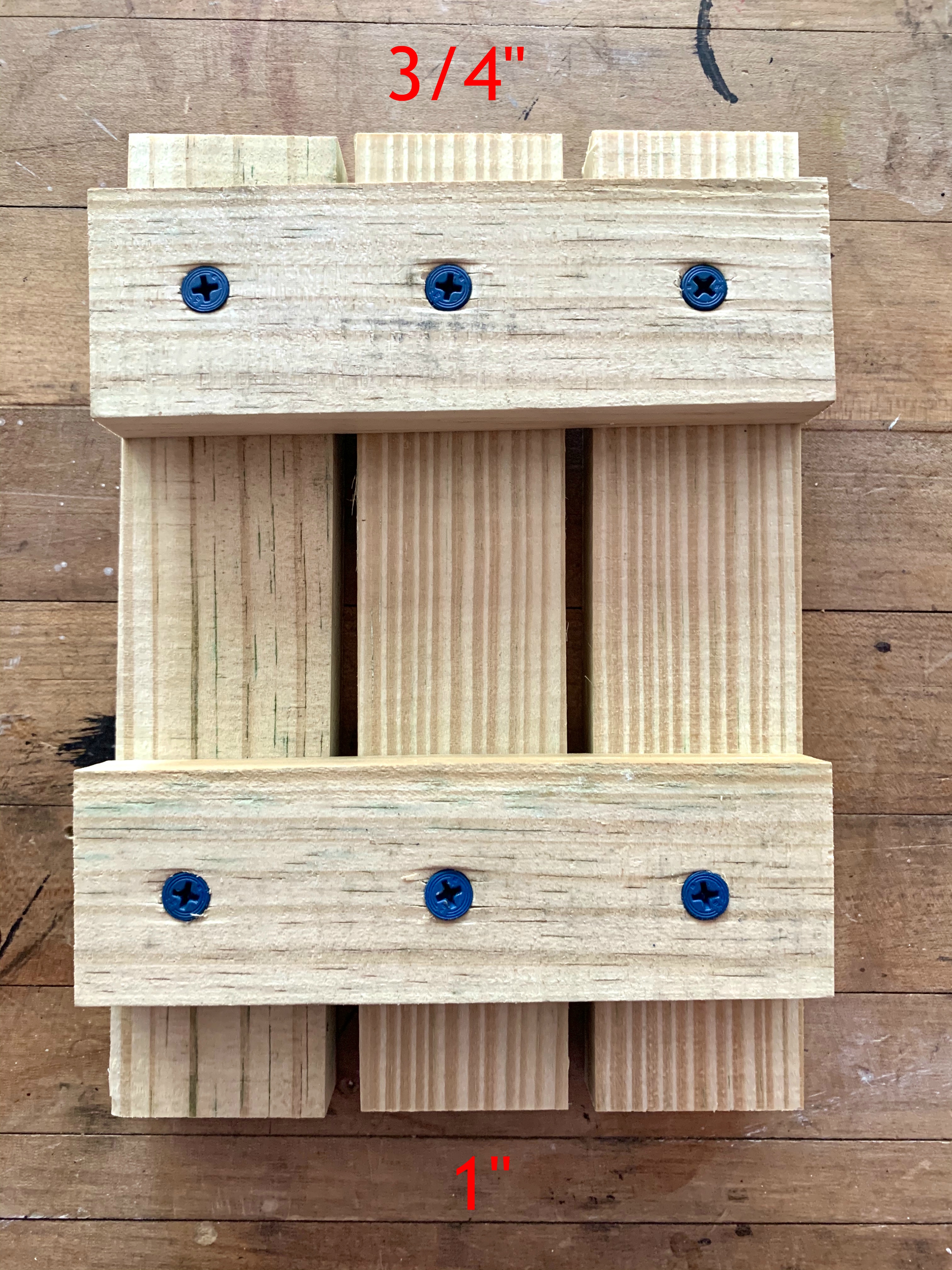
I just flopped the table frame upside down and attached the new wood top with a few drywall screws.

Attach the Wood Top From Underneath

Easy peasy, and lightyears ahead of what I started with.

But I still wanted more.

Here’s where being a hoarder has it’s advantages…

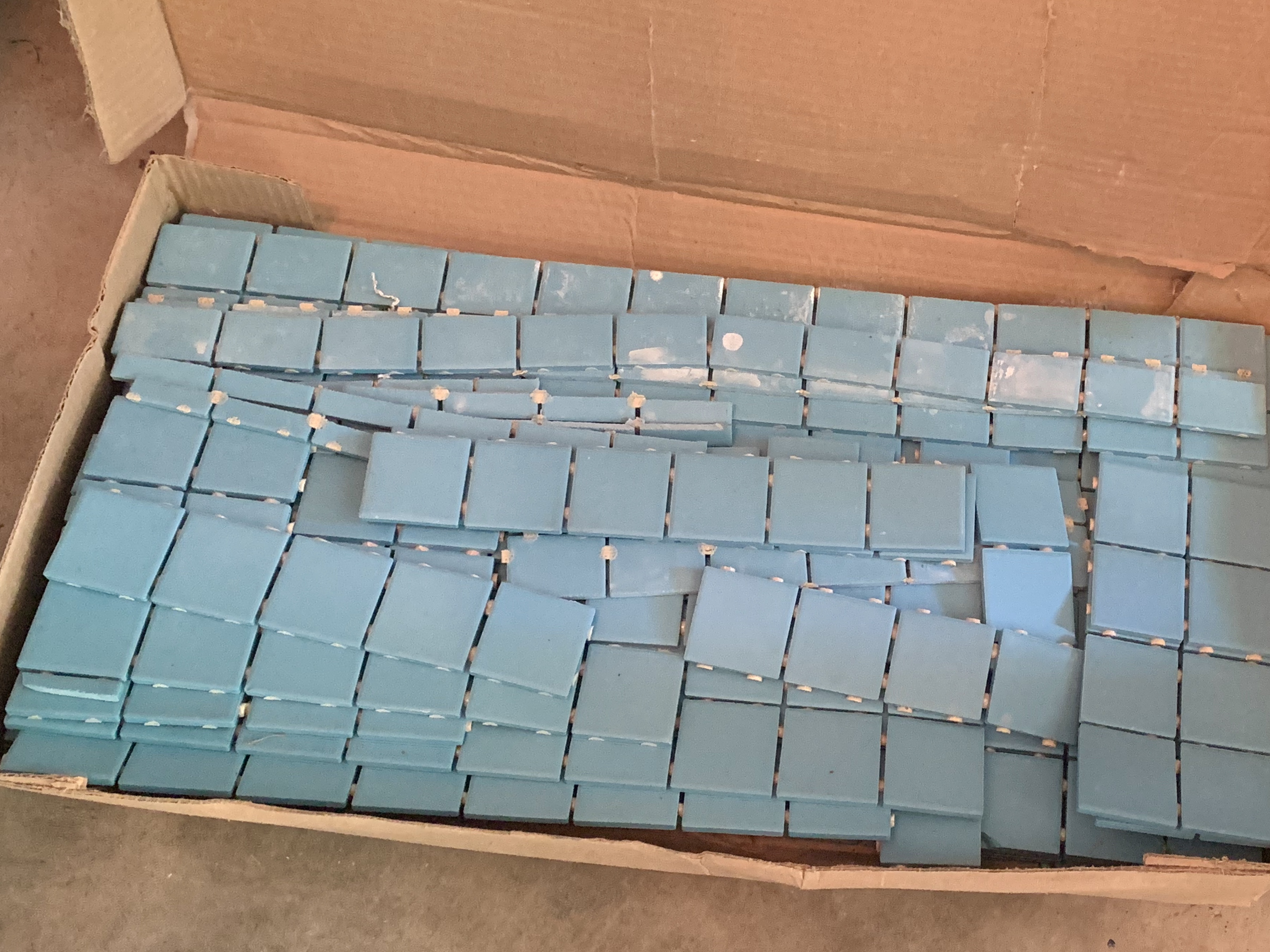
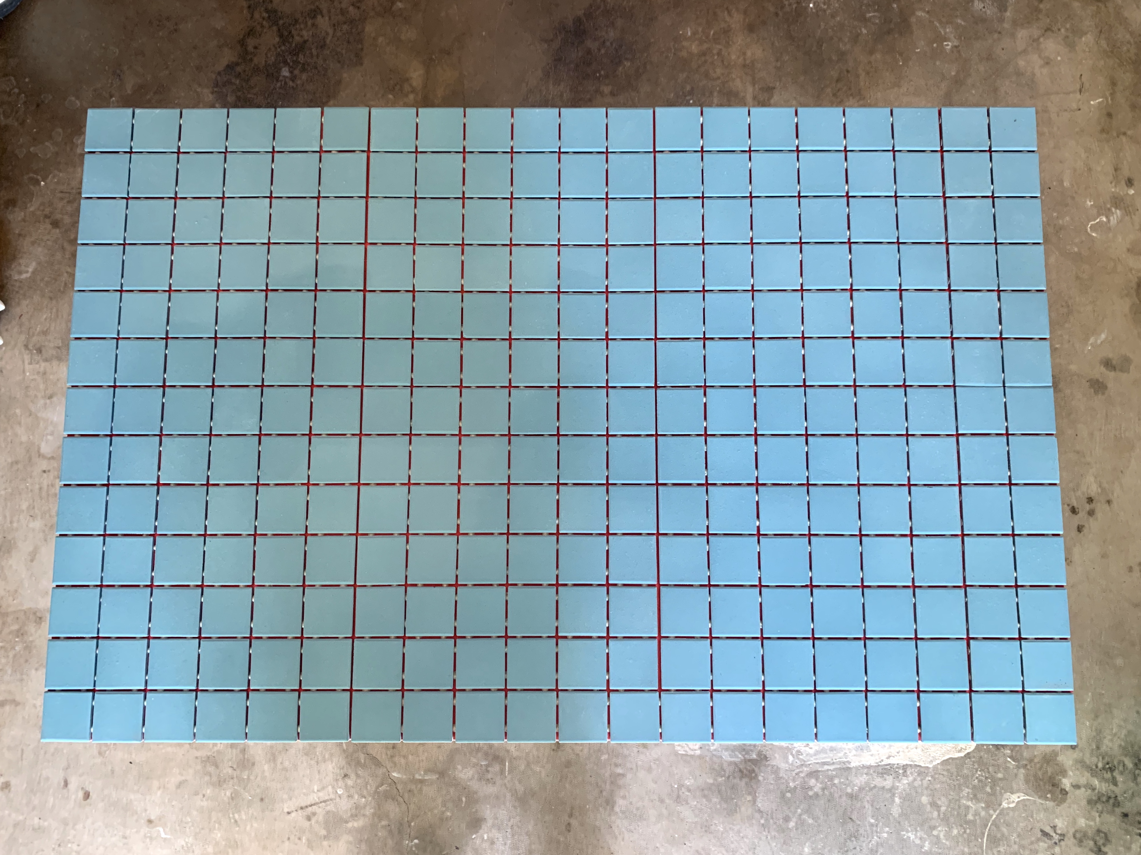
Not only was there a plethora of 1-inch square turquoise tile left over from the master bathroom remodel,

Plenty of Turquoise Tile Left

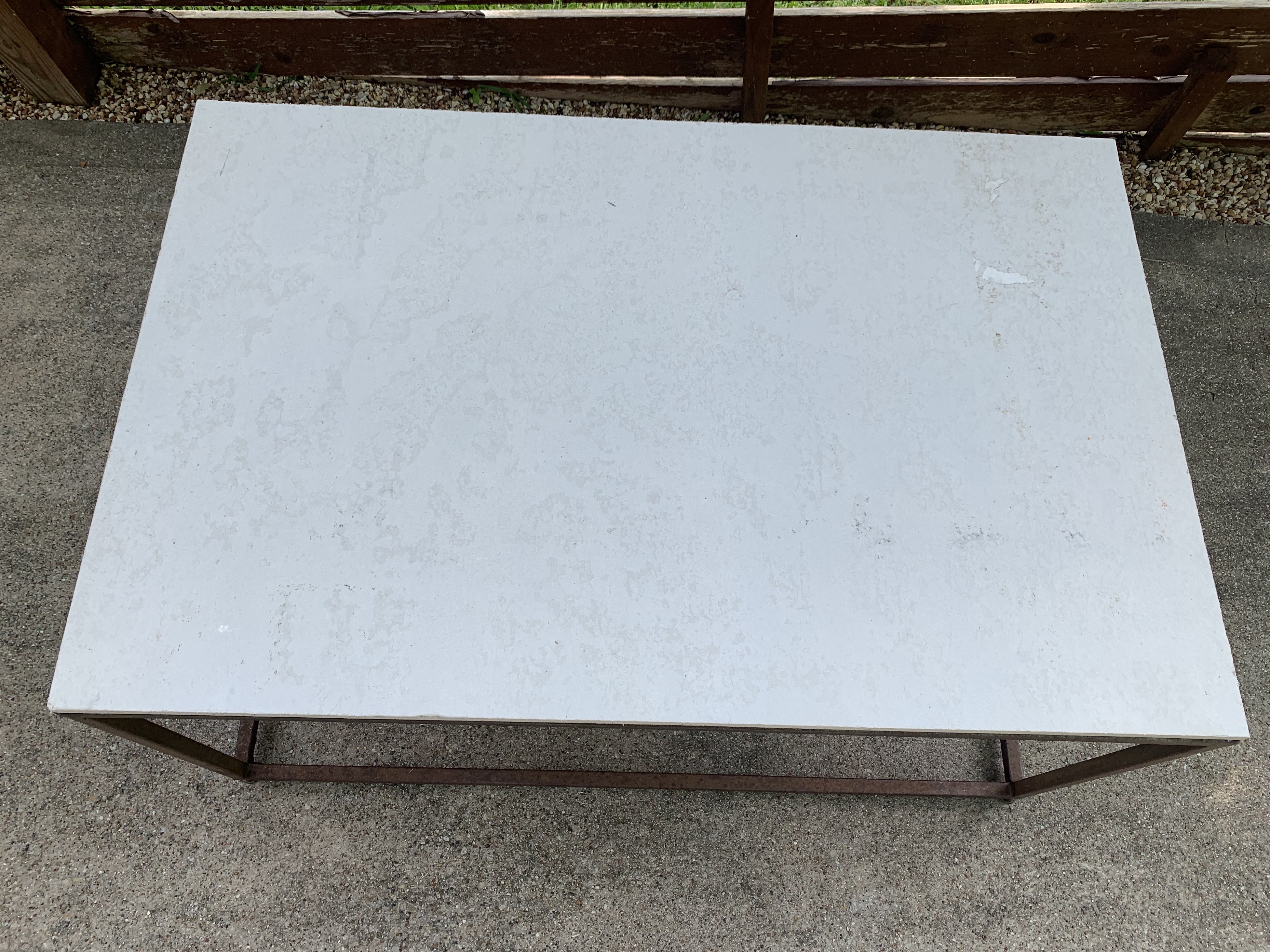
there was also a piece of cement board just the right size for a new top.

Left Over Cement Board

I just screwed it down to the new pressure-treated lumber top.

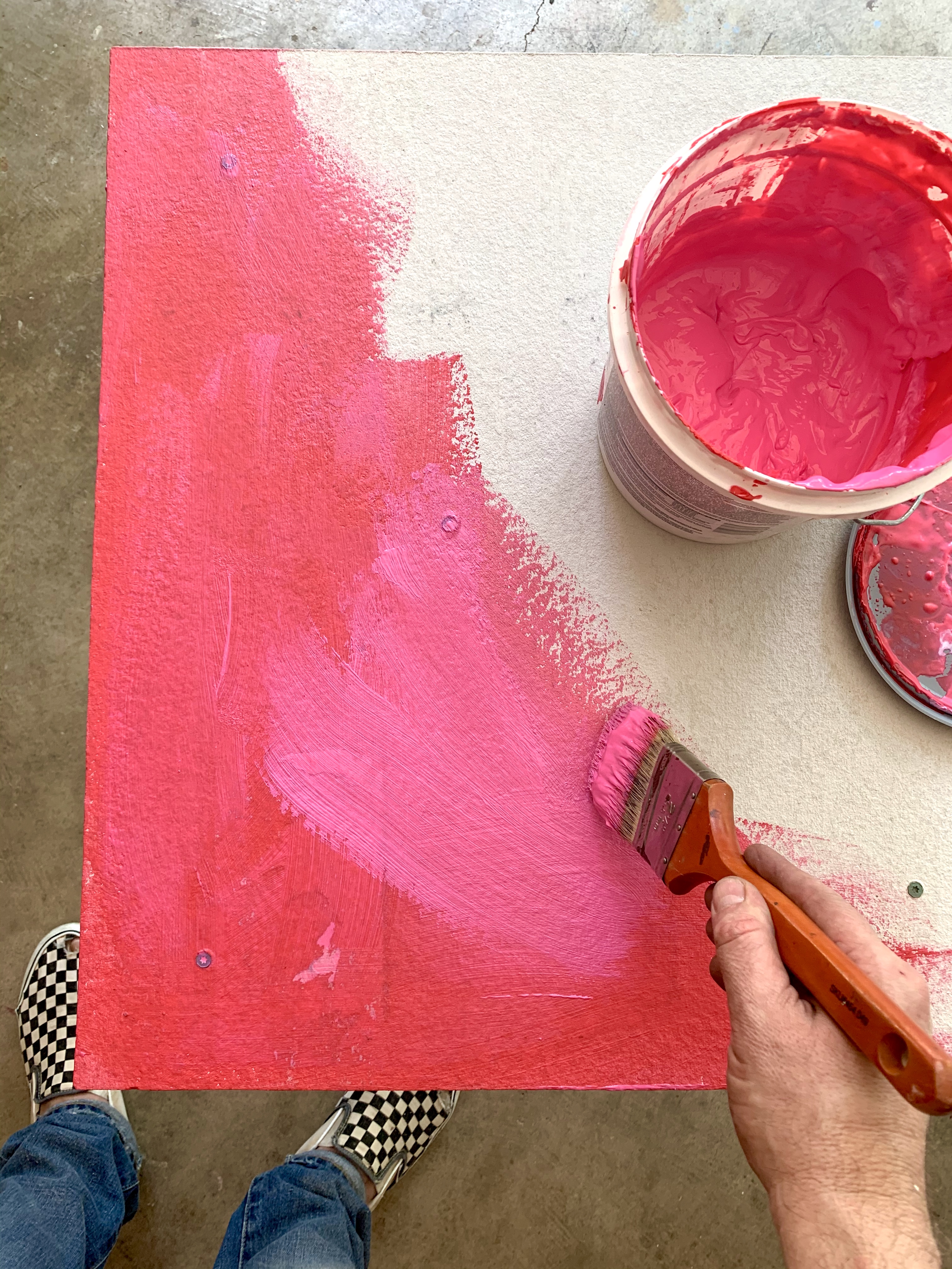
For a little added water proofing – this thing is probably going to sit outside for a few more years – a spread on a layer of Redguard waterproofing membrane.

Paint on a Layer of Redguard

Red Guard Top

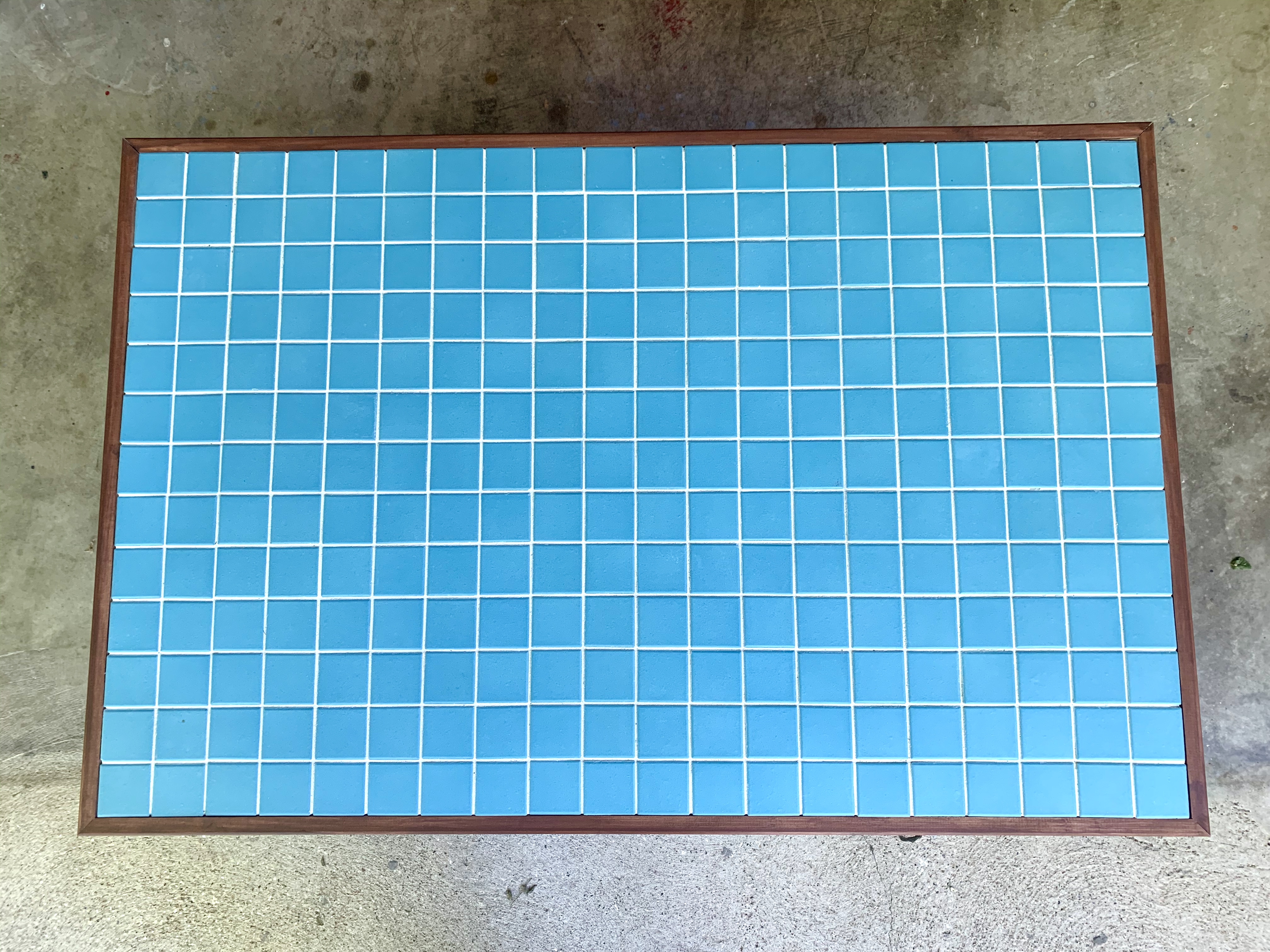
I’m pretty sure that table-top-tiling-Gods were watching over me that day, because the table top was the exact size of 260 tiles.

Turquoise Tile on Top

NO TILE CUTTING NECESSARY,

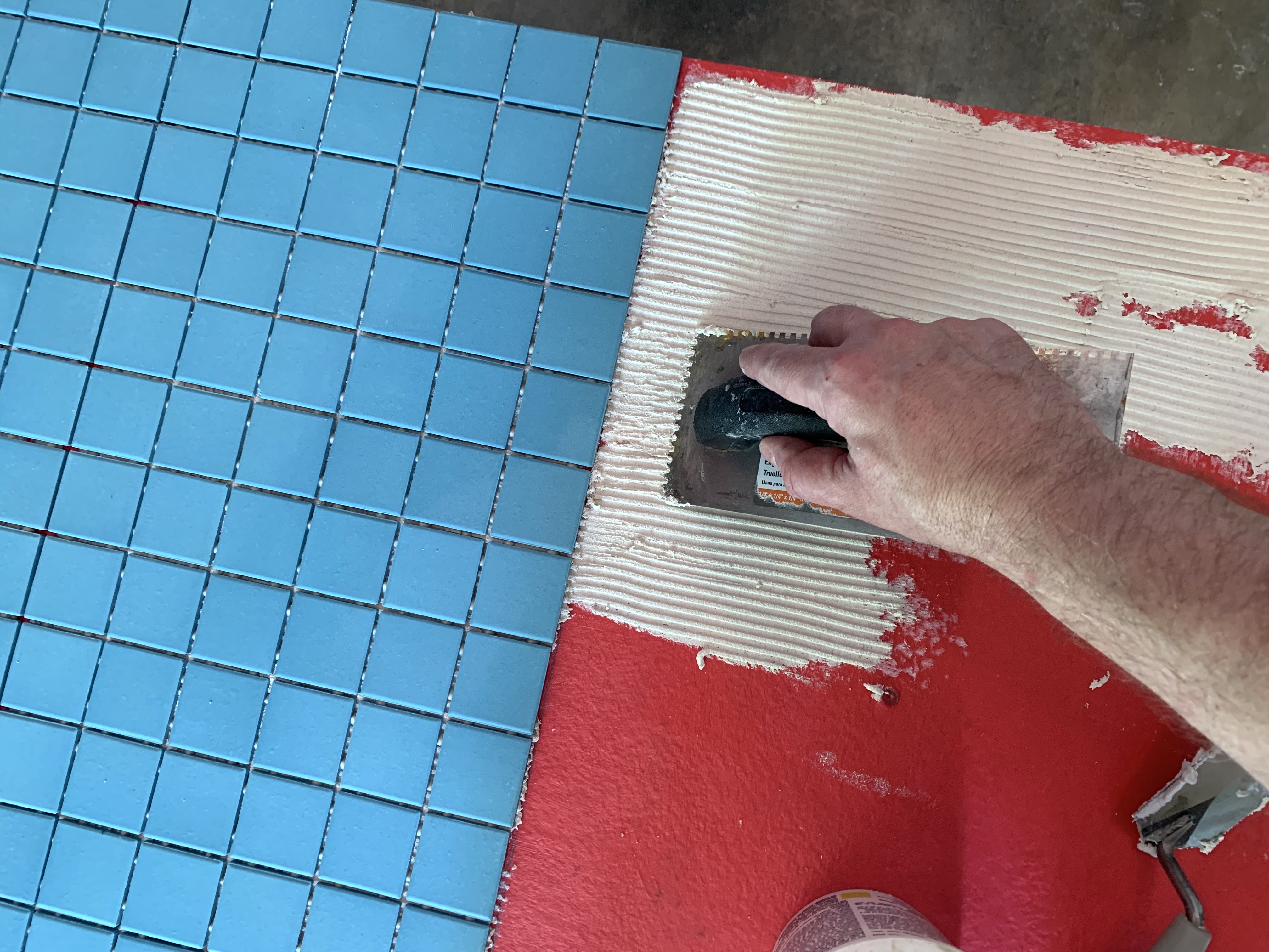
I applied them with a layer of thin set, also found in the hoard.

You should know the drill by now; thin layer of thin set, trowled on at a 45 degree angle…. yada, yada, yada.

Applying the Turquoise Tile

For grout, wouldn’t ya’ll know we had some in the garage hoard.

In alabaster.

Alabaster Grout

Our Bathrooms both have white grout. So we’re not sure where this one came from. Possibly the seashell flower pot I made a few years ago.

Doesn’t matter anyway, because not-quite-so white is a much better outside option than bright white.

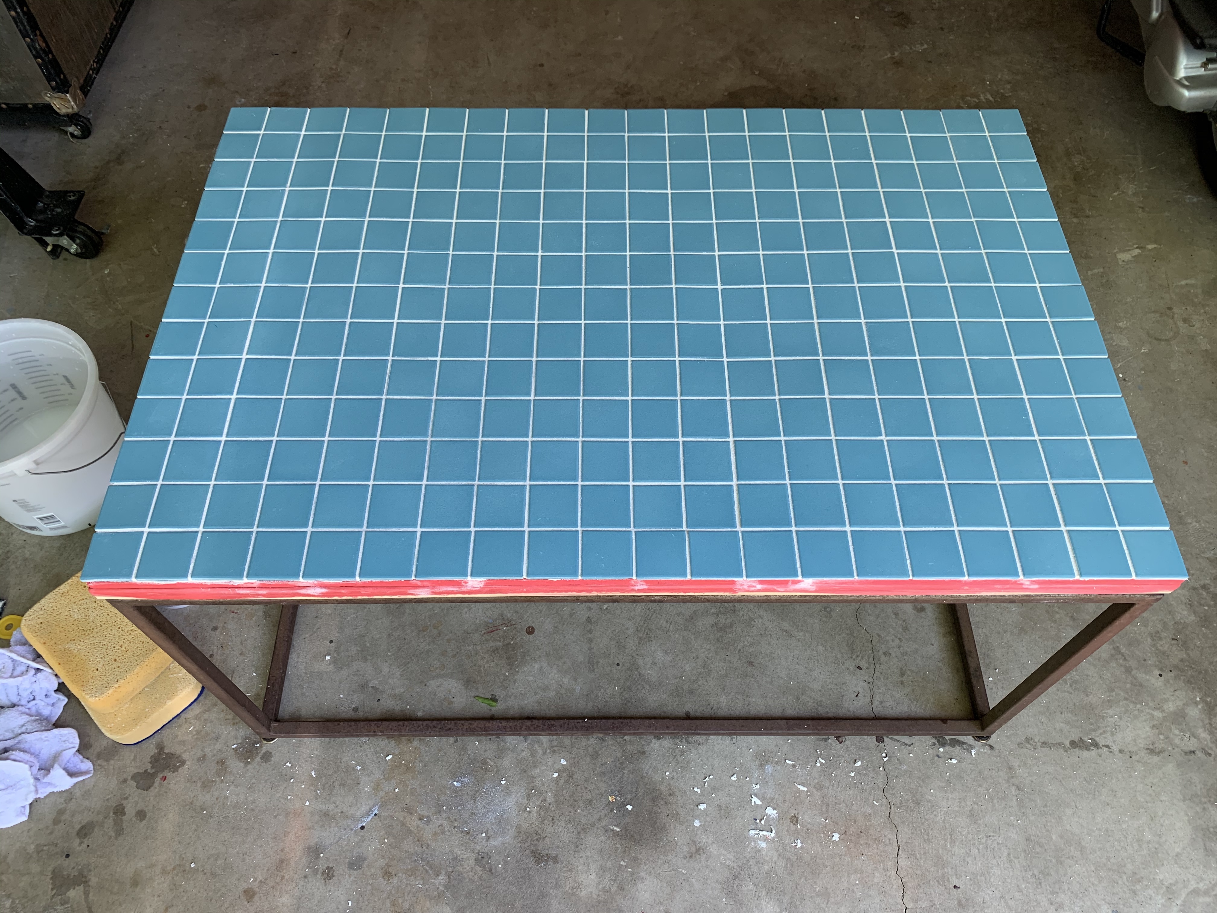
I smeared the grout on, diagonal motion.

You know, like so…

IMG_6340

…wiping off the excess with a wet sponge as I go.

Finished Grouted Top

Not bad,

After a day to cure, I covered the edge with some wood trim. (Also found in the garage hoard.)

Added Wood Trim

And stained it with American Walnut stain.

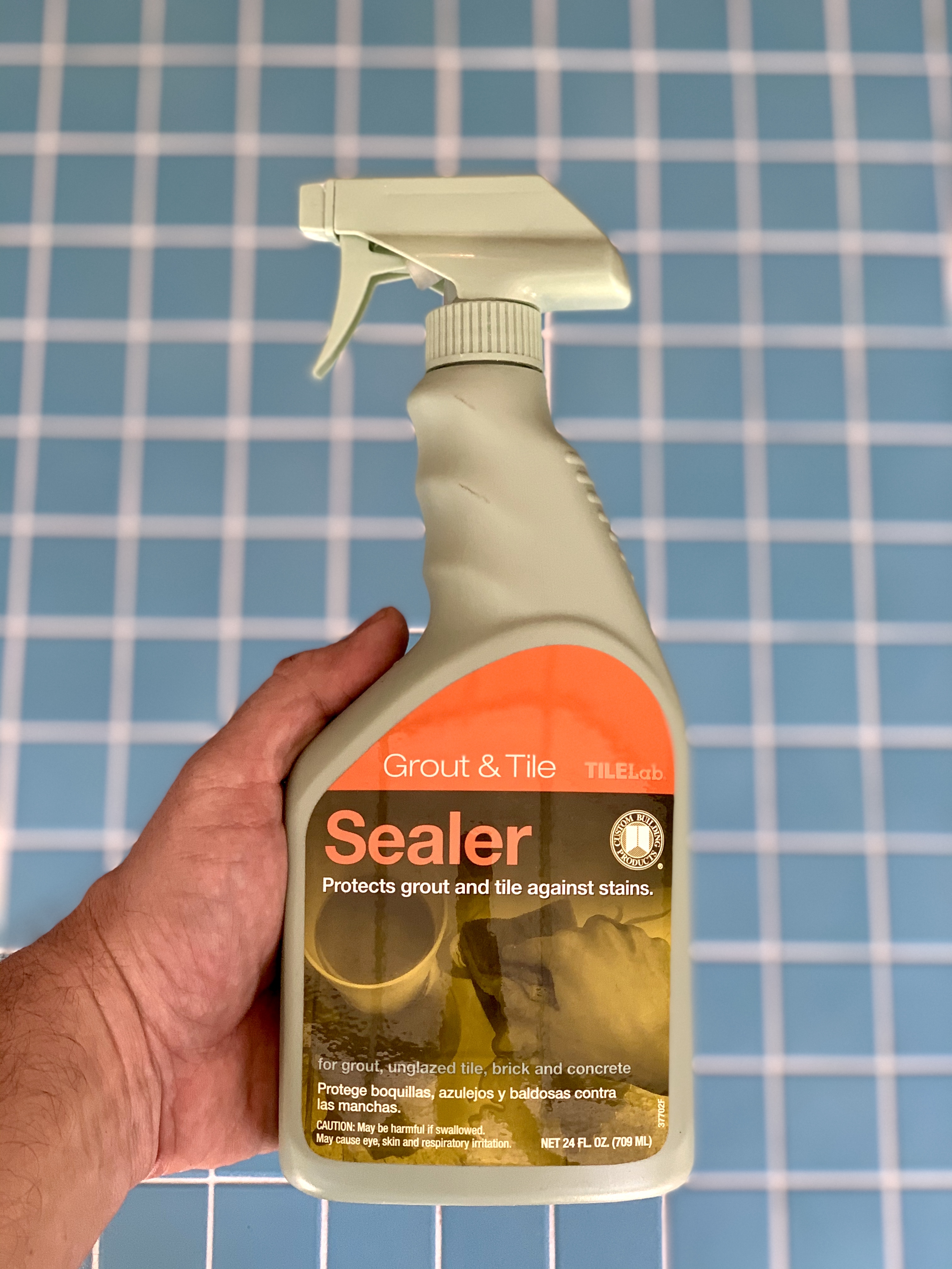
Because it’s going to get rained on for the next decade or so, I sealed the grout, and tile,  with a good amount of sealer.

IMG_6367

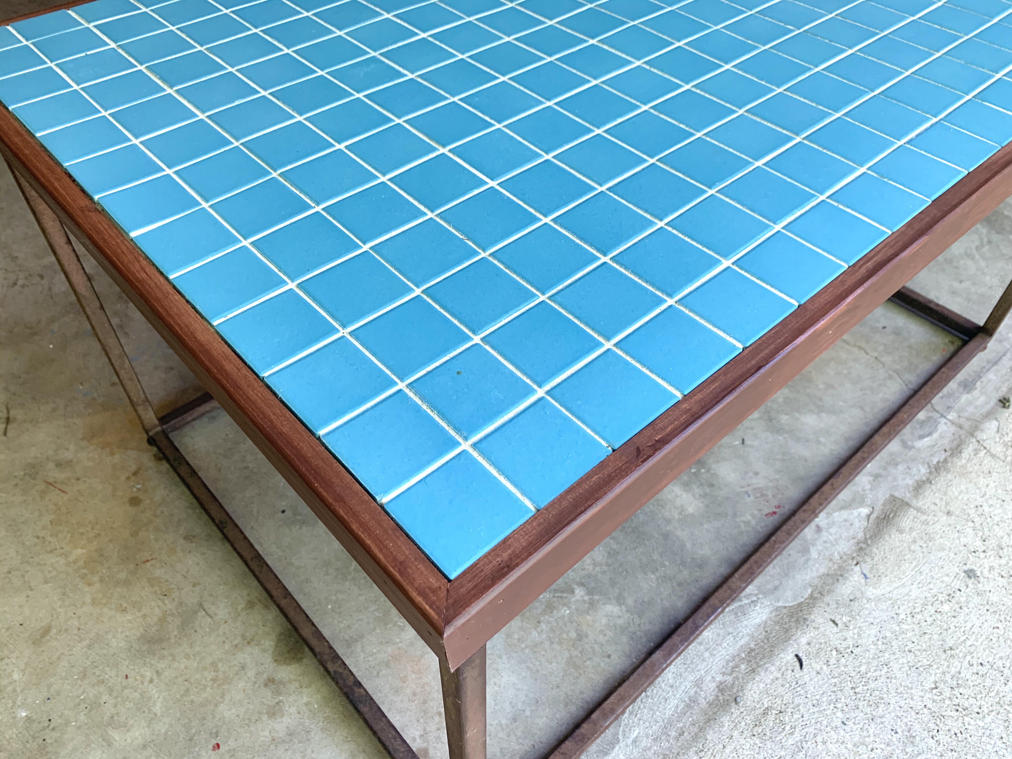
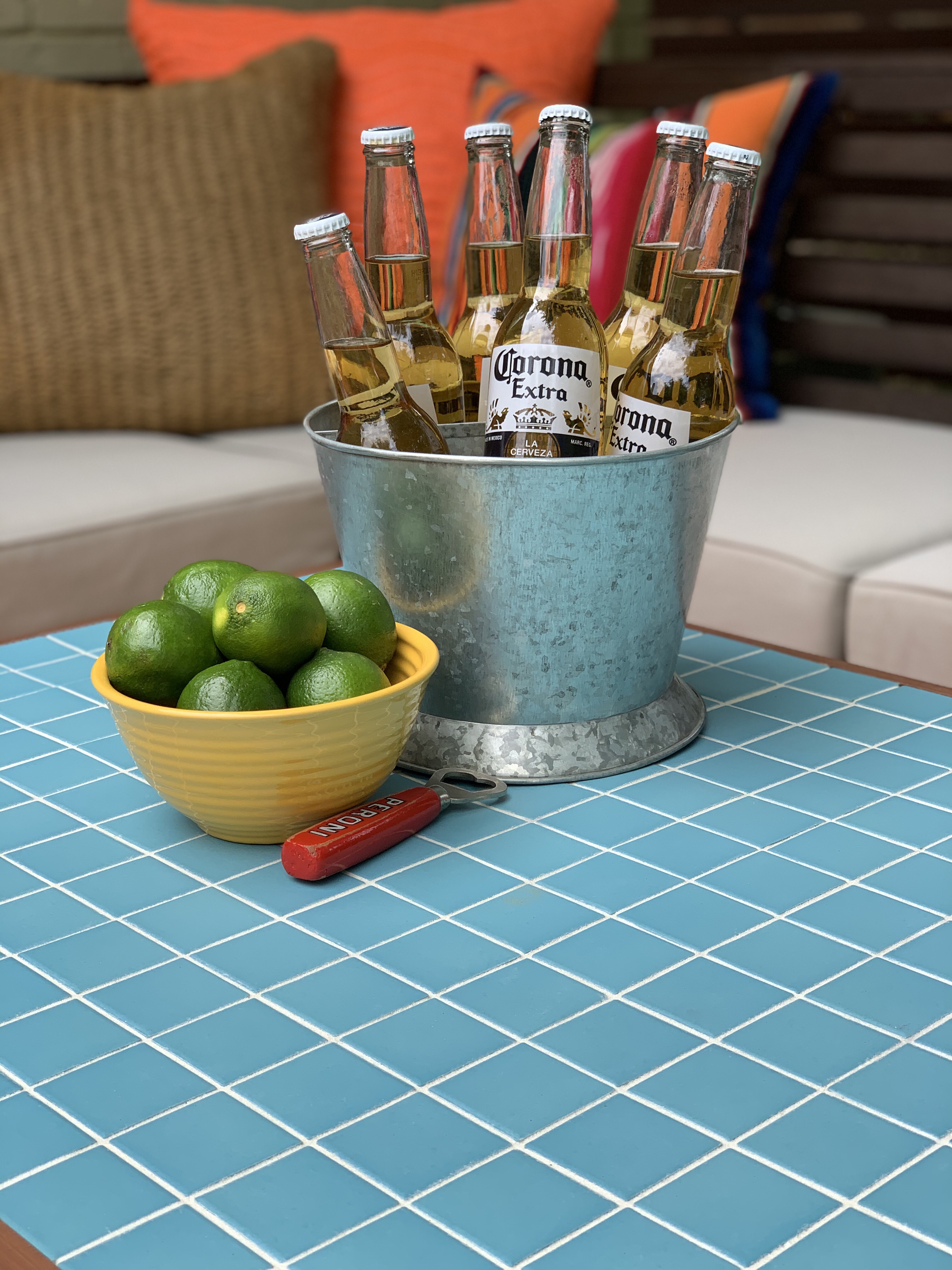
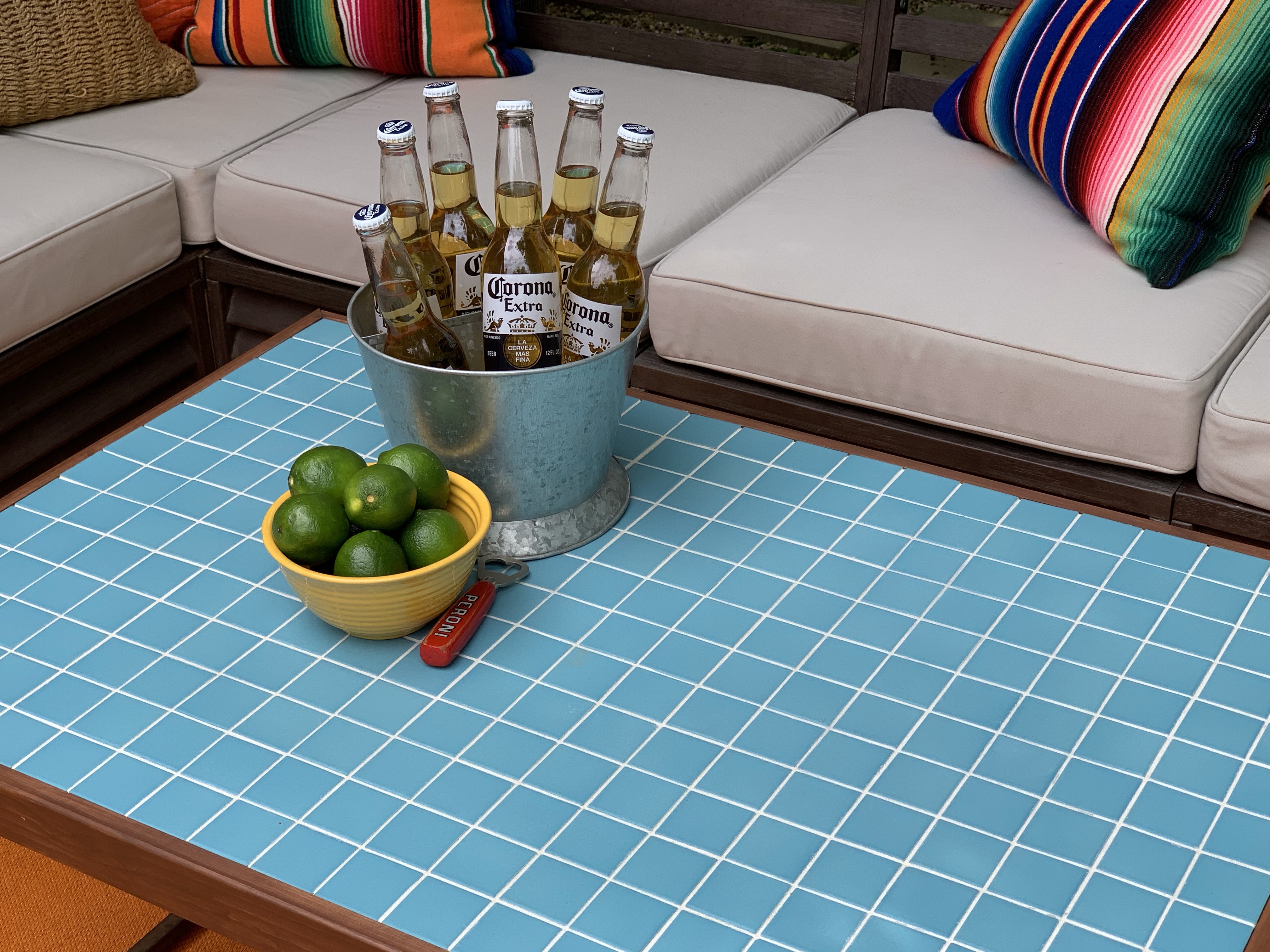
Couldn’t be happier with the way this turned out…

Finished Tile Table

And she looks even better on the deck,

IMG_2029

IMG_2030

IMG_2031

Way, More, Much better.

And pretty much free.

On to the next project.

Share this:

  • Facebook
  • LinkedIn
  • Twitter
  • Pinterest

Like this:

Like Loading...

Avocado Margaritas

Posted by James on May 5, 2020
Posted in: New Home, Recipes. Tagged: Avocado Margaritas, Cinco de Mayo Recipes, Medori Recipe, Tajin. 3 Comments

If you’re like me – and I’m willing to bet that you are because you’re reading this – you more than occasionally enjoy a refreshing adult beverage.

Have I got a great one for you today.

Avocado Margaritas.

Avocado MArgaritas from the Cavender Diary Boys

You read that correctly;

Avocado….

and Tequila….

Blended together.

All the Ingredients for Avocado Margaritas

Here’s what ya need for one margarita, but double it and make 2;

  • 2 Ounces White (Blanco) Tequila
  • 1 1/2 Ounces Melon Liquor
  • 1 Ounce Orange Liquor
  • 1 Ounce Agave Nectar
  • 1 Ounce Fresh Lime Juice
  • 1/4 Soft Avocado
  •  About 1/2 Cup of Ice
  • Tajin (Spicy Salt)

Add the first 7 ingredients into a blender and pulse until well blended.

Blending Avocado Margaritas

Takes about 5 seconds.

Now, my addition to this recipe is the Tajin.

Tajin is a slightly-smoky, lime/chili seasoning salt that’s pretty popular in Latin countries sprinkled over chilled fruit. If you live in Texas, like we do, most liquor stores have at the cash register. (It’s also popular sprinkled into a beer with a squeeze of lime.) If you don’t live in Texas, you can find it on Amazon.

My dear friend Sonya, who’s from Guatemala, brought us some Tajin last summer when we hosted a baby shower for a coworker. Sonya made a fruit salad with cucumber – I know, CUCUMBER in a fruit salad – and left me the jar so I could replicate the taste.

I enjoy it sprinkled on pineapple.

I haven’t seen Sonya in a while and hope she’s doing well.

Rub a third of the glass rim with a lime wedge and roll it in Tajin. It’s the perfect compliment to the cool, creamy avocado.

Rim the Glass with Tajin Collage

Trust me.

And please try this drink.

It’s a great way to use that Medori you’ve had collecting dust in the back of the liquor cabinet for the past 20 years.

Happy Cinco de Mayo!

And, as always,

You’re welcome.


Share this:

  • Facebook
  • LinkedIn
  • Twitter
  • Pinterest

Like this:

Like Loading...

Bandanna Republic

Posted by James on May 2, 2020
Posted in: New Home, Projects. Tagged: Framing Basics, Ralph Lauren Bandanna, The Colorado Kid Bandanna, vintage bandannas. 8 Comments

When I found this red bandanna,

the colorado kid ralph lauren bandanna

I knew right away that I’d frame it.

I’m certainly not going to use it to blow my nose…

Just one more oddball thing that I think needs to be in a frame.

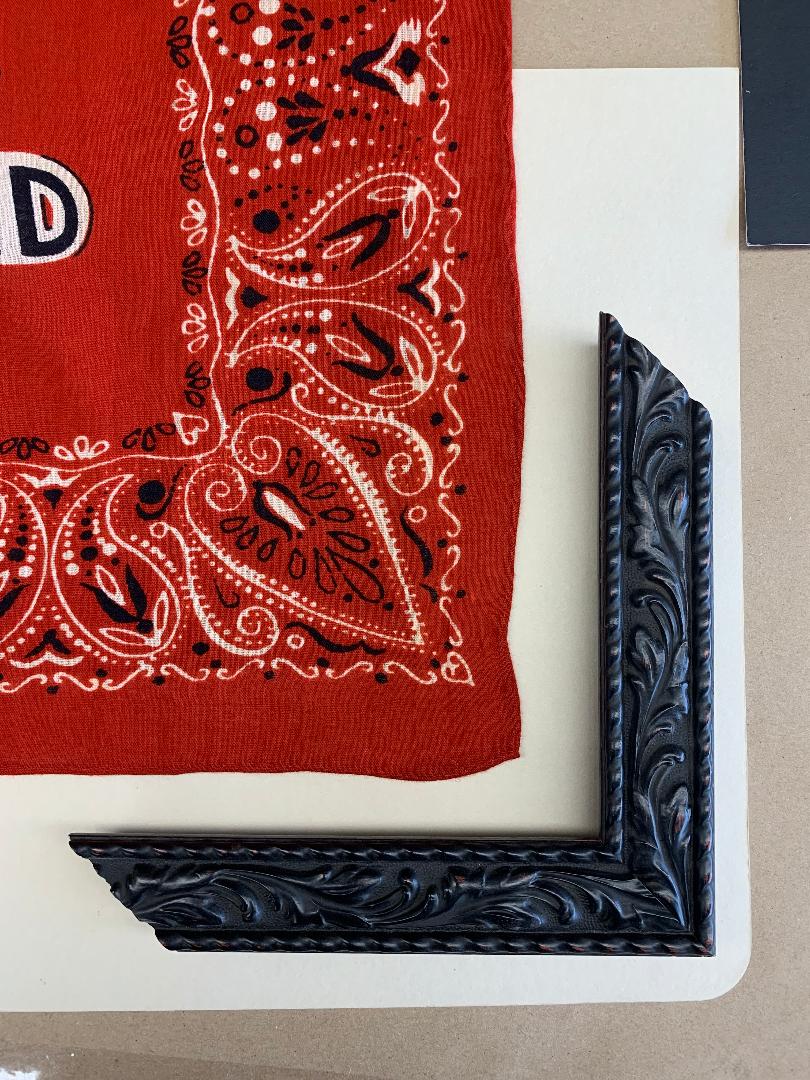
I had no doubt that I wanted a black carved wood frame – a little reminiscent of a hand-tooled leather western belt, with a slight nod to the paisley in the bandana. It took about 20 seconds to find the perfect one.

But how to mount the bandana????

I tried it several ways,

With a white background;

white mat under the bandanna

With a white mat over the bandanna edges;

white mat over the bandanna

Looks clean and crisp, and I usually like that, but it’s still not right.

Maybe the white is too much.

So then I tried a black background:

black mat under the bandanna

…and a black mat over the edge of the red bandanna;

black mat over the bandanna

I thought the black mat might extend the color of the frame.

But it still just wasn’t right.

Maybe I should scratch the idea of a background/mat altogether.

And do something like this.

black frame pushed up to print

Better, but the print in the scarf and the carved wood details in the frame still need some air to breathe – just a little space.

some space between bandana and frame

That’s it!!!

That little red edge makes all the difference.

See,

IMG_6123

Way, more much better.

Now if we only had the empty wall-space to hang it in.


Share this:

  • Facebook
  • LinkedIn
  • Twitter
  • Pinterest

Like this:

Like Loading...

Playing Header Games

Posted by James on April 19, 2020
Posted in: New Home. Tagged: Header, Home Improvement, Home Imrovement, Our Living Room. 16 Comments

Our entryway used be a tight, awkward little hallway,

Stupid Pony Walls in the Entryway

…with useless pony walls on each side. They just visually tightened an already small space.

The pony walls went to the curb within a month of moving in – a small task that made Jamie a little nervous. Especially when I bought a crowbar and a sledge hammer in front of him at Home Depot. If I recall, his exact words were,

“Why did we buy this house if we have to change it?”

I know, that was 10 years ago. He’s singing a much different tune these days.

In fact, I came home from work one day to find that he had already removed the pony walls… by himself.

But it took us another 9+ years to remove the odd header that hovered over those little walls. At one time, there were decorative “cage-like” railings that sat upon said walls and stretched up to the header. If you’ve ever watched HGTV’s House Hunters you know what I’m talking about. It was an attempt to make a small house look like she had an actual formal entryway. You know, without closing it off too much.

1972 solution = bars. In case you’re wondering, a cage is never the solution…

Anyhoo, there that header has sat – or hung – over our heads for 10 years. With standard 8 foot ceilings, we need all the visual clearance we can get. After making sure it wasn’t load bearing  (I learned that phrase from HGTV too) I set about ripping it down.

Remember, I still had that crowbar and sledge hammer….

Header in Living Room

And I used them to do this…

Header in Living Room with Drywall Removed

Stripped off all the drywall to see what we’re working with.

Sure, we like “industrial”, but this is just a little too rustic.

Thick Header Boards

Over the course of a few days, Jamie will tell you it took several weeks, I gently removed the massive boards and patched the four inch wide hole with smaller boards, a run of drywall, and then a layer of drywall mud.

Repairing the Ceiling

Then I sanded,

Followed by more mud, and more sanding,

And eventually even more mud, and, you guessed it, even more sanding……

Where the Header Was

When I was fully satisfied with the texture, I wrapped grocery bags around the can lights and gave the whole ceiling several coats of ceiling paint white.

Have I mentioned that you should routinely paint your ceilings? Because you should.

First thing.

It makes a tremendous difference reflecting light in an old house. (Especially an old house that was built when smoking was popular.)

After Lots of Sanding and Ceiling Paint

IMG_4565

Eventually we could hardly tell that there had ever been a header there at all.

New Ceiling in the Living Room

If you didn’t know to look for it… you’d never know what used to be there.

I know, I’m impressed too.

Did a fairly decent job of matching the texture on the walls too.

Added Crown in the Living Room

Notice that I took this time to add crown molding in this room too. Used the same technique as in the master bedroom. I can’t stress enough how much it cleans the edges of the room. Do it!

On to our next project.

Lord knows we have time…..

Share this:

  • Facebook
  • LinkedIn
  • Twitter
  • Pinterest

Like this:

Like Loading...

Zucchini/Carrot Bread

Posted by James on April 16, 2020
Posted in: New Home, Recipes. Tagged: Easy Zucchini Bread, Vegetable Bread, Zucchini Carrot Bread. 7 Comments

Zucchini Carrot Bread from the Cavender Diary Boys

Bored,

Bored, Bored, Bored, Bored, Bored……

In the past couple of weeks we have done everything we can to keep ourselves busy; we’ve cleaned out the garage, every closet, every drawer. I’ve painted art, made candles, taught my dog a few new tricks, built a wood storage box for the bathroom, and revamped an industrial pendant. We’ve taken long walks and watched everything there is on Disney+ and Netflix.

EVERYTHING.

Everyone on the Face-Space seems to be baking banana bread.

But we don’t have any bananas.

After a quick survey of the kitchen, we do have zucchini and carrots.

So today we’re making Zucchini/Carrot Bread.

Dry Ingredients

That’s right, now I’m making bread with leftover vegetables.

Here’s what ya need:

  • 2 3/4 cups all-purpose flour
  • 2 Tsp Cinnamon
  • 1 1/2 Tsp Nutmeg
  •  1/2 Tsp Salt
  • 1 Tsp Baking Soda
  • 1 Tsp Baking Powder
  • 1/2  Cup White Sugar
  • 1/2 cup Light Brown Sugar
  • 1 Cup Oil
  • 1/2 Cup Honey
  • 1/2 Tsp Vanilla
  • 3 Eggs
  • 1 Cup Chopped Pecans
  • 1 Cup Shredded Zucchini
  • 1 Cup Shredded Carrots

Shift together the first 6 ingredients – flour, cinnamon, nutmeg, salt, baking soda, and baking powder – into a bowl and set asside.

Add Nutmeg

In a separate bowl use a kitchen mixer to mix together the next 6 ingredients – sugar, brown sugar, oil, honey, vanilla, and eggs – on low until well-blended.

*Here’s a helpful hint. Measure the honey in the same measuring cup you use for the oil. The light coating of oil will help it to slide right out. You’re welcome.

Mix Wet Ingredients

Electric Mixer

Now to grate the veggies.

Carrots and Zucchini

If you happen have a food processor, aren’t you lucky?

If you’re like me, and don’t have a fancy food processor, just use a regular cheese grater over a bowl.

Be careful of those fingertips – no one wants any extra strips of protein.

Grate The Zucchini

Grate the zucchini first and then squeeze out as much of the water as you can.

Not need to do this with the carrots. They have almost no liquid. If you’ve ever juiced one, you know this already.

Grated Zucchini

Two 8-inch veggies will make just about a cup shredded. There are no exact measurements here. If you want more, then add more.

Gratted Zucchini and Carrots

Roughly chop a cup of pecans.

Why pecans and not walnuts?

Because Texas, that’s why.

Roughly Chop the Pecans

Mix the shredded vegetables and about 3/4 of the pecans into the wet mixture.

Stir in the Chopepd Pecans

Then slowly fold in the dry mixture with a spatula, about a 1/2 cup at a time.

Slowly Stir In the Dry Ingredients

You want to make sure everything is mixed well; no clumps, no dry pockets.

Mixed Bread BAtter

Divide the mixture into two 8-inch loaf pans. I sprayed them down with a butter flavored cooking spray first.

Two Loaf Pans

Now bake the loaves at 325 degrees for about 50 minutes.

(After 50 minutes, your house should smell like heaven. Insert a toothpick into the middle of one. If it come out clean, they’re ready. If not, pop them back into the oven for another 5 – 10 minutes.)

Let the hot bread sit-in the pan for about five minutes then gently slide them out and let them cool on a drying rack.

Two Loaves Cooling on the Rack

I smear a big layer of cream cheese over the top of the bread and sprinkle it with the remaining pecans.

Zucchini Carrot Bread

Zucchini Carrot Bread 2

Zucchini Carrot Bread 3

It’s a dense bread,

Almost cake-like, but not too sweet.

Give it a try sometime…

What else are you doing?

Share this:

  • Facebook
  • LinkedIn
  • Twitter
  • Pinterest

Like this:

Like Loading...

Ronan Farrow’s BIG BOY Apartment

Posted by James on April 15, 2020
Posted in: New Home. Tagged: Definitely Woody Allen's Son, Frank Sinatra Love Child, Mia Farrow Son, Ronan Farrow, Ronan Farrow Apartment, Woody Allen Son. 10 Comments

Genius spawn of Mia Farrow and Woody Allen, Ronan Farrow, has a new address. (At least he did 5 years ago when I wrote this.) The boy wonder recently relocated to his first apartment on west 60th…. and man, it’s a stunner.

Not sure where he was living before this, let’s just assume it was with Mom in the Dakota.

Here’s the before:

Ronan Farrow's Living Room Before

Ronan Farrow's Dining Room Before

Ronan Farrow's Kitchen Before

Stunning views, but other than that….ehhhhh,

I’m more a fan of acquired decor and not “decorated”, but even still, with the aid of BHDM design, Ronan transformed the space into a relaxing, masculine retreat in the sky.

And here’s what BHDM did for poor Ronan:

Ronan Farrow's Living Room 1

I know. BA-BAM!

These vintage highway signs are just calling my name.

Ronan Farrow's Living Room 2

Ronan Farrow's Living Room 3

Ronan Farrow's Living Room 4

Ronan Farrow's Living Room 5

Ronan Farrow's Dining Room 1

Never thought of framing Rorschach ink blots before…… but I sure want to now.

Do y’all see a slaughtered bunny rabbit?

Or is it just me?

Ronan Farrow's Dining Room 2

If someone breaks in a steals this sketch of a mustached gent…. it may possibly have been me.

Ronan Farrow's Moustached Man

The kitchen bar area was simply updated with a few mail-order bar stools from, get this, From the Source.

Ronan Farrow's Bar Counter

How great is that reclaimed industrial red pendant next to his bed?

Ronan Farrow's Bedroom

Ronan Farrow's Bedroom Desk

Most everything was purchased online, even the vintage chairs.

Just found this post hidden behind 80 other drafts in my WordPress and thought it was worthy of a posting.

Hope y’all enjoy.

Stay safe.

Share this:

  • Facebook
  • LinkedIn
  • Twitter
  • Pinterest

Like this:

Like Loading...

Candy-O

Posted by James on April 4, 2020
Posted in: New Home. Tagged: Alberto Vargas, Album Art, Candy Morre, Candy-O, David Robinson, Mount 'N Ride, New Wave Album Cover, The Cars, The Cars Candy-O, Vargas, Vargas Girl, Vargas Pin Up. 11 Comments

I’ve always been fascinated by album art. A single twelve inch square image conveys everything you need to know about the artist and the music contained inside the folded cardboard.

And sometimes, it does nothing more than intrigue. Like this one hanging on my wall.

2F7D4844-FA93-4581-9693-034EB00B96F3_1_201_a

People are always asking about her, so here’s a little background;

Candy-O is the second studio album from the American new-wave band The Cars.

The Album cover was painted by pin-up artist Alberto Vargas with a technique that combines watercolors and airbrush. Vargas gained fame for his illustrations of scantily-clad young ladies in the pages of 1940s Esquire magazines; many of which were used as inspiration for the nose art on WW2 bombers.

Vargas WW2 Bomber Nose Art

Unfortunately, his artwork was also a pain in the ass for Esquire. The magazine was denied a second class postal permit by the US Post Office for distributing his “pornography”. Esquire took the fight all the way to the Supreme Court. Even though they won the case the magazine still dropped Vargas as a contributing artist; keeping the usage rights to his proper name, “Varga”.

In 1957 Playboy magazine published a retrospective article about Vargas that prompted Hugh Heffner to personally reach out to the struggling artist and offer him a job as an illustrator. From ’57 to ’74 Vargas’s work blossomed and he painted 152 paintings for Heff and Playboy magazine – only now with an “S” added to the end of his name. Sadly, it was his wife’s death in 1974 that forced him into a deep depression – she had been his model, his business manager and his muse in every way – and he retired from painting.

The idea to hire Vargas for the Candy-O album cover came from Cars drummer David Robinson, he was the band’s artistic director and also an avid collector of vintage pin-ups. Robinson had recently been given a copy of Vargas’s 1978 autobiography and was surprised to learn that the artist was still alive and living in Los Angeles. Of course the 83-year-old Vargas had no interest in a rock-n-roll project (How could he have known that this would be his most recognized piece of work?) and had to be persuaded to take the job by his niece, who was a huge Cars fan.

Vargas selected a young dancer named Nancy Beth as his model and suggested a dance position Nancy Beth referred to as the “rose petal”; her arm draped demurely across her forehead and eyes like a petal. Unfortunately, Nancy Beth wasn’t prepared for the modeling session to be in the nude – or semi-nude; there was, after all, a sheer leotard but nothing else. (This was a step-up for Vargas models. In the past they had always been completely nude with clothes only added to the final portraits). When she declined, Elektra Records hired actress-model-whatever Candy Moore – the name “Candy” was purely a coincidence. She had been a child actress and even played Lucile Ball’s daughter, Chris Carmichael, on The Lucy Show in the early ’60s. To create a photo that Vargas could use as a guide, Robinson set up a photo shoot at a Ferrari dealership in Beverly Hills and had Candy drape herself across the hood of a Ferrari 365 GTC.

Candy Posing on the Ferrari

There must have been quite a lot of chemistry that day because she and Robinson dated for a little while after.

I found a short interview with David Robinson about the experience.

It should come as no surprise that Vargas’s first version of the painting was rejected by the record label. Apparently, there wasn’t much of Candy’s anatomy left to the imagination….. if you know what I mean. The old man was used to illustrating for X-rated magazines, not for record bins at Tower Records.

Candy-O was released on June 13, 1979. Sex sells, especially in the music industry, and the album cover garnered way more attention that the actual music – which, in my humble opinion…. is just ok. (It’s my least favorite Cars album)

There’s no doubt that it was Vargas’s buxom babe – there’s no mention of the band, or even the album’s name, on the cover. In fact, there’s barely even a car; just an outline. – that helped Candy-O go platinum in eight weeks.

Shortly after the release, Vargas, then in his 80’s, was invited by the band to see them in concert. When asked about the artist’s impression of the band, Robinson said, “He just said it wasn’t his kind of music. But he was impressed because he could see that we worked really hard and he said there were beautiful girls all over the place.
He liked that very much.” 

I’m sure he did.

Share this:

  • Facebook
  • LinkedIn
  • Twitter
  • Pinterest

Like this:

Like Loading...

Posts navigation

← Older Entries
Newer Entries →
  • The Cavender Boys

  • Buy My Book

    Check out the link below to get your copy of "DIY Industrial Pipe Furniture & Decor" by James Angus

    https://amzn.com/1612436064

  • Tags

    American Flag Apartment Therapy arts Backyard Bathroom Remodeling Beacon Blanket Big Tex Black Spray Paint Bloggers Can Lights Cedar Walls Christmas Christmas Decorating Christmas Ornaments Christmas Tree Crazy Mouse Ride Den Diane Keaton diy Doberman Earth Grout Edward Curtis Electrical Work Fletcher's Corny Dogs flower beds Frankoma pottery Front Yard Garage Garage Update Halloween Halloween Decorating happy halloween harley Harley Davidson home House Tour Houzz hudson bay blankets Ikea Ikea Borrby Lantern illustration july 4th Key West Trip Kitchen Remodel Living Room mantle Master Bathroom Master Bathroom Remodel Master Bedroom mercury ornaments merry christmas Modern Horizontal Fence Motherhood Paint Colors plumbing pipe Projects Ralph Lauren restoration hardware Russet Stain Shiny Brite Ornaments state fair of texas style Swiss Army Blanket Target technology Texas State Fair thanksgiving Thrift store Tile Backsplash travel vacation Vintage chair vintage christmas vintage ornaments Wood Wall
  • Recent Posts

    • Capitol T, and that Rhymes with P
    • Christmas in New York: 2021 Version
    • Cavender Christmas 2021
    • San Juan, Post-Covid
    • Christmas on Cavender 2020
  • Archives

    • July 2022
    • December 2021
    • July 2021
    • December 2020
    • October 2020
    • September 2020
    • August 2020
    • July 2020
    • June 2020
    • May 2020
    • April 2020
    • March 2020
    • February 2020
    • January 2020
    • December 2019
    • October 2019
    • April 2019
    • January 2019
    • December 2018
    • November 2018
    • October 2018
    • September 2018
    • June 2018
    • May 2018
    • April 2018
    • March 2018
    • January 2018
    • December 2017
    • October 2017
    • September 2017
    • August 2017
    • July 2017
    • June 2017
    • May 2017
    • April 2017
    • March 2017
    • February 2017
    • January 2017
    • December 2016
    • November 2016
    • October 2016
    • September 2016
    • August 2016
    • July 2016
    • June 2016
    • May 2016
    • April 2016
    • March 2016
    • February 2016
    • January 2016
    • December 2015
    • November 2015
    • October 2015
    • September 2015
    • August 2015
    • July 2015
    • June 2015
    • May 2015
    • April 2015
    • March 2015
    • February 2015
    • January 2015
    • December 2014
    • November 2014
    • October 2014
    • September 2014
    • August 2014
    • July 2014
    • June 2014
    • May 2014
    • April 2014
    • March 2014
    • February 2014
    • January 2014
    • December 2013
    • November 2013
    • October 2013
    • September 2013
    • August 2013
    • July 2013
    • June 2013
    • May 2013
    • April 2013
    • March 2013
    • February 2013
    • January 2013
    • December 2012
    • November 2012
    • October 2012
    • September 2012
    • August 2012
    • July 2012
    • June 2012
    • May 2012
    • April 2012
    • March 2012
    • February 2012
    • January 2012
    • December 2011
    • November 2011
    • October 2011
    • September 2011
    • August 2011
    • July 2011
    • June 2011
    • May 2011
    • April 2011
    • March 2011
    • February 2011
    • January 2011
    • November 2010
    • August 2010
    • June 2010
    • May 2010
    • April 2010
    • March 2010
    • February 2010
  • Enter your email address to follow this blog and receive notifications of new posts by email.

    Join 3,394 other subscribers
  • @CavenderDiary

    • Capitol T, and that Rhymes with P thecavenderdiary.com/2022/07/05/cap… 6 months ago
    • Christmas in New York: 2021 Version thecavenderdiary.com/2021/12/26/chr… 11 months ago
    • Cavender Christmas 2021 thecavenderdiary.com/2021/12/24/cav… 1 year ago
    • San Juan, Post-Covid thecavenderdiary.com/2021/07/27/san… via @CavenderDiary 1 year ago
    • San Juan, Post-Covid thecavenderdiary.com/2021/07/27/san… 1 year ago
    Follow @CavenderDiary
  • The Cavender Diary

    The Cavender Diary
  • The Cavender Diary

    • RSS - Posts
    • RSS - Comments
  • Blogs Worth Watchin'

    • An Urban Cottage
    • Apartment Therapy
    • Beard and Pigtails
    • Brooklyn Limestone
    • Burlap & Denim
    • Camp Wandawega
    • Color Outside the Lines
    • Decorpad
    • Decorum DIYer
    • Den & Delve
    • Design Hazards
    • Domestic Daddy
    • Domestic Imperfection
    • Eclectically Vintage
    • Emily Henderson
    • Fourth Floor Walkup
    • Funky Junk Interiors
    • Handmade America
    • Heather Bullard
    • Houzz
    • I Heart Organizing
    • Japanese Trash
    • kara pasley designs
    • Manhattan-Nest
    • Merrypad
    • Nine Red
    • Our Humble Abode
    • Our Vintage Home Love
    • Pure Style Home
    • Red Bird Vintage Home
    • Roger & Chris
    • Sweetsuite
    • Tara Bradford Photography
    • The Brick House
    • The Inspired Room
    • The Lettered Cottage
    • The Recipe Grinder
    • Today's Nest
    • Vintage Revivals
    • West Eastern
    • Yellow Brick Home
    • Young House Love
  • Steal Our Style

    • American Photo Archive
    • Art's Not Dead
    • Barn Light Electric
    • Bauer Pottery
    • CB2
    • Decades Home
    • Design Within Reach
    • El Paso Saddle Blankets
    • Fiestaware
    • Jonathan Adler
    • Just Modern Decor
    • Lucky Stars Ranch
    • Pendleton
    • Pottery Barn
    • Ralph Lauren Home
    • Ranger Doug
    • Restoration Hardware
    • School House Electric & Supply Co.
    • Sonic Editions
    • The Curiosity Shoppe
    • The Land of Nod
    • Urban Outfitters
    • West Elm
    • Wisteria
Blog at WordPress.com.
THE CAVENDER DIARY
Blog at WordPress.com.
  • Follow Following
    • THE CAVENDER DIARY
    • Join 1,047 other followers
    • Already have a WordPress.com account? Log in now.
    • THE CAVENDER DIARY
    • Customize
    • Follow Following
    • Sign up
    • Log in
    • Report this content
    • View site in Reader
    • Manage subscriptions
    • Collapse this bar
 

Loading Comments...
 

    %d bloggers like this: